Patterns
Guidelines
Support your User Engagement scenario with one or more of these patterns.
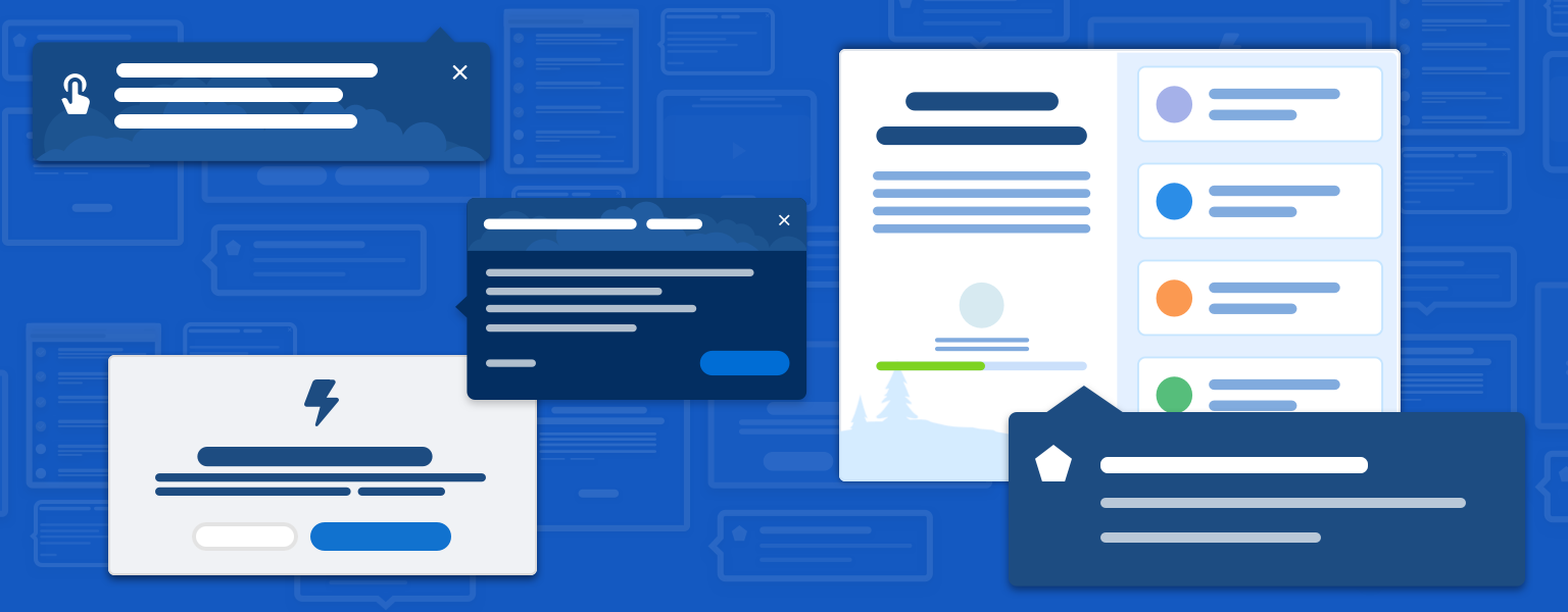
Introduction
Here at Salesforce, we use various engagement patterns to onboard, guide, assist, and educate our users. This section gives an overview of common patterns and offers examples of how they can be used. We also highlight pros and cons for each pattern and identify a few anti-patterns.
Start using our Design Kits
Open in FigmaComponents and Patterns
Welcome Mat
Onboarding is your first opportunity to introduce a product or service to your customers—and to make a positive first impression. So say hello and make them feel welcome.
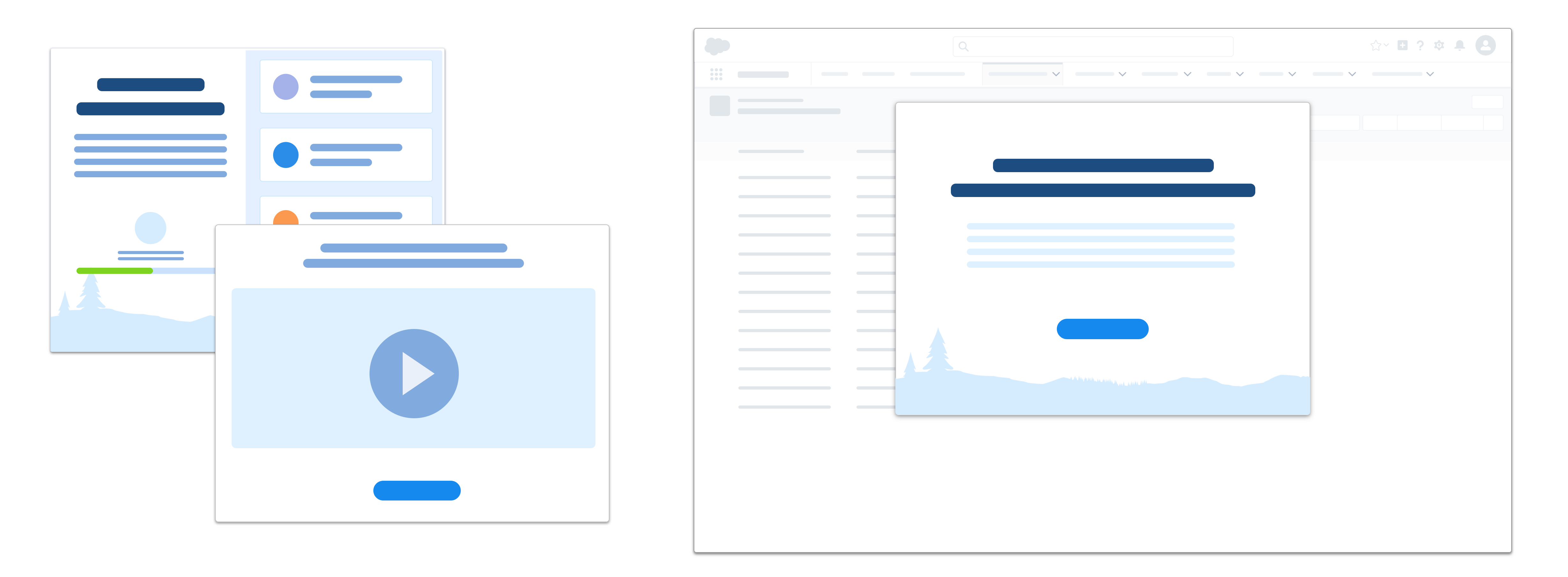
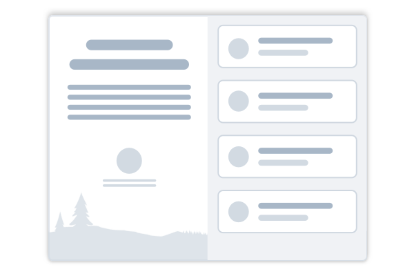
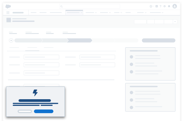
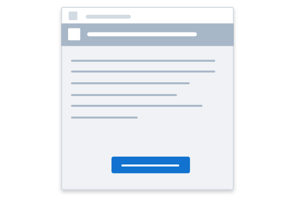
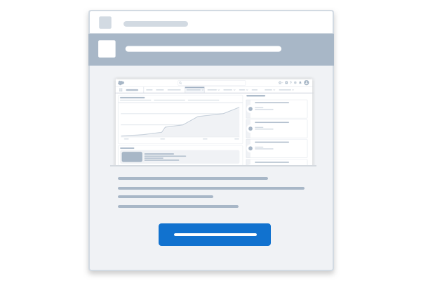
The welcome mat (aka onboarding modal) is a blocking modal component that appears the first time a user logs into an app after certain scenarios, such as new user, new feature available, or major application updates, are activated. It can contain primary and secondary messages, with an optional call to action. Welcome mats introduce users to your app app—they should feel welcoming and supportive, inspiring to explore the content.
Splash Welcome Mat
Welcome mats can be designed and configured to support a wide range of use cases. A simple "splash" welcome mat can deliver a welcoming message to users, with or without a single call to action button.
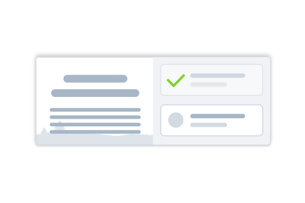
Information-Only Welcome Mat
An information-only welcome mat can be used to communicate important system or feature updates to users.
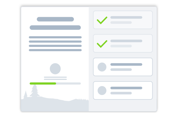
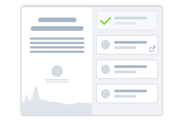
Checklist Welcome Mat
A welcome mat with multiple calls to action can be used to onboard users to a collection of topics related to a given scenario such as a new release or new user.
See the Welcome Mat blueprint for implementation information.
Usage
Use this full blocking modal to make sure that users acknowledge important updates.
Use cases: Introduce a product, new user onboarding, seasonal release, major product update, or update where action is required.
| Pros | Cons |
|---|---|
| The blocking modal's high visibility grabs users' attention and encourages action. | The modal completely blocks the viewport. |
| It presents a brandable moment and allows you to present multiple content types in one place. | Some users quickly close anything that auto-pops. |
| It's a recognizable pattern; users know what to expect. | The modal can provide setup steps or other guidance, but users can't take action in the product while the modal is open. |
Popovers and Prompts
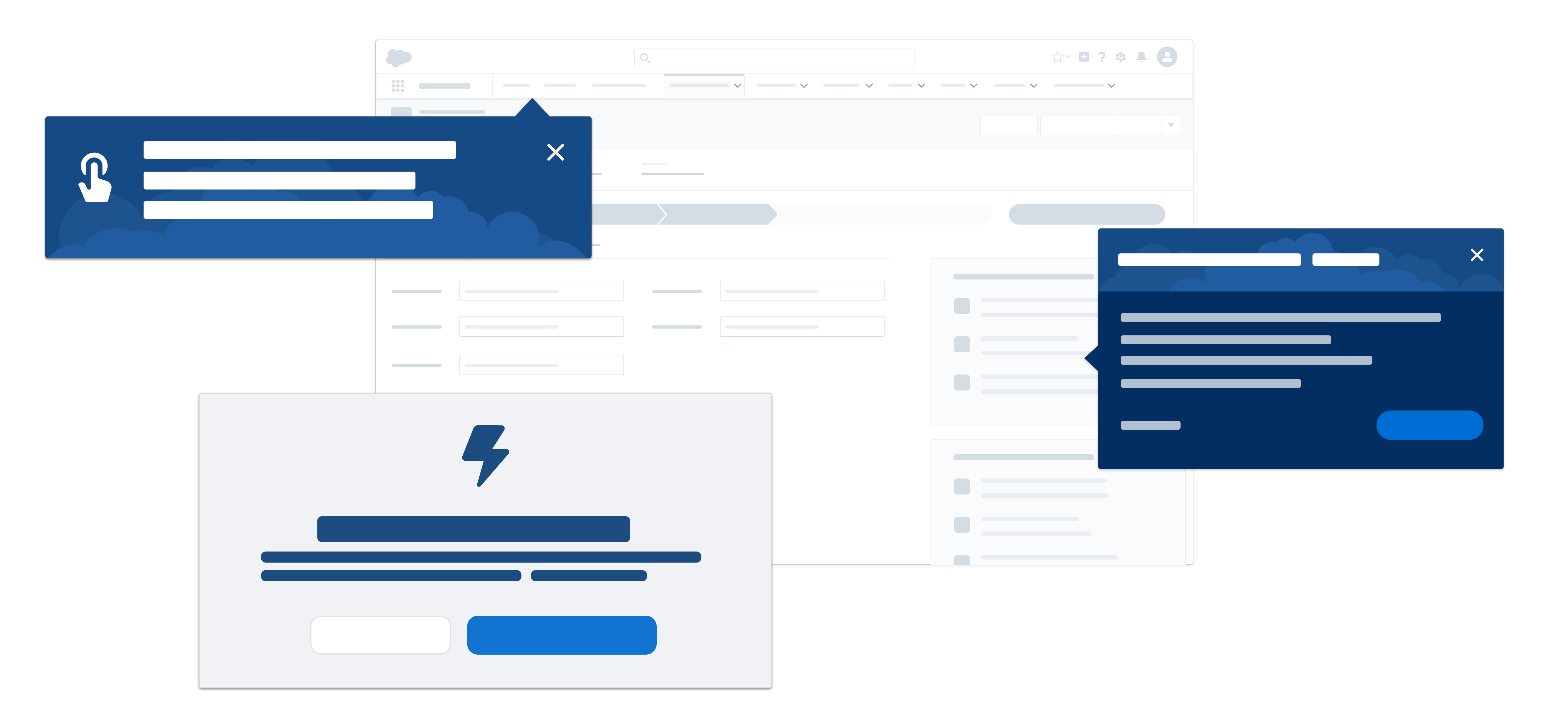
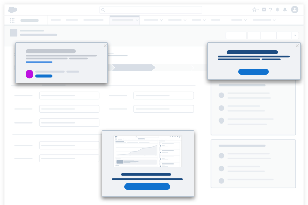
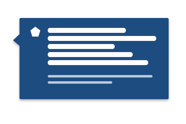
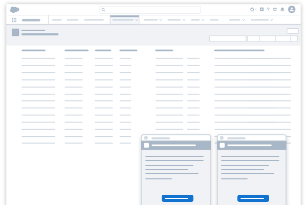
Popovers and prompts are non-modal dialog panels that give the user contextual information about your application. Prompts grab the user’s attention and alert them to system-related issues or updates. Prompts can come in many shapes, forms, and sizes. SLDS offers a wide variety of prompt patterns to support a range of use cases.
Non-Modal Prompt
Non-modal prompts engage users, nudging them to take action, or communicating system updates and notifications. A non-modal prompt gives the user information relevant to the current page, app, or larger context. Unlike a modal, a non-modal prompt is nonblocking, allowing the user to complete the current task before taking action. Dismissing removes it permanently (unless frequency rules apply).
See the Non-Modal Prompt blueprint for implementation information.
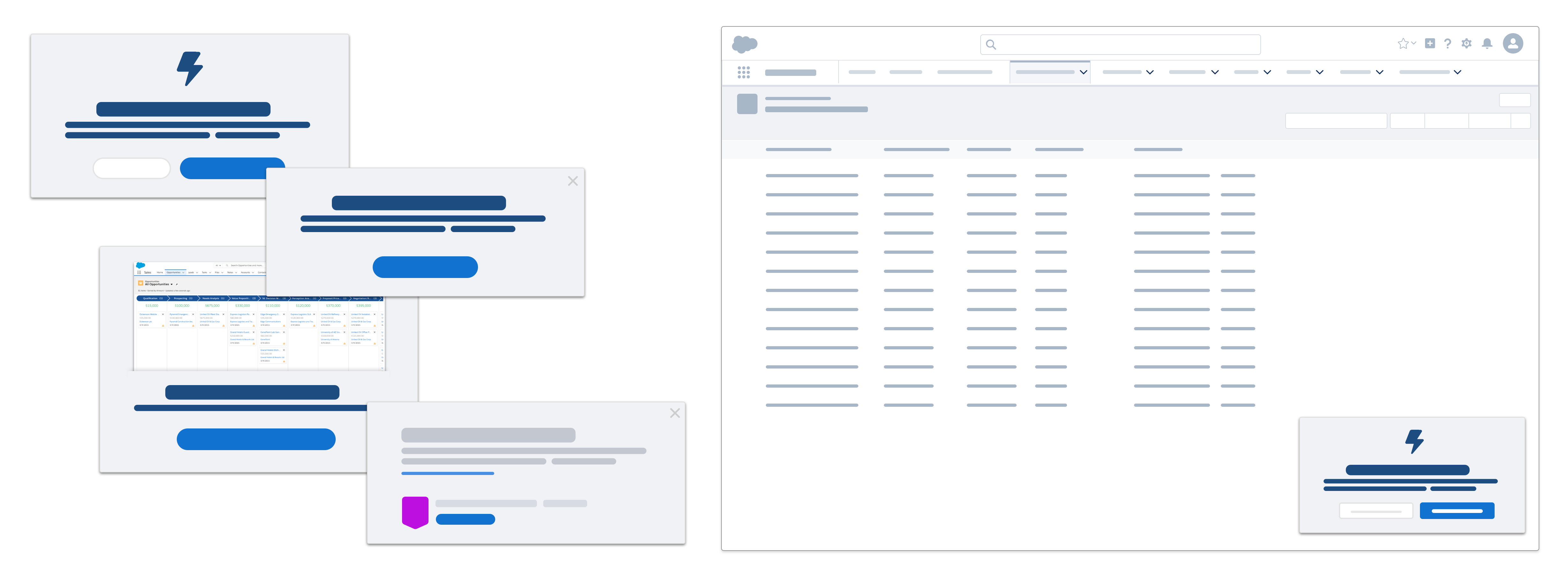
Use cases: Communicate to users about system maintenance and downtime. Alert users of new and updated features. Encourage users to engage with another area of your application that they might not otherwise explore.
| Pros | Cons |
|---|---|
| Prompts and noticeable but not overpowering. | If prompts are used too frequently, users may become annoyed. |
| Prompts are non-blocking, allowing users to interact with a page until ready to take action. | Prompts may temporarily cover an important part of your page. |
| Prompts can be customized using a variety of layouts, with primary and secondary buttons. | |
| Prompts can be triggered by time and frequency rules. | |
Feature Popover
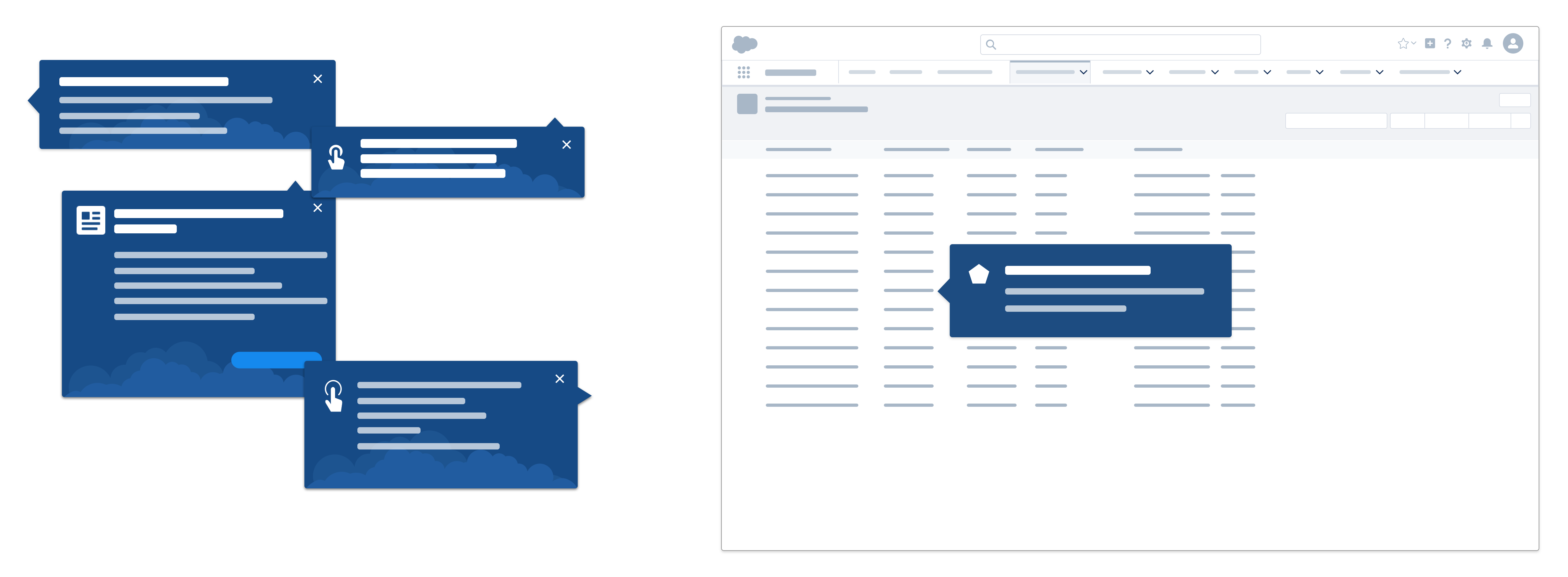
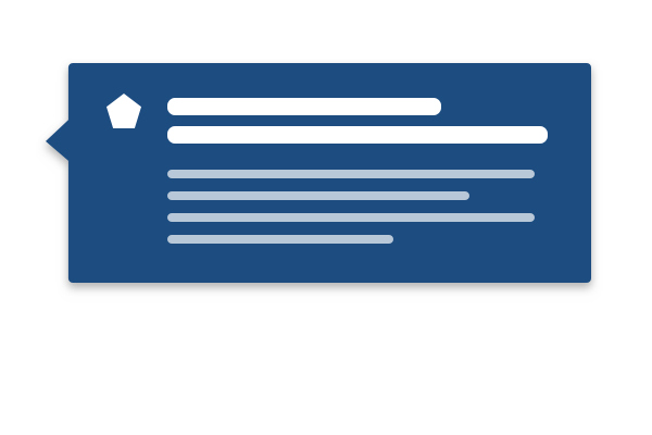
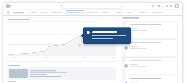
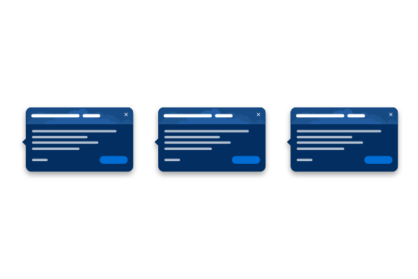
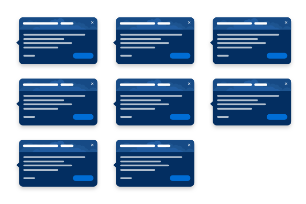
A feature popover highlights a new feature or points out a significant change to an existing feature. Its content may also link to a help topic, video tutorial, or another page in your application.
A feature popover may be triggered by a user action, or may simply appear the first time a user arrives on a new or updated page. Unlike a walkthrough, this is a single callout, with no subsequent steps. Once the user closes it, it doesn't appear again. Typically, feature popovers are used to onboard new users to an application, and appear early on in the onboarding process.
See the Feature Popover blueprint for implementation information.
Use cases: Introducing a new feature, highlighting significant change to an existing feature, encouraging a user to take action where they might not otherwise.
| Pros | Cons |
|---|---|
| Popovers are lightweight and simple. | Popovers can't be revisited. |
| Popover content is often short and to the point. | Users may dismiss popovers without reading them. |
| Popovers are relatively easy to build and implement as part of a larger onboarding strategy. | If not well timed and well orchestrated, popovers could overload users. |
| Popovers point to the feature being promoted, making it's easy for users to take action. | |
Walkthrough
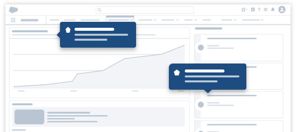
A walkthrough gives users a hands-on interactive tour, guiding them through a series of onboarding steps. It's a good way to introduce new features that appear within a single interactive page, or point out a feature's immediate business value. Walkthroughs can also guide users through a series of procedural steps across multiple pages, if the process is straightforward and unlikely to be customized.
See the Walkthrough blueprint for implementation information.
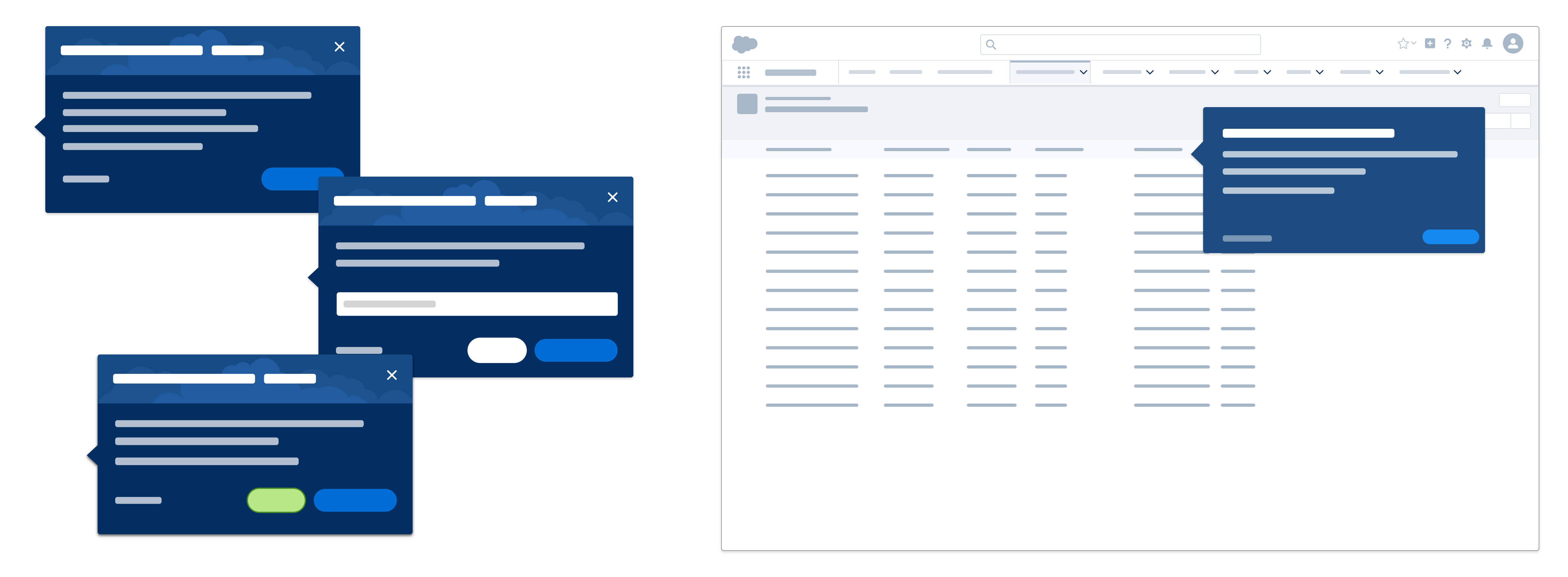
Use cases: Onboarding users to a new workflow, giving a tour of new features, or providing contextual assistance while configuring or setting up your application.
| Pros | Cons |
|---|---|
| Walkthroughs guide users through an app's actual interface and support hands-on experience. | Users may get impatient and not complete a walkthrough series. |
| Walkthroughs are more contextual and specific than separate long-form content. | Users may dismiss or advance without reading walkthroughs and so not fully comprehend how to perform a task. |
| Users can closely follow steps because the walkthrough stays on screen while they work. | |
Docked Assistant
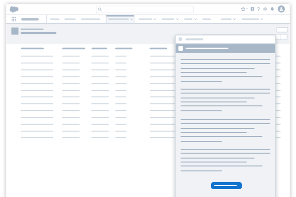
The docked assistant is a persistent, nonblocking panel that guides users as they complete tasks or gather information.
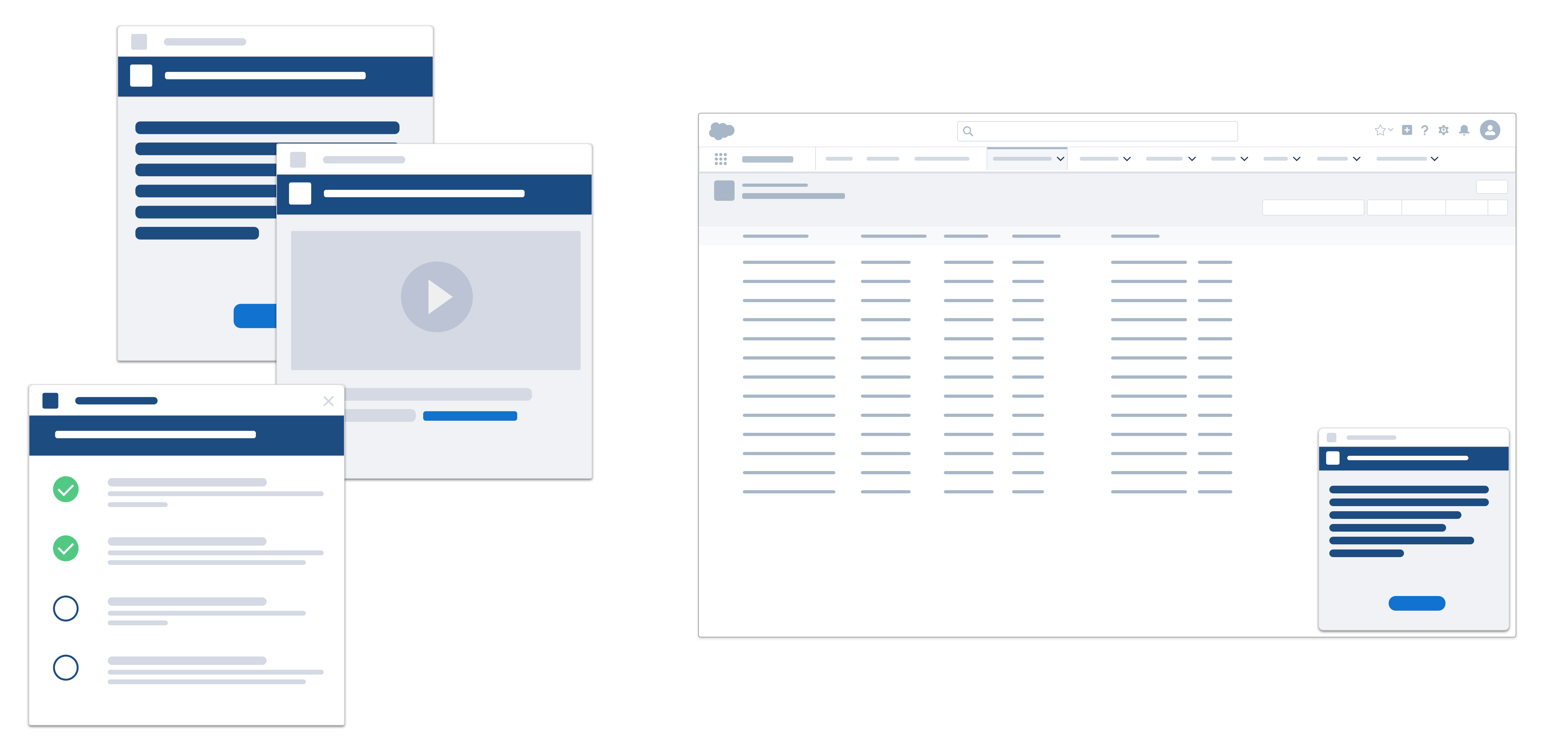
The docked assistant pattern can be expanded or collapsed as needed, and stays with users as they navigate around your product or application.
In a help and learning context, this panel may contain instructions, guidance, or learning material that users can refer to while working. In response to user actions, it can update its content, register achievements, or offer encouragement.
The docked assistant is built on the Docked Composer blueprint's base variant. In the context of onboarding and user assistance, the blueprint contains content and tools that support the user engagement scenario. This may be instructional content, setup assistants, or videos.
See the Docked Composer blueprint for implementation information.
Usage
Use the docked assistant to push important information to users while taking up minimal screen real estate.
Use cases: Alerting users to new features or recent enhancements related to the current product or page.
| Pros | Cons |
|---|---|
| A nonblocking panel doesn't interrupt users' work. | Users can confuse it with other docked panels or utility panels. |
| The panel can be minimized, giving users access to the page underneath without permanently dismissing the panel. | Unlike a feature prompt (which points to a page element), the panel may be disconnected from the element or feature it's associated with. |
| An expandable viewport accommodates long-form content. | |
| It's good for introducing users to a new feature or productivity tip related to the page they're on. | |
Tooltip
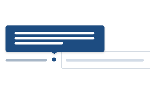
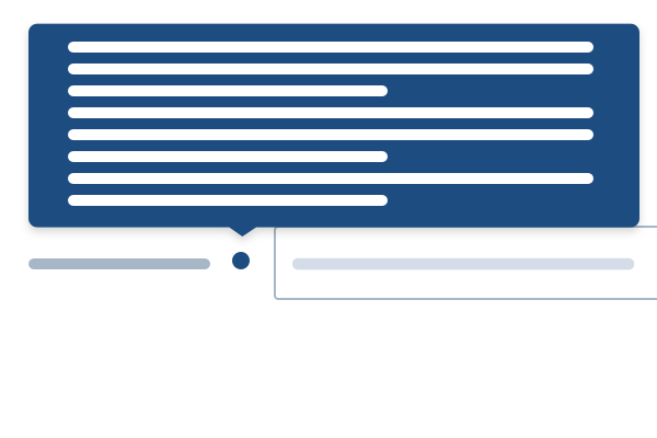
A tooltip (aka info bubble) pops up to display a small piece of contextual information about an element on the screen, whenever the user hovers over or focuses on that element.
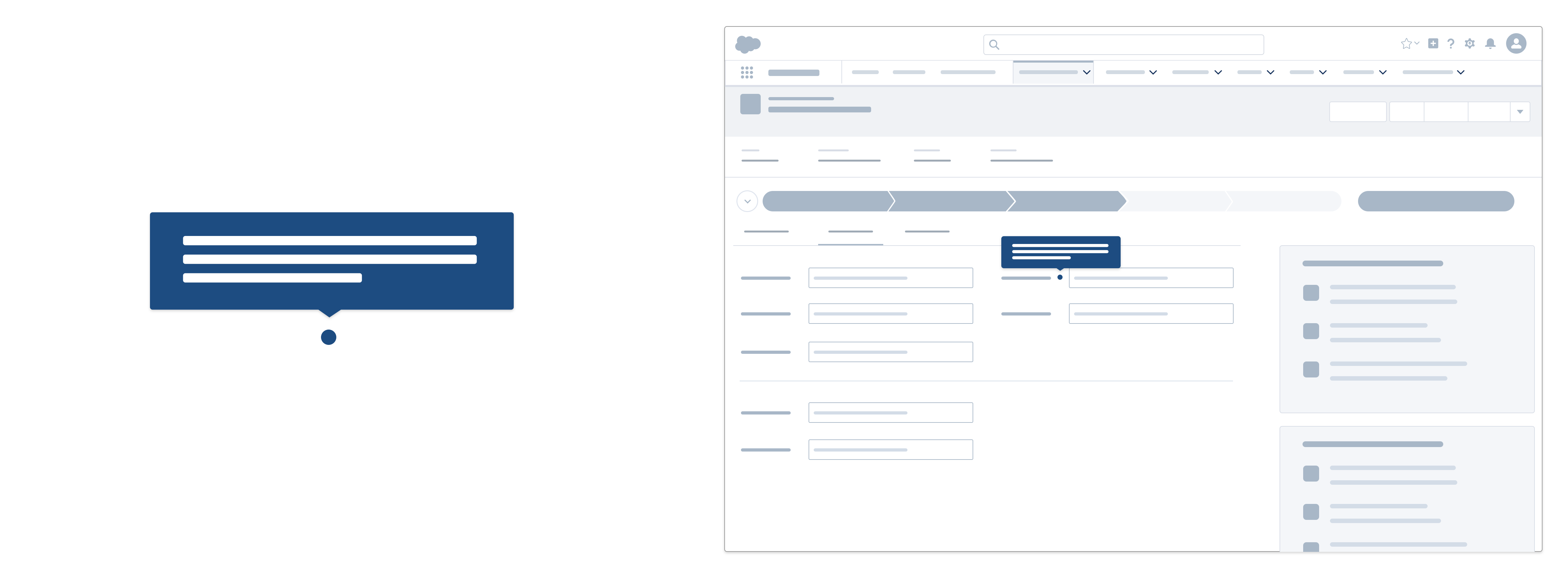
Rather than enabling action, tooltips provide examples, suggestions, and links to more information. They are not focusable and can't contain focusable content.
Usage
Each tooltip includes a nubbin, a small triangle pointing to the element it references. The nubbin can appear at any of nine locations—at the top, middle, or bottom of each side of the tooltip.
Use cases: Field-level help, icon usage, secondary information about a page element that doesn't require persistent presence on page layouts.
| Pros | Cons |
|---|---|
| Tooltips can provide supporting instructional text for a field or text input. | Tooltips may be hard to discover under icons. |
| They offer lightweight help, in context. | Space for long-form content is limited. |
| They keep users in your product or app by offering info about the page they're using or action they're performing. | Tooltips can't link to additional resources. |
Setup Assistant
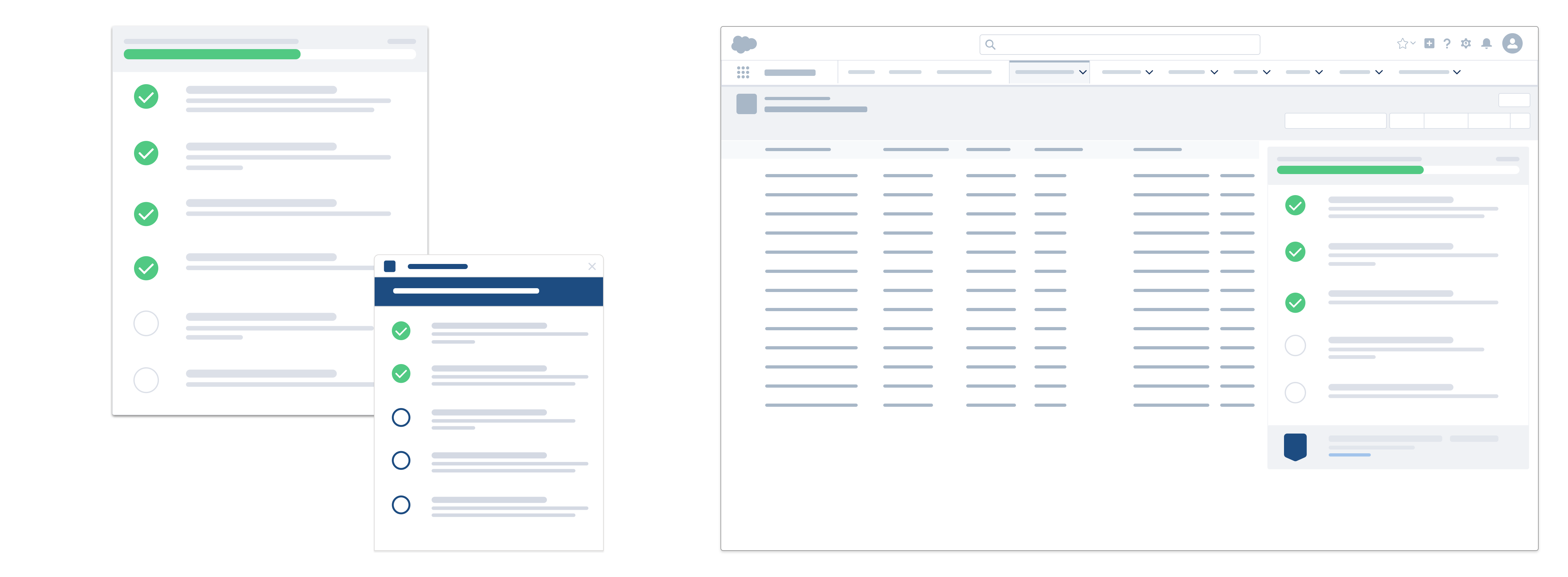
A setup assistant (aka progression system) is a centralized list of tasks designed to help users onboard organizations, clouds, or features.
Usage
This prescriptive, detailed guide walks users through the complex process of configuring, setting up, and rolling out features, which can take hours or even days. In the process, it can launch LSF (Lightning Setup Flow) and link to configuration pages, Trailhead modules, articles, help and training documentation, and videos. Checkboxes, progress indicators, messages, or other rewards encourage users and motivate them to complete required steps.
See the Setup Assistant blueprint for implementation information.
Use cases: Configuring a system that requires multiple, distinct tasks, often over an extended time—for example, a new or trial system.
| Pros | Con |
|---|---|
| A linear progression lets users know exactly where they are in their setup journey. | All steps in an assistant may not be relevant for users. |
| A series of validated steps inspires user confidence. | |
| Great for beginner users who need some guidance on where to begin with your product. | |
Empty States
Empty states tell users that there’s no content to display—and what they can do next.
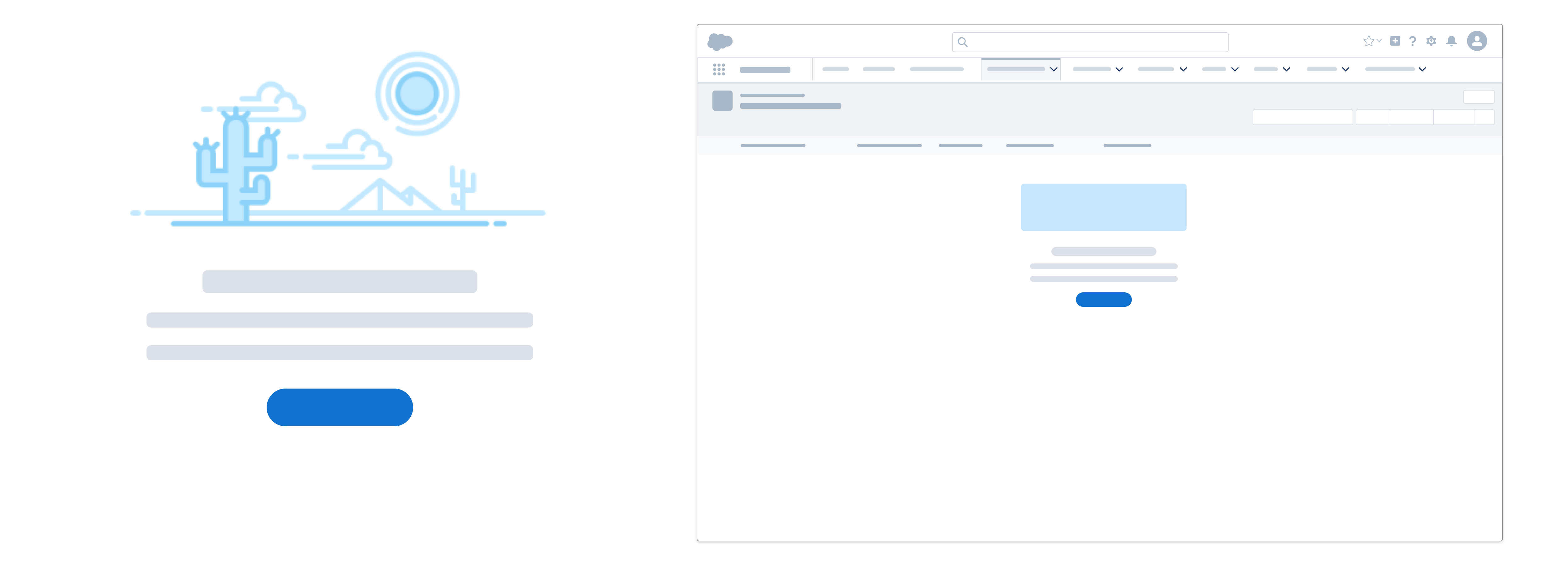
Empty states are messages that appear whenever an element has no content to display to the user—and they're powerful onboarding tools. An empty state message consists of three pieces:
- The title describes the situation.
- The headline gives you an opportunity to convey more information while adding some fun.
- If needed, you can also include body text to add details or engage users.
For readability, keep line length for each of these pieces under 66 characters per line. In general, line length should never exceed the width of your illustration.
For usage best practices including dos and dont's, see the Empty State guidelines.
Usage
An empty state is first a means to communicate with users. It should communicate what it’s for, why they’re seeing it—and what they can do next.
It's also an opportunity to engage users, adding energy and motivating them to interact. It can guide users through an onboarding process or help them get more value from Salesforce, without overwhelming them with too much information at once. And it's a great way to reinforce our brand while injecting a bit of fun into the user experience.
When designing an empty state, be sure to consider how well it will work for desktop and mobile use cases. Fo example, will it be used in both environments, or just one? Does the CTA apply for mobile users? How will the image work on a small screen?
For more details, see the Empty States pattern documentation.
Use cases: Empty list, unconfigured filter, empty feed, feature not yet set up or configured.
| Pros | Cons |
|---|---|
| Empty states are an opportunity to let your brand, voice, and tone shine. Have fun with them. | It can be difficult to maintain current brand imagery in empty states. |
| They create a learning opportunity with informational graphics or guidance on next actions. | Empty states rely on serendipitous discovery of a feature rather than pushing a notification about its value. |
| They can give users a preview of, or value proposition for, a future experience. | |
| They can help users be productive because they convey the value of the thing they're missing out on. | |
Trial Bar
The trial bar is a persistent user interface element that helps users wayfind or interact with priority content and tools, supporting a trial or other immersive onboarding scenarios.
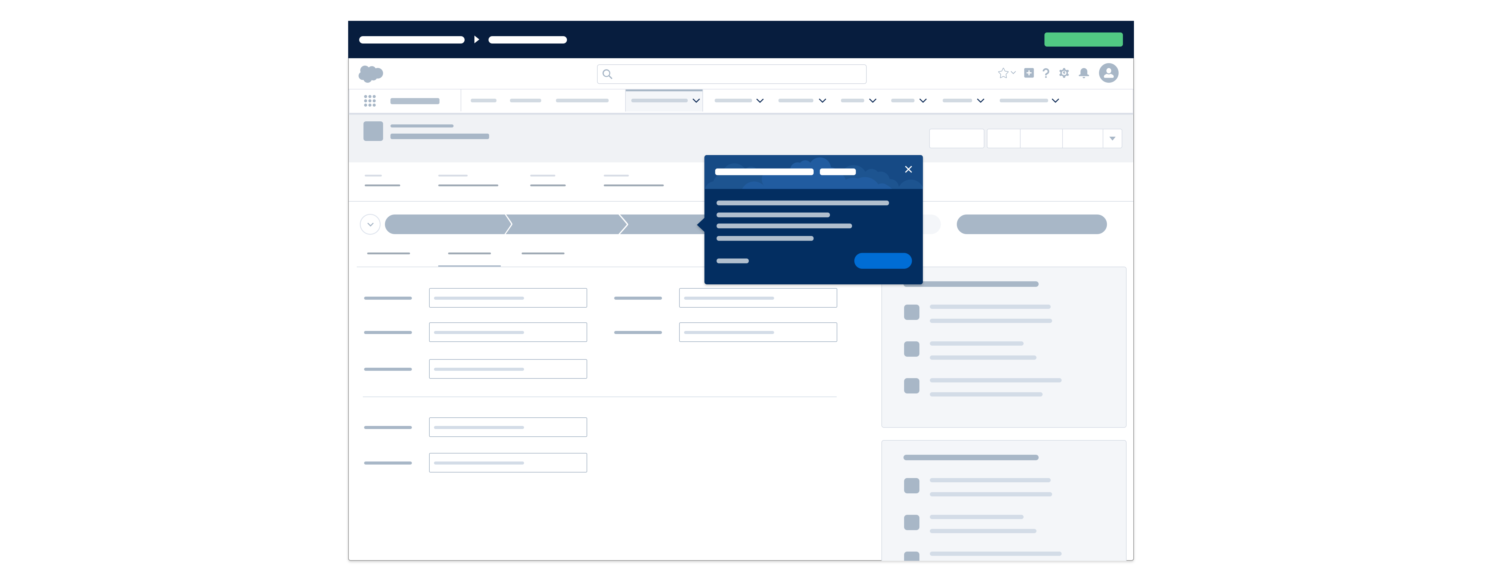
The purpose of this persistent experience is to put the applications, value propositions and key features front and center. The trial bar typically contains the application name plus a list of clickable links designed to expose users to key elements of the application, inspiring an "aha moment." It may also include a countdown to the end of the trial phase and a primary call to action.
See the Trial Bar blueprint for implementation information.
Usage
A trial bar should span the width of the upper viewport (the viewable area in a browser). It's best used in full-screen mode, and can't be dismissed by the user.
Use cases: Application trial experiences, temporary states in which users are likely to need onboarding help.
| Pros | Cons |
|---|---|
| The trial bar appears on all major user-facing app pages. | It gives users temporary, targeted help for a set amount of time. |
| The trial bar takes up a small amount of vertical screen space. | Users can't remove it. |
Salesforce Trial Experiences
Explore a few Salesforce trials below.