Iconography
Icons are symbols used to represent features, functionality, or content. Visit the icon page to see a library of all icons and the component blueprint page for implementation details.

Overview
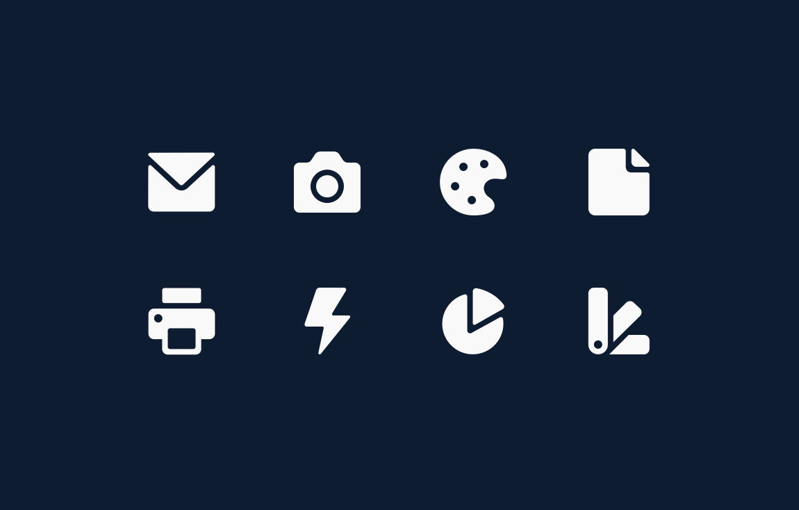
Five types of icons are used to communicate information within Salesforce, each with variations based on use case and representation. From most to least used, they are:

Utility icons are simple, single-color glyphs that identify labels and actions across form factors. They can be paired with text or used alone, and can be any color. They have no background shape.

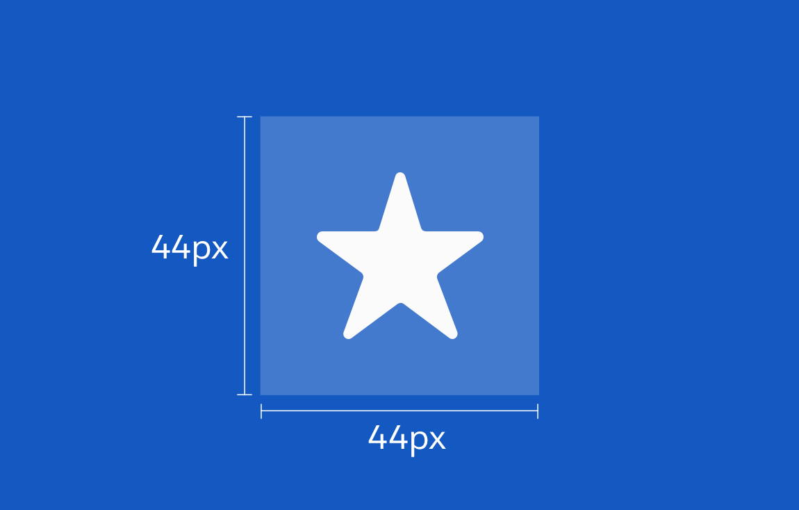
Object icons fall into two categories. Standard object icons (e.g., Accounts, Leads, Opportunities, and Cases) come with Salesforce. Custom object icons are a unique set of icons used to create custom objects. Each object icon is made up of a white glyph on a squircle (square + circle = square with rounded corners). Object icons use a specific, limited color palette.

Action icons are touch-device specific icons that appear next to an item—for example, a page header or card—to let users take action in a specific context. Each action icon is made up of a white glyph on a colored circle. Action icons use a specific, limited color palette.

Doctype icons represent document file formats. Each doctype icon is made up of a white glyph representing its file type, on a background resembling a piece of paper with a folded corner.

Product icons represent applications using product logos. On the desktop, they’re used only in the app launcher and at the top left of each Salesforce application window. On mobile-device home screens, they launch the corresponding mobile app. Product icons are full color and use official product color palettes.
Design Principles
Salesforce icon design is a blend of professional and playful. Our icons are simple, approachable, and legible, distinguished by negative space and large rounded corners. Icons should be recognizable and easy to remember.
Accessibility
Screen readers handle the two major icon types differently. Informational icons are read to convey information to users, while decorative icons are ignored. Choose the right icon type for each use case; for informational icons, write preliminary labels for CX review and developer use. For more information on icon accessibility, see the Accessibility section of the Icon blueprint.
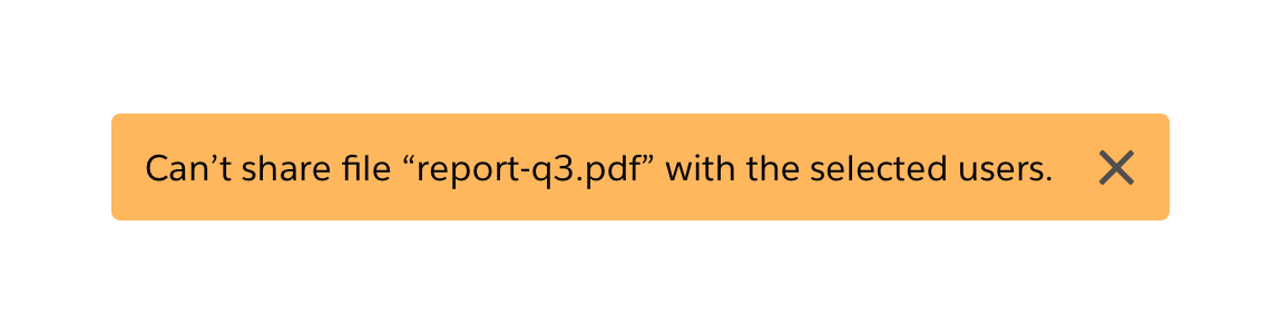
Informational Icons
Informational icons—for example, icon buttons and standalone avatars—convey important information that surrounding text doesn’t. Each icon should be accompanied by either assistive text or aria-label (a code string that labels the element). Each image should have an alt description. In the alt description, write what the icon or image does, not what it looks like (e.g., "Upload File" instead of "paperclip").
Informational Icon Example:
Users click the X icon within a toast message to dismiss the message. Screen readers should read this icon as “Close.”
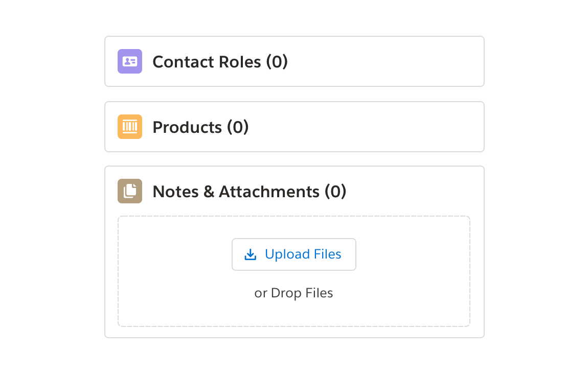
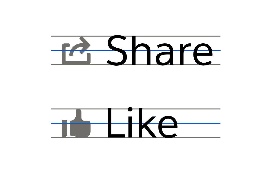
Decorative Icons
Icons and images add no relevant information or functionality. Redundant icons and images, which reinforce adjacent text’s meaning but add no new information, also fall into this category. Screen readers should skip over decorative icons. For images, use an empty alt tag, to force screen readers to skip over them.
Decorative Icon Example:
The following icons are decorative; the visible text next to them reiterates their new information.
Grid System and Keyline Shapes
Icons are based on a 8pt grid system and come in four keyline shapes—circle, square, vertical rectangle, and horizontal rectangle. These shapes are created using business process model and notation diagram (BPMN) conventions.

Mobile Tap Targeting
When designing for mobile, add space around each icon to make it easier to select.
Icon Categories and Types
Salesforce uses four main icon types: object, utility, action, and doctype. Keep design elements consistent within each icon type. (See Iconography specs for details.)
Object Icons
Object icons are used for both mobile and desktop applications. They consist of white images on colored squares with 4px rounded corners.
- Standard icons represent Salesforce objects and entities that come with the product (for example, Account or Contact records).
- Custom icons represent custom Salesforce that objects customers create to meet their business needs.
Note
Not all custom object icons meet WCAG color contrast guidelines. Only use them as decorative elements paired with text.


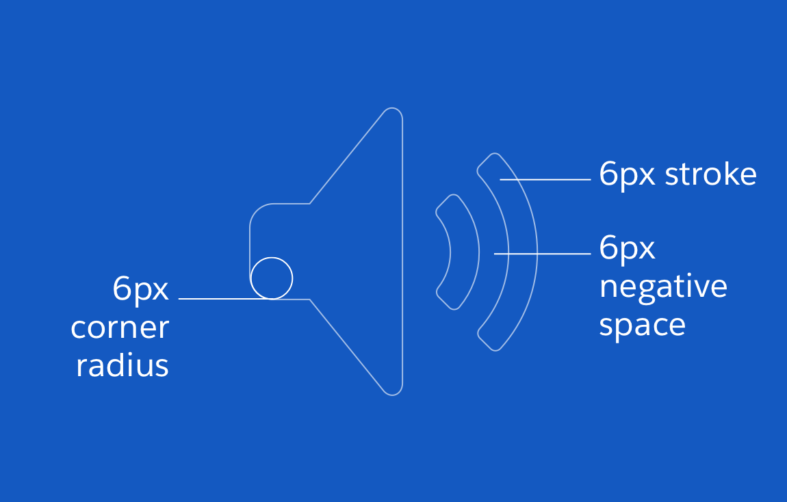
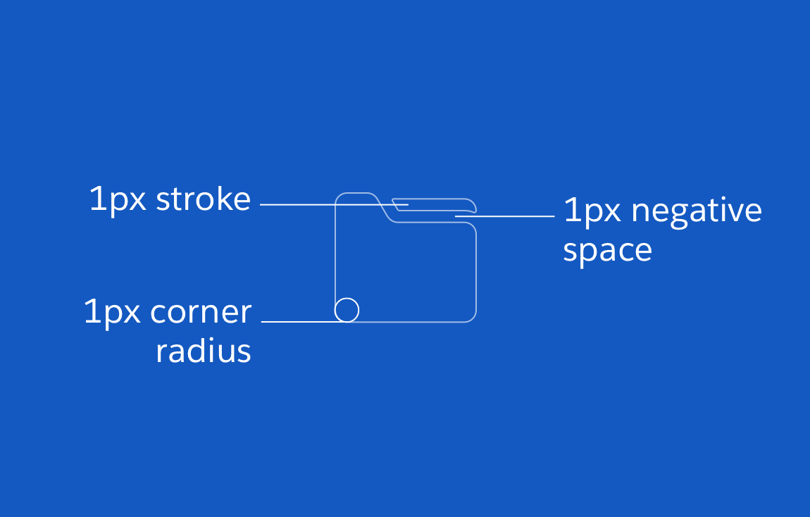
Anatomy
- Based on a 60x60px grid
- 6px stroke weight
- 6px corner radius
- 6px negative space
Keyline Shapes


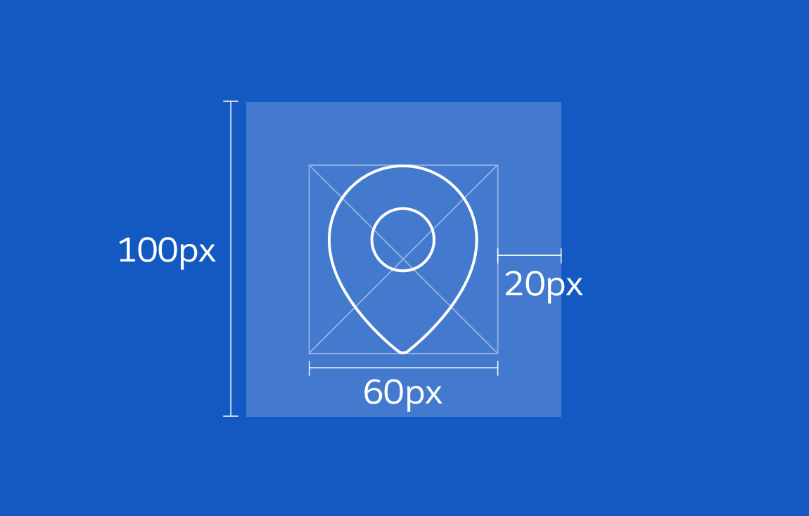
Artboard
- Recommended canvas size for setting up Illustrator or Figma files: 100x100px
- Live area of 60x60px, with 20px padding on each side
Dos and Don’ts


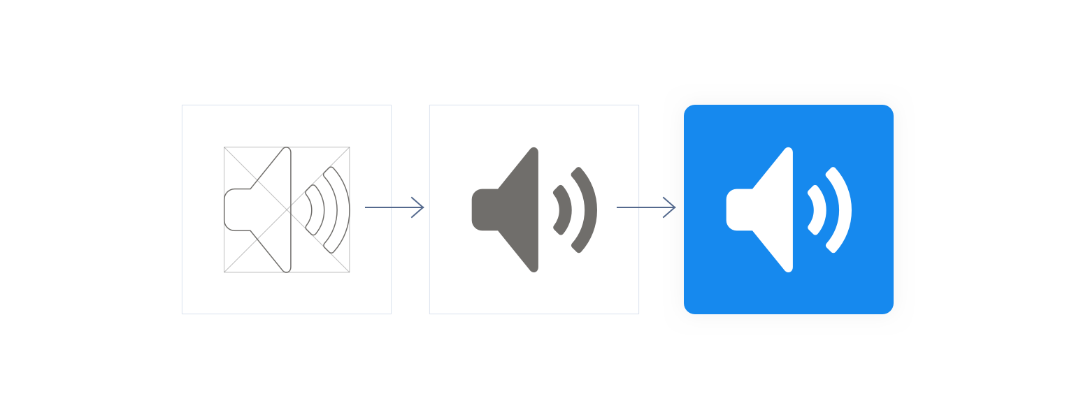
Utility Icons
Utility icons are simple, single-color images representing UI-specific actions such as closing a dialog, searching, opening a menu, and sharing a feed post. These actions can be either generic or Salesforce specific. Utility icons do not have keyline shape backgrounds.
Utility icons appear in both mobile and desktop environments—including in feeds, Global Header, navigation, Docked Composer, Button Groups, Alerts, and Toasts.
Utility icons can include text describing their functions. Text and image are center aligned.
Anatomy
- Based on a 16x16px grid
- 1px stroke weight
- 1px corner radius
- 1px negative space
- Based on a 24x24px grid
- 2px stroke weight
- 2px corner radius
- 2px negative space
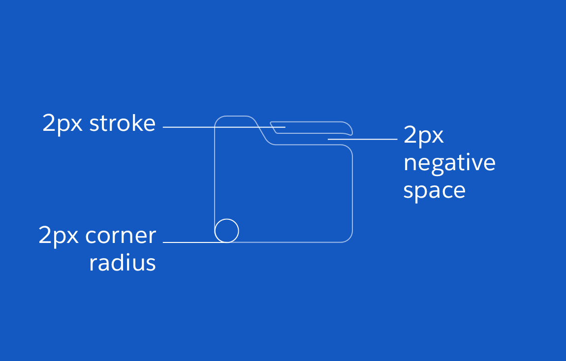
When scaling icons larger than 24px, increase the stroke and spacing: 32px icon (2px stroke weight), 48px icon (4px stroke weight), and 60px icon (6px stroke weight).
Keyline Shapes


Artboard
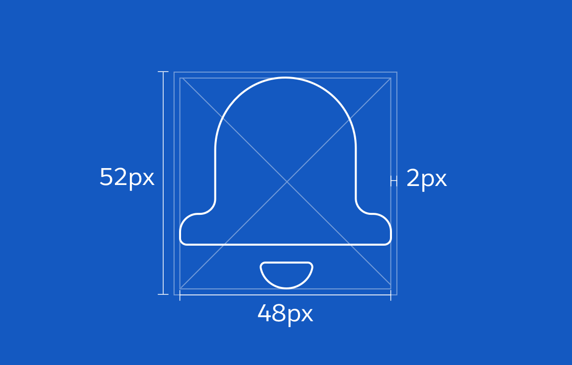
- Recommended canvas size for setting up Illustrator or Figma files: 52x52px
- Live area of 48px, with 2px padding on each side
Dos and Don’ts


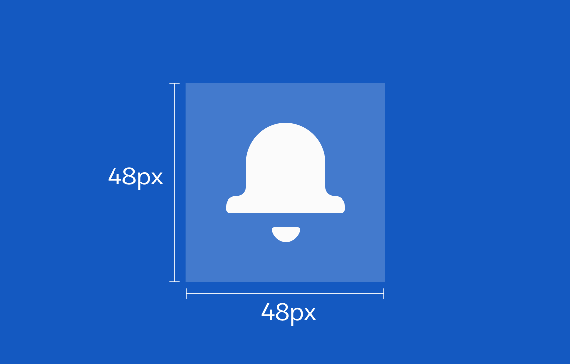
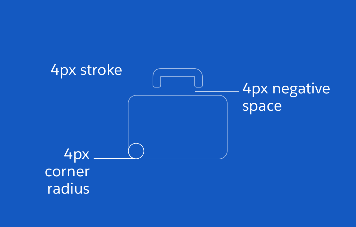
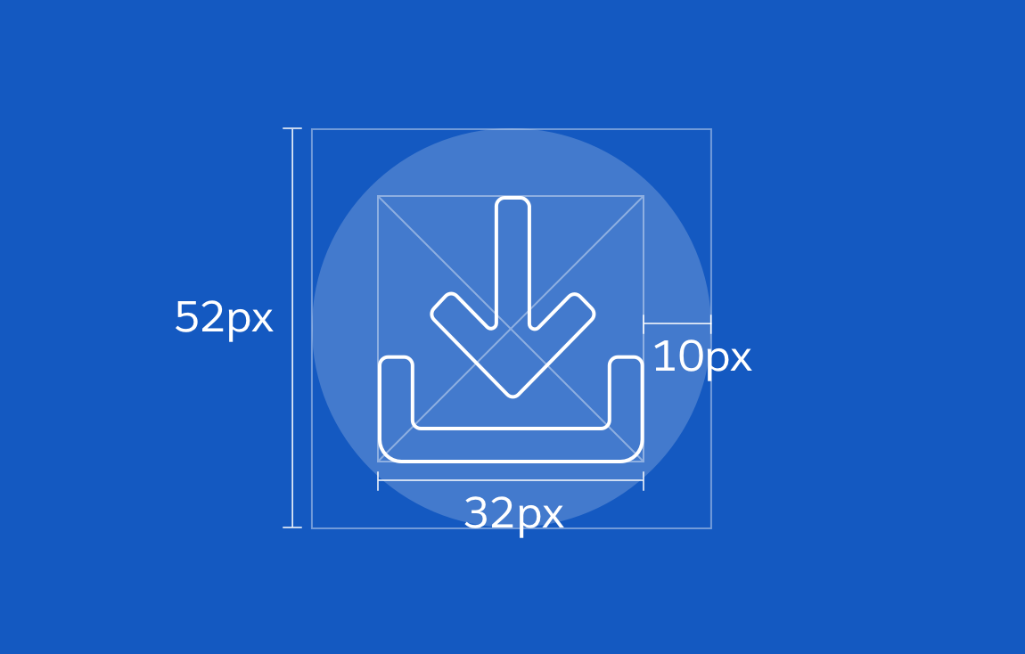
Action Icons
Action icons represent actions that users can take within a touch device app. These important icons, which represent the main ways Salesforce users accomplish tasks, appear only in the mobile action bar.


Anatomy
- Based on a grid of 48x48px
- 4px stroke weight
- 4px corner radius
- 4px negative space
Keyline Shapes


Artboard
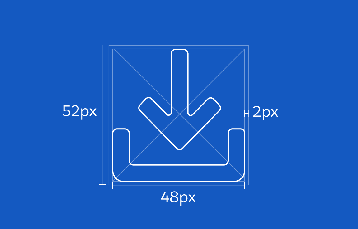
- Recommended canvas size for setting up Illustrator or Figma files: 52x52px
- Live area of 48x48px, with 2px padding on each side
- Circle background: Live area of 52x52px (circle), 32x32px (icon), with 10px padding on each side
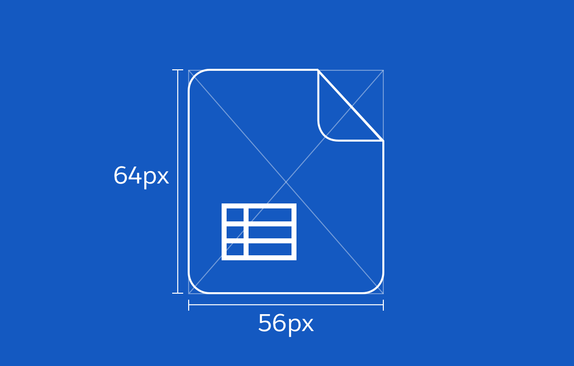
Doctype Icons
Doctype icons represent file types, and are often used when a file preview is unavailable. Use a recognizable white glyph inside these icons if a familiar visual metaphor is available; otherwise, use a text abbreviations of the corresponding file extension.
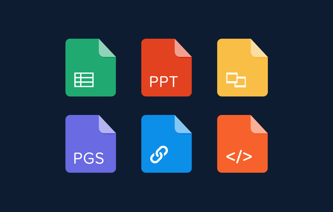
Doctype icons are used in both mobile and desktop environments, including inside feeds, publishers, cards, and related lists.

Anatomy
- Based on a grid of 56x64px
- Live area of 36x12px (letter) or 36x22px (icon), with 10px padding
- 6px corner radius
- Icon: color #fff
- Text: Proxima Nova Soft, Regular 18 pt, color #fff
- Flip: color #fff with opacity of 50%; drop shadow: color #000 with opacity of 10%
- Add a background color
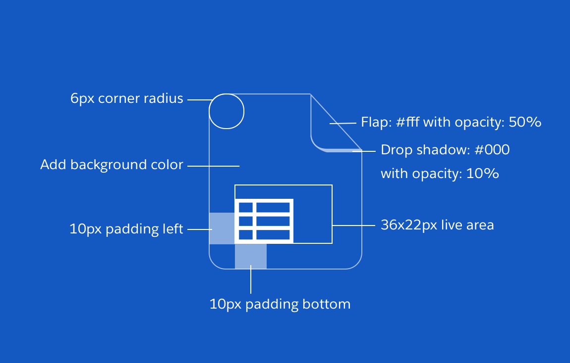
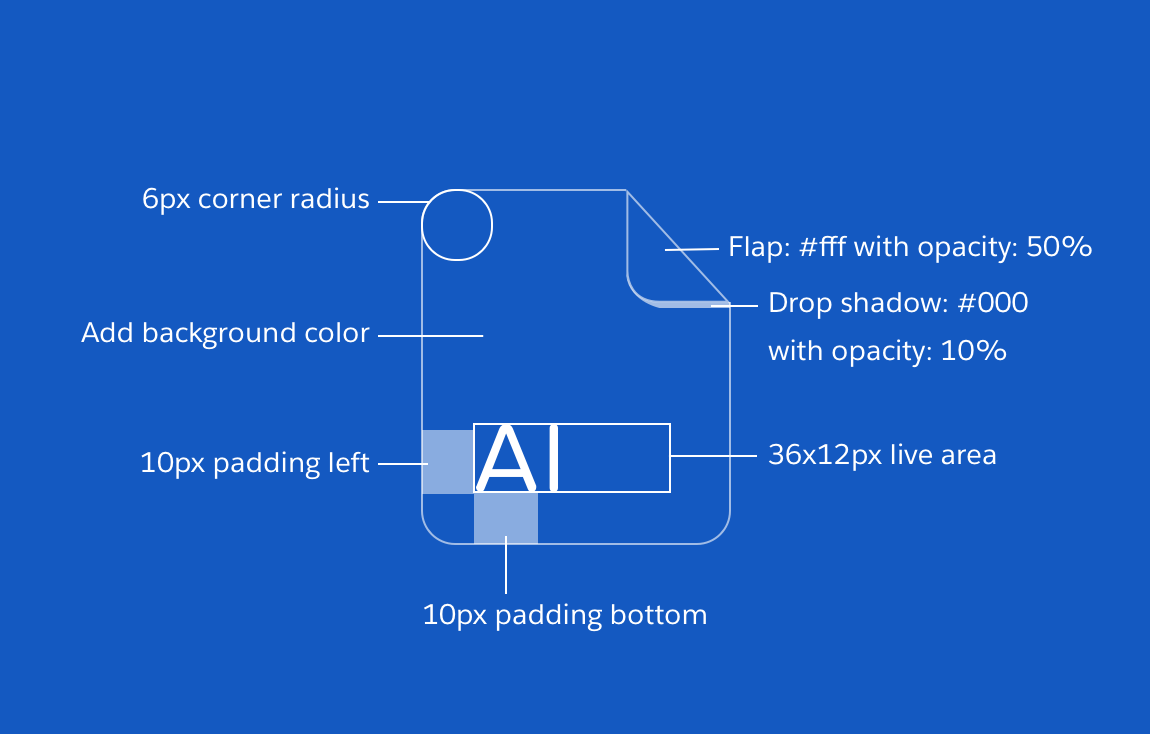
Keyline Shape
Vertical Rectangle (56x64px)

Artboard
- Recommended canvas size for setting up Illustrator or Figma files: 56x64px
- Live area of 36x12px (letter) or 36x22px (icon), with 10px padding


Dos and Don’ts


Product Icons
Product icons are the branding for each Salesforce product. Each product icon is made up of a two-color glyph with a 4px rounded stroke on a white background. These are used as mobile application icons; in the product, they represent each official Salesforce application in the App Launcher as a 48x48px icon.