Click to Create
Click to Create
This contextual action opens a modifiable, movable components list.

Introduction
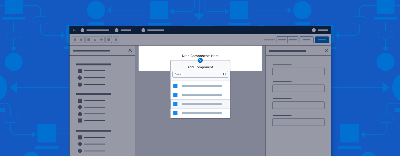
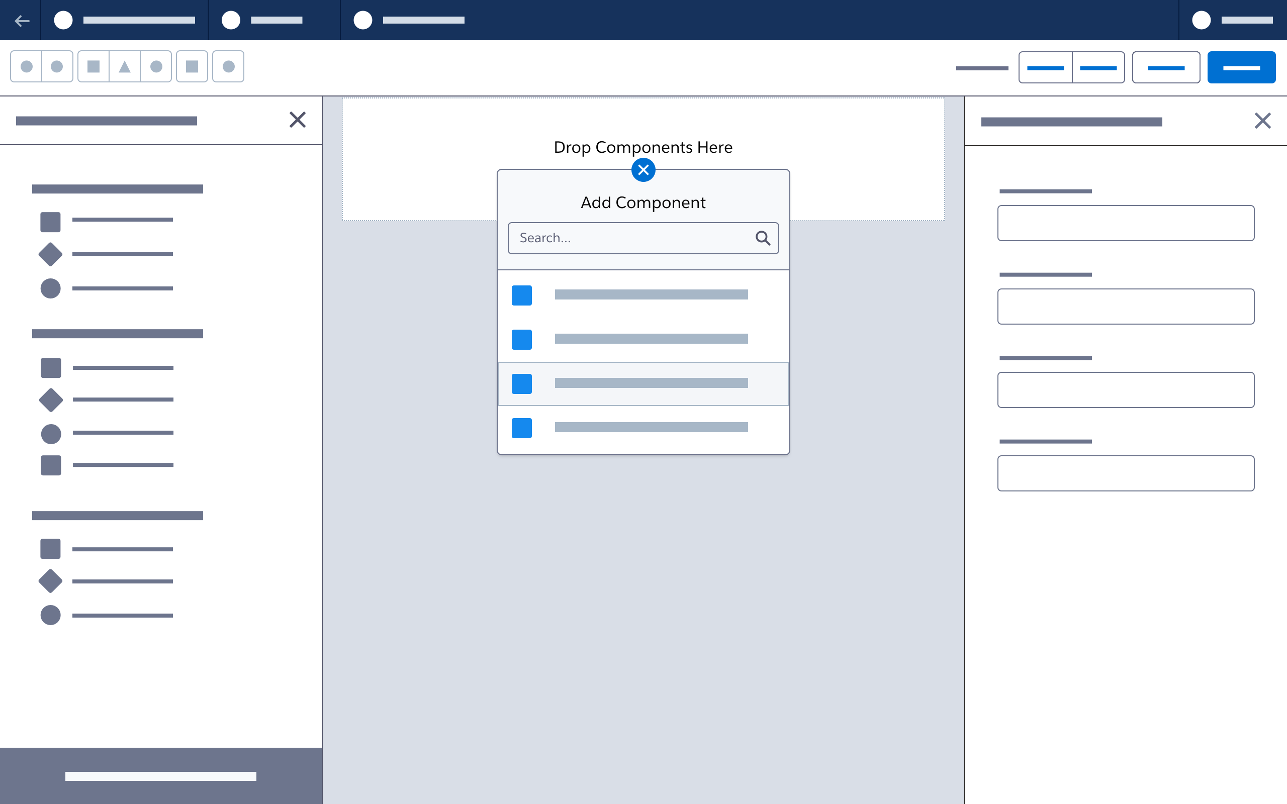
With click to create, users click (or use a keyboard) to open a contextual list of components that can be added to a selected position on the canvas.
Start using our Design Kits
Open in FigmaUsage
Insertion Points (Nodes)
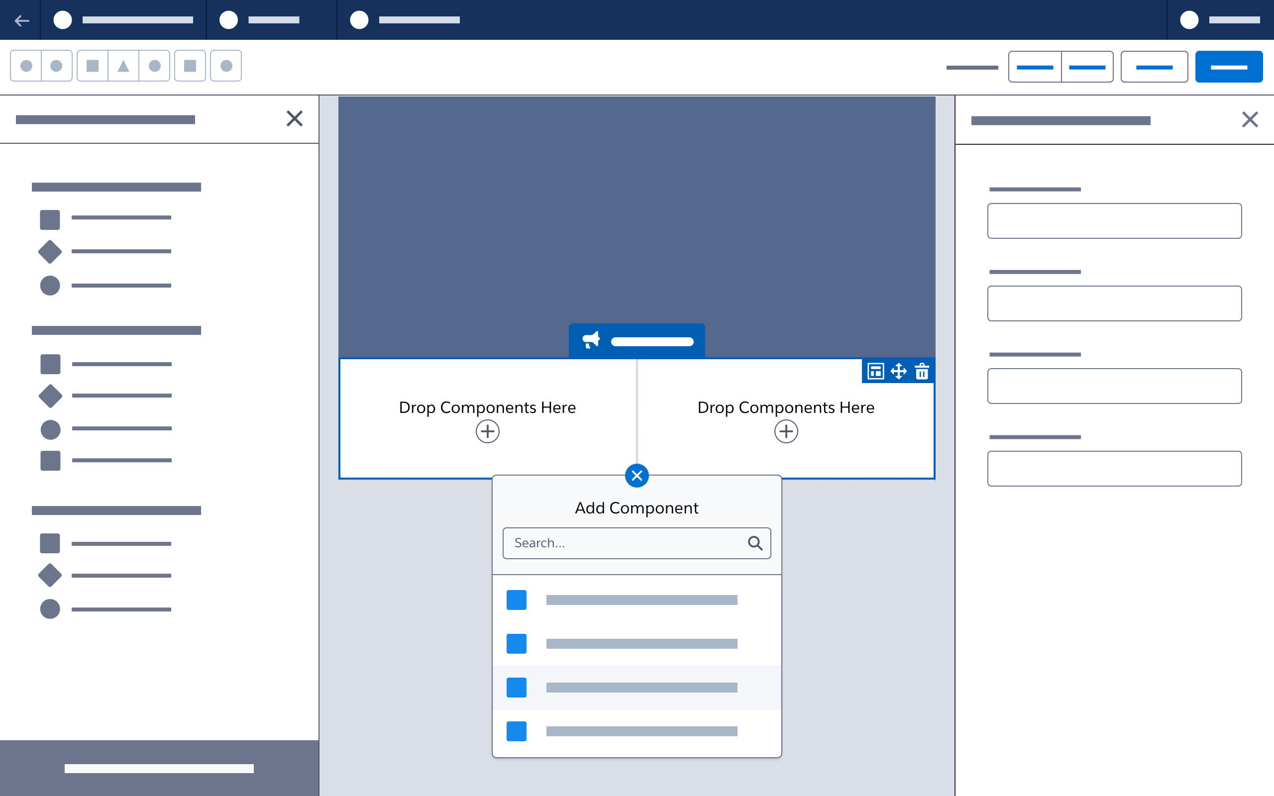
- Click to create insertion points appear:
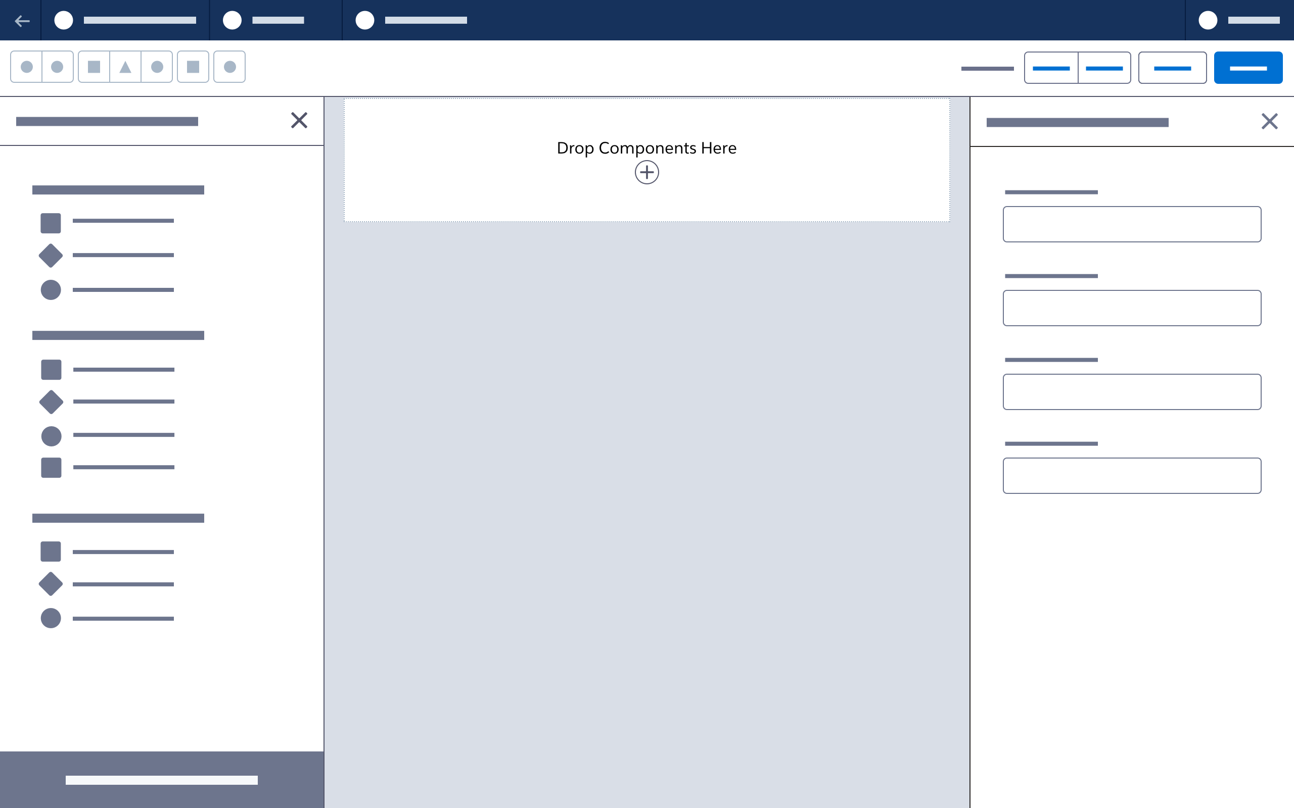
- In empty columns
- Below each row (there isn’t a node for click to create at the top of the canvas)
- On an empty/default canvas, include a node in any empty row/column, allowing a layout component to be selected.

Popover Menu
- In a popover menu, clicking the node icon (a plus sign) changes it into a close icon. Clicking again changes it back and closes the menu.
- Alslds-p-bottom_nonel menu options should map to available components in the left-hand component panel.

Canvas Updates
- When content is added to an empty canvas, add a node for click to create below each new row.
- Clicking to add a component selects that component and shows its property sheet (just as when dropping a component onto the canvas).

Next: Connectors