Header
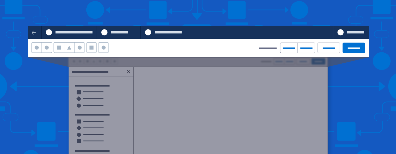
The builder header persists at the top of the window. It contains navigation elements and file information.
Introduction
Every builder needs a builder header, which contains basic navigation elements. It also shows the builder type and document or file name.
See the Builder Header component blueprint for implementation information
Start using our Design Kits
Open in FigmaTop Bar
The top bar of the header should be consistent across builders.

Styles & Colors
Use the following styles and colors for the top bar.
- Top Bar Background
- Background-color: #16325C / Biscay
- Top Bar Separator Lines
- Color: #061C3F / Deep Cove
- Button
- Background-color: transparent
- Text Color: #FFFFFF / White
- Button: hover
- Background-color: #061C3F / Deep Cove
- Text Color: #FFFFFF / White
- Button: hover
- Background-color: #061C3F / Deep Cove
- Text Color: #FFFFFF / White
- Text-decoration: underline


Left Side Actions
The left-hand side of the top bar may contain one or more of these four elements, in this order from left to right:
- Back button.
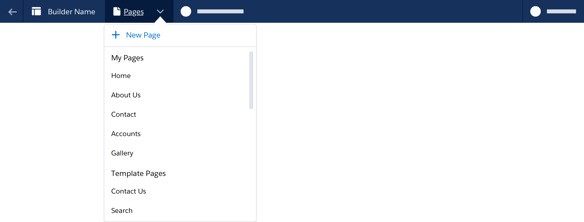
- Builder logo and name. If this element has a menu, include a chevron to let users know it is clickable.
- Pages menu (optional).
- File name and version number.

Back Button
The Back button is located at the top left of the builder header. Use hover text to show where the builder has launched from. If the builder launches from only one location, hover text should read “Back.” Specify a launch site with hover text such as “Back to setup,” “Back to journey,” or “Back to email record.”


Menus
A menu can be added to an element in the top bar, when needed.
- If users can add new pages, include an Add Page item at the top of the Pages menu.
- Menus may be divided into sections.
- Menus may include scrollable overflow. Menu height can be set dynamically, with scrolling triggered after a set height.
- The builder name can function as a menu if needed.
- Any element with a menu should be a button element. Include a chevron to let users know it is clickable.
Right Side Actions
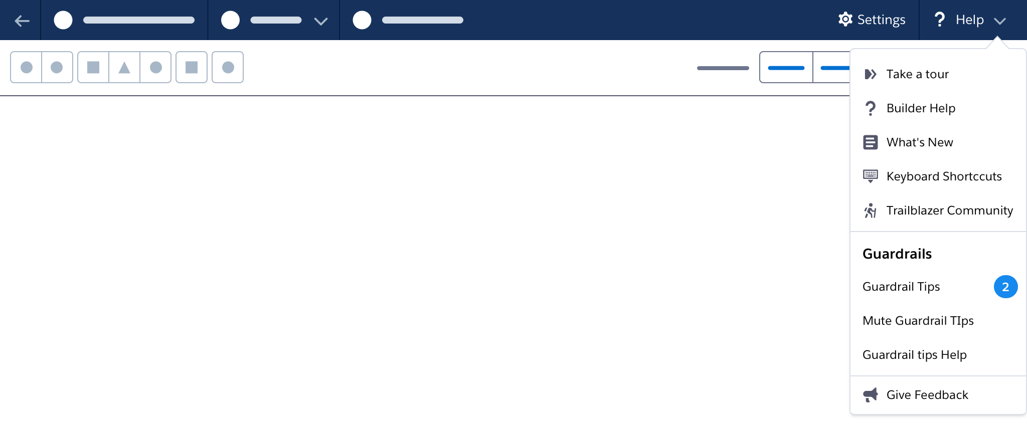
Settings
A builder may have no settings, just builder or canvas settings, or both builder and canvas settings.
Builder-level settings affect the overall configuration and behaviors of the builder and should persist each time the builder is opened. Builder settings are located next to Help at the top right of the header. The Settings button opens a popover or modal where settings can be edited and saved.

Canvas-level settings affect the canvas or configuration of the current record or file. Canvas settings are located on the left side of the action toolbar. The canvas-level settings button opens a popover or modal where settings or preferences can be edited and saved. After each save, the builder canvas should reflect any updates.

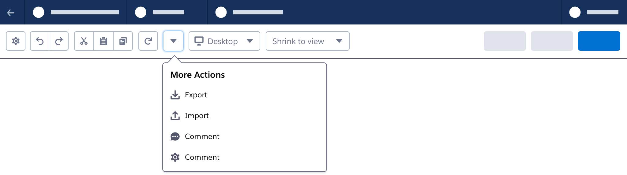
Help Menu
The help menu contains resources for learning about, using, and offering feedback on the builder. It includes a guardrail tips section.
- Use icons to differentiate help resources.
- Use sections to group menu items.
- Use dynamic counts or badges for items such as guardrail tips.
Toolbar
The toolbar is located below the top bar. It contains buttons that affect the builder as whole, such as Save, Activate, Publish, Undo, Copy, and Zoom. Keep the action toolbar lean and mean—use an overflow menu to manage additional options.
See the Builder Header component blueprint for implementation information
Primary Actions
The builder header bar should contain only one primary action button, at the far right of the toolbar. Place any additional action buttons associated with the open file to its immediate left.


When the user clicks a primary action button, the status text updates to reflect the action in progress, then updates again when the action is complete.
Save
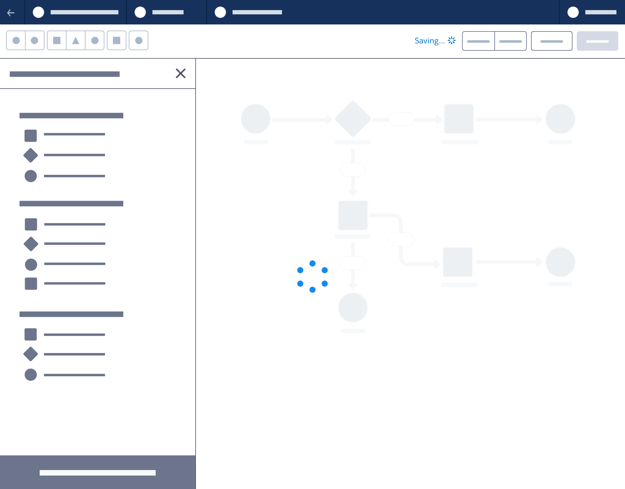
Saving commits all changes to the server. Status text updates to reflect saving in progress, then updates again when saving is complete.
- Use “Save As” to create a new copy of a current record.
- Don’t use toasts or alerts for save messages. When users save often, toasts can be disruptive. Banners are reserved for systemwide messages.
Accessibility Note: Background status text changes should not trigger screen reader alerts.

Operation Sequence for Status Text when Saving
| Order | Message | Time on Screen | Transition/Animation | Notes | |||||
| 1 | Saving... | Time needed to complete the action | Opacity 0.25s ease-in and animate the saving spinner | An animated spinner appears to the right of the status message. The canvas is blocked from further editing with an overlay and spinner. | |||||
| 2, if successful | Saved [time] (Seconds, minutes, days, months, years) | Persistent | Opacity 0.25s ease-in | Update status message to the time of the successful save. | |||||
| 2, if failed | Saved [time] (Seconds, minutes, days, months, years) | Persistent | Opacity 0.25s ease-in | Update status message to the time of the last successful save. Include relevant warnings and errors in popovers. |
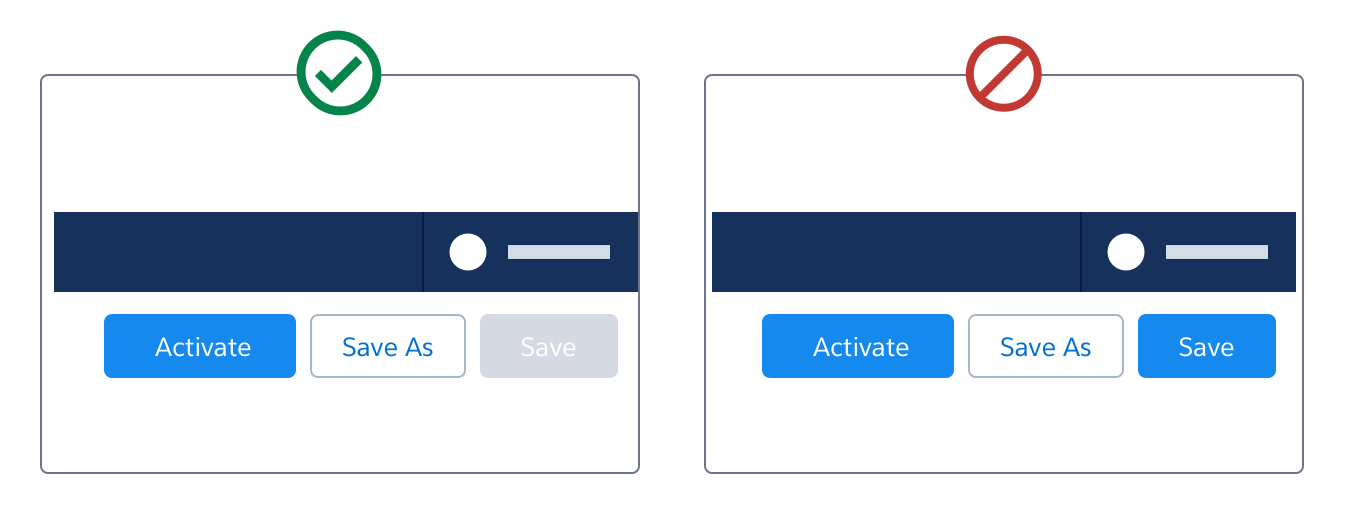
Activate/Deactivate
Activation and deactivation are significant milestones—use a toast to notify users of success or failure. When the action is in progress, update the status message to read “Activating...” or “Deactivating....” Use an animated spinner.


For builders with activate and deactivate actions, this may be the primary action (button Brand) or a secondary action (button Neutral). Use text destructive (not destructive) style for the deactivate button.


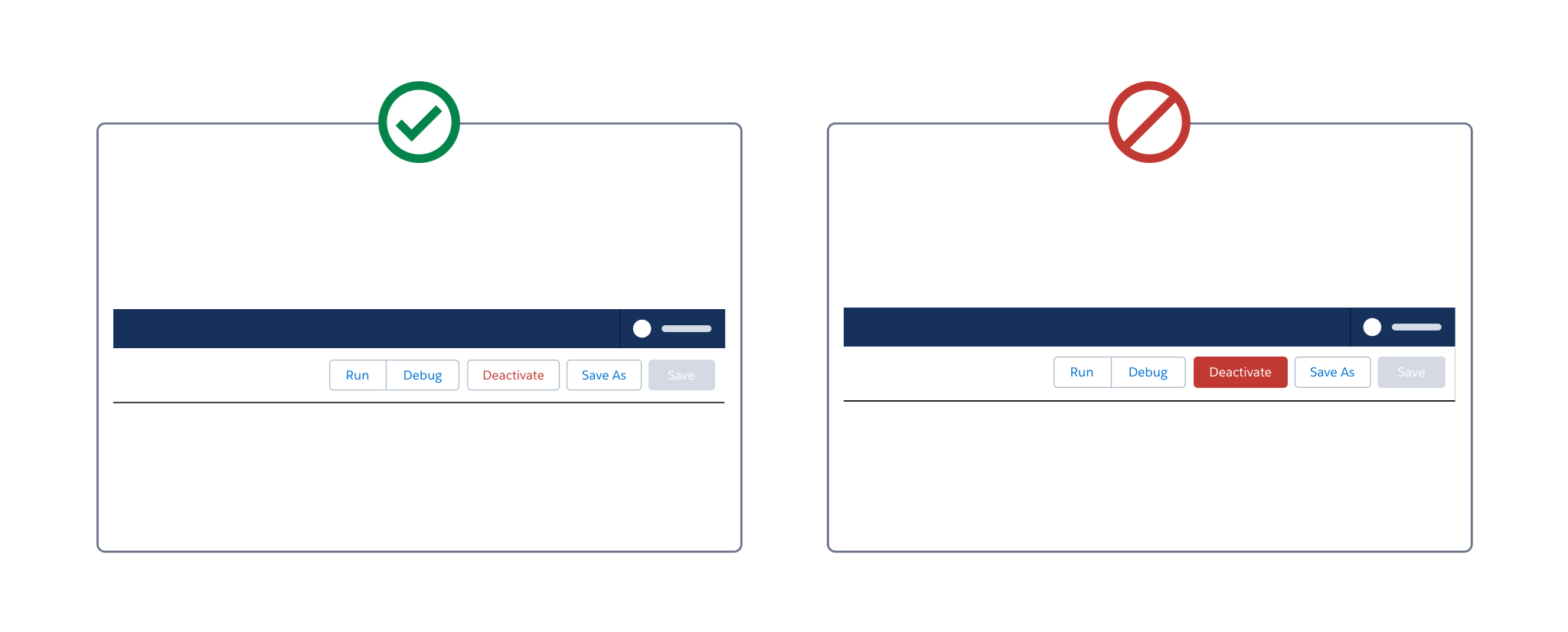
The save button is disabled after activation and the Activate button is replaced with Deactivate. To avoid shifting, make the Activate and Deactivate buttons the same width.

Status Text
Use status text and alerts with action buttons to reinforce status notifications, warnings, and errors.
In the toolbar, show status with inline text next the action buttons. Use a focusable text button that includes hidden text for screen readers. Avoid badges, which are visually heavy and not focusable.
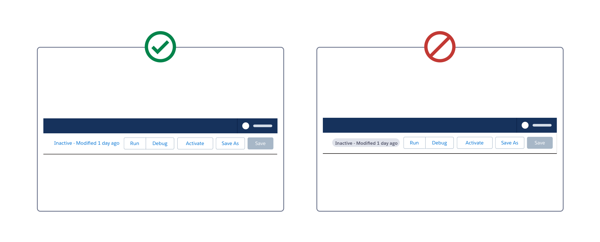
A status text can include:
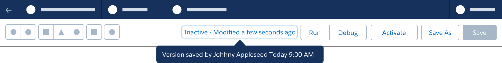
- A file (version) state, such as active, inactive, draft (e.g. "Inactive - Modified a few seconds ago")
- Action, plus Last Modified Time, represented with relativeDateTime. (e.g. "Saved 1 day ago")
When the user hovers or focuses status text, use a tooltip to communicate additional details (e.g., Version 2 saved by Johnny Appleseed Today 9:00 AM).
In-progress actions
When an action, such as saving or activating, is in progress, disable action buttons. Status text should include the action name and an animated spinner icon. Do not alter button states to indicate actions in progress.

When an action is in progress, disable the canvas and show an animation.
When an action is complete, update the status text. Disable the Save button until any further changes are made.

Alerts
In the toolbar, alert icons are located to the left of actions buttons, and to the right of status text.
When the canvas or a canvas element generates a warning or error, an alert icon appears in the toolbar. On hover, a popover shows detailed information on all current unresolved warnings or errors.
Accessibility Note: In the alert focus popover, up/down arrow keys move keyboard focus between listed errors. Pressing Enter moves keyboard focus to the related component in the canvas.

See Validation for more information
Utility Actions
Utility actions are tools related to the canvas. They appear at the left side of the toolbar.
Some actions, such as Undo/Redo, may affect both the canvas and related panel settings.
Button Ordering
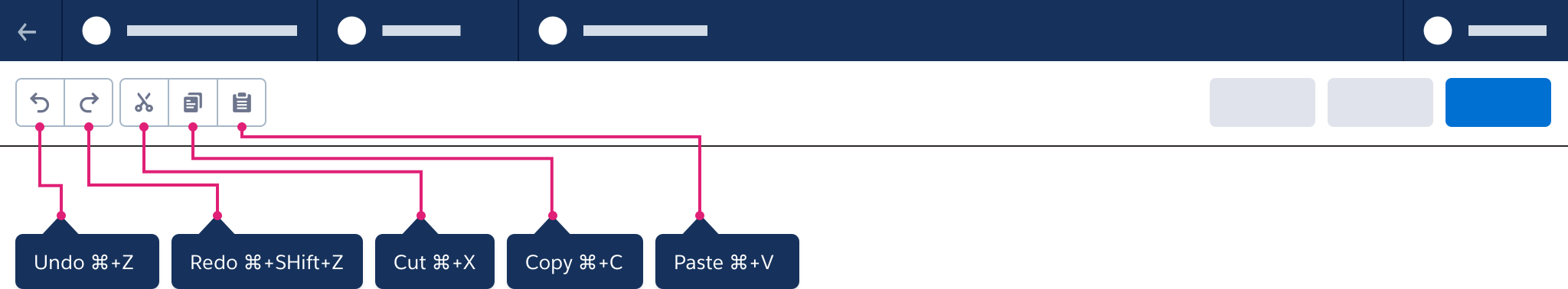
Buttons for common actions such as Canvas Settings, Cut, Copy, Paste and Undo/Redo should appear in a consistent location across builders.

Button Tooltips
Buttons that appear without text should use tooltips indicating their functions and related keyboard shortcuts.
Overflow Menu
When a builder includes a large number of utility actions, use an overflow menu.
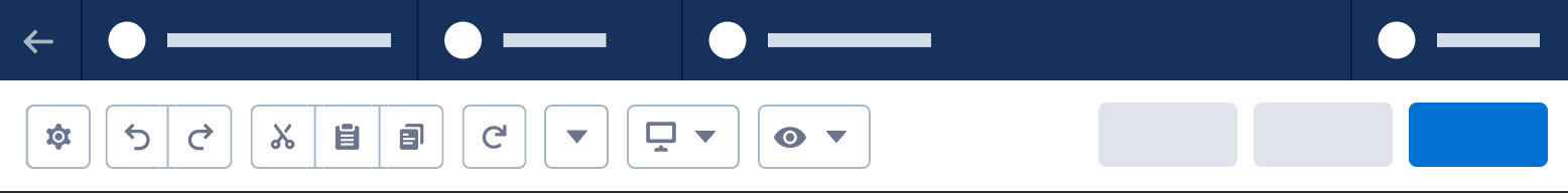
Responsive Menu
To save space, dropdown menus may be collapsed to icon-only menus.
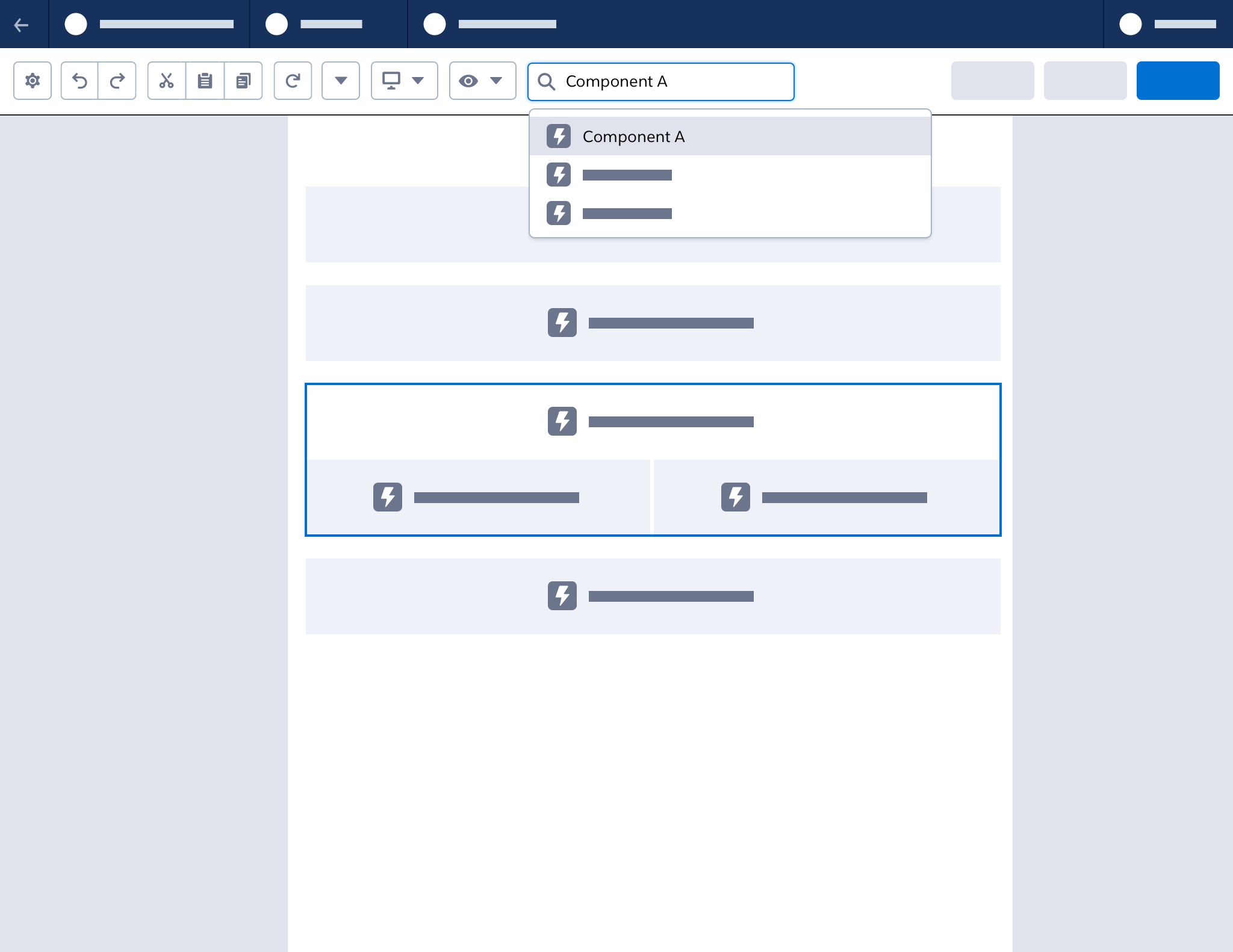
Search
A search bar/lookup lets users search for components or elements on the canvas.
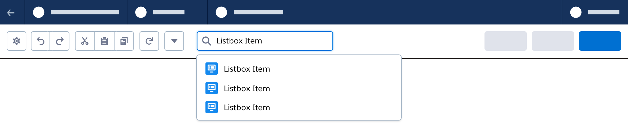
To save space, use a search button, with the search bar in a popover.
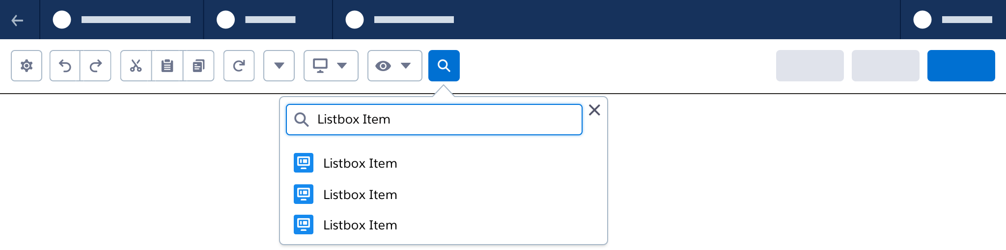
When a search list item has focus, the canvas should move to show and highlight the corresponding element. When a search list item is selected, the canvas should remain in position to show and highlight the corresponding selected element.
Undo/Redo
Undo/Redo actions affect all areas below the header, including the canvas and panels. If the builder can access multiple pages, maintain an undo/redo queue for each page.
Accessibility Note: Undo/Redo should provide screen readers with highly specific, visually hidden updates—for example, changes to component x undone instead of changes undone.
Actions for Undo/Redo
The queue for undo/redo includes all creation and configuration actions. Undo/redo will not affect primary actions such as save or activate.
Left Panel
- Drag to add component to canvas
- A resource edit or definition (Flow Builder)
Canvas
- Click to create a component to canvas
- Move element
- Delete element
- Copy and paste element
- Connector change
- Canvas scaling or zooming
Property Panel
- Changes to any input
- Layout property change
- Rich text editor changes
- Text entry (based on delimiting and debouncing)
Previewing
If needed, use a preview mode to verify content or flows before publication or activation.
Transition to Preview
Transition to Preview
Make the transition from editing to preview as clear as possible.
- In the header, hide any actions not needed in preview.
- On the canvas, hide any guides, indicators, or elements not included in the final rendered or activated state.
- Close any open panels.
- Provide a clear button action to return to editing mode.
Panel Toggling
In builders with a left-hand components/tool panel, use a stateful button in the toolbar to open and close the panel. Users can also close the panel by clicking the “X” button in the panel header.
When this panel is opened and closed, the canvas should resize using drawer behavior. The panel should not overlay the canvas.
Next: Layout