Prompts
Guidelines

Prompts alert users to system-related issues and updates.
Note: If you’re a partner building an app that appears within Salesforce, don’t use this component.
Usage

- Visual: Pronounced
- Voice & Tone: (Varies per circumstance)
- Motion: Dramatic
- Duration: Permanent
- Audio: Loud
Prompts appear when the system needs to communicate a message to the user; it doesn’t show up as a result of user action. Prompts should appear rarely and generally should not be a part of a typical user flow.
Prompts do not have a close (×) button. To dismiss a prompt, the user needs to hit the action button inside of the prompt.
A prompt can show one of the following states:
- Error: when the system is running into a system issue that may prevent the user from moving forward properly.
- Informational: when the system needs to relay system-related information that isn’t necessarily work-stopping.
Prompt in Context


Dos and Don’ts
Do
- Do use prompts sparingly. They should not be your first choice to display system messaging because they interrupt the user and block everything else on the page.
- Do solicit user feedback in prompts when it makes sense. When an unexpected system error happens, for example, user feedback may be a good way to identify the issue.
Do Not
- Do not use prompts as a confirmation for user action, e.g. warning before user deletes an item. Use a standard modal instead for this.
- Do not stack multiple prompts.
Variants - Component
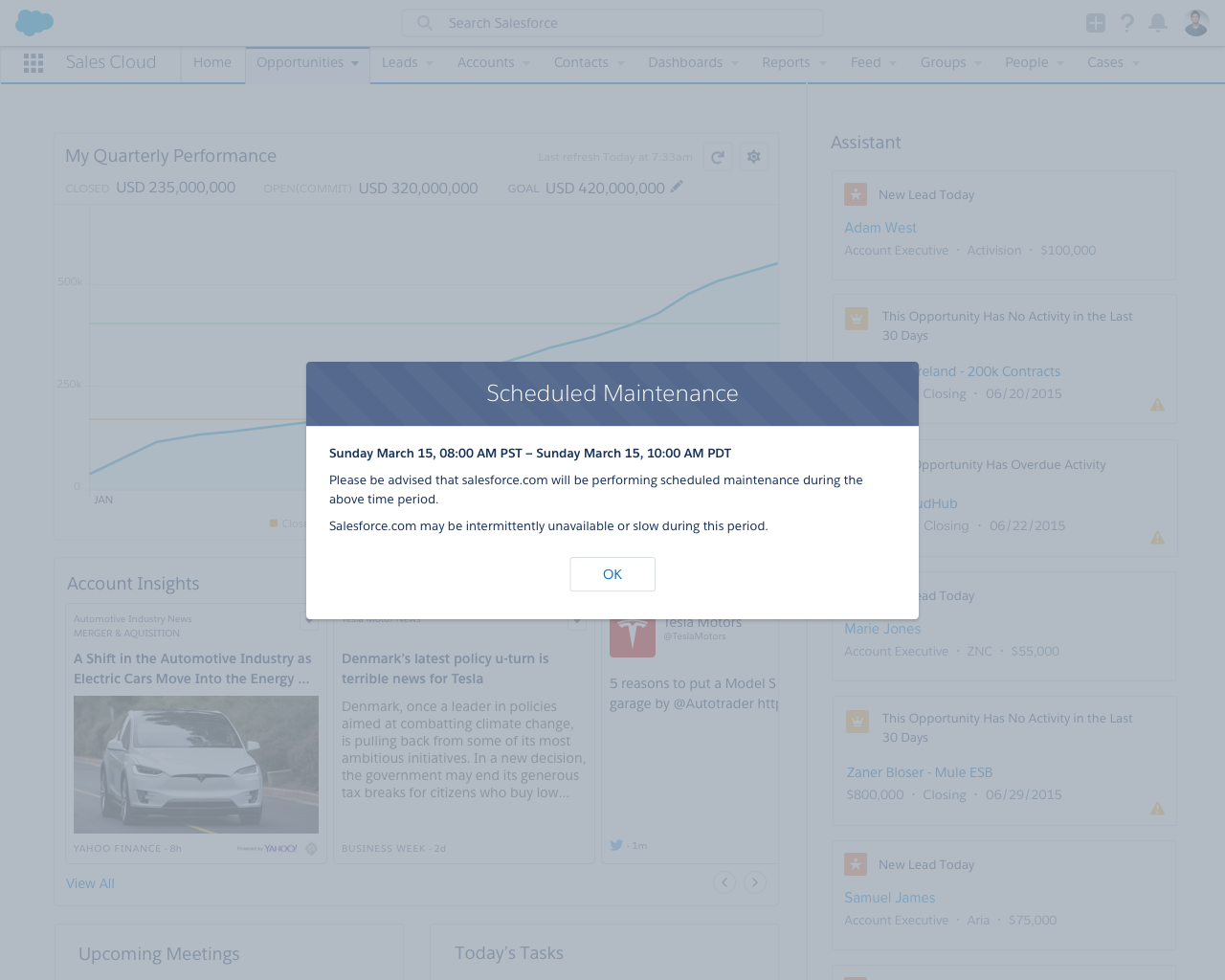
Scheduled Maintenance
Sunday March 15, 08:00 AM PST – 10:00 AM PDT
Please be advised that salesforce.com will be performing scheduled maintenance during the above time period.
Salesforce.com may be intermittently unavailable or slow during this period.
Still There?
For security, we log you out if you’re inactive for too long.
Sorry to Interrupt
This page has an error. You might just need to refresh it. First, would you give us some details?
(We’re reporting this as error ID: 7491d3-88xd-5obnp034271twp).
Variants - State
Something Has Gone Wrong
Unfortunately, there was a problem. Please try again. If the problem continues, get in touch with your adminstrator.
Scheduled Maintenance
Sunday March 15, 08:00 AM PST – 10:00 AM PDT
Please be advised that salesforce.com will be performing scheduled maintenance during the above time period.
Salesforce.com may be intermittently unavailable or slow during this period.
Variants - Screen Size
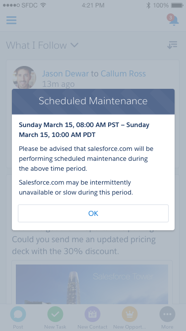
Scheduled Maintenance
Sunday March 15, 08:00 AM PST – 10:00 AM PDT
Please be advised that salesforce.com will be performing scheduled maintenance during the above time period.
Salesforce.com may be intermittently unavailable or slow during this period.
- Smaller title
- Full-width button
UI Text
UI text can vary greatly case to case, depending on the context. The guidelines below serve as examples, but you are not limited to them.
| State | Intent | Example Title | Example Body |
|---|---|---|---|
| Informational | Inform user of upcoming maintenance | Scheduled Maintenance | Sunday March 15, 08:00 AM PST – 10:00 AM PDT. Please be advised that salesforce.com will be performing scheduled maintenance during the above time period. Salesforce.com may be intermittently unavailable or slow during this period. |
| Informational | Asks user if they still want to be logged in | Still There? | |
| Error | Alerts user that an unspecified system error happened | Something Has Gone Wrong |
Recommended Specs
Refer to this code sample for the prompt markup.
Use the default prompt component specs plus the animation specs below.
| Description | Token | Value |
|---|---|---|
| Background fade in & fade out duration | $duration-quickly | 0.1 seconds |
| Prompt grow animation duration | $duration-quickly | 0.1 seconds |
| Prompt grow initial size | N/A | 0.9 |
| Prompt grow final size | N/A | 1.0 |