Modals
Modal can show an action in progress, confirm a user action, or communicate about an error.

Usage

- Visual: Pronounced
- Voice & Tone: Informational
- Motion: Dramatic
- Duration: Permanent
- Audio: Soft (or Vibrate)
In the context of messaging, a modal can show one of the following states:
- Transient: when a user is uploading files.
- Warning: when a user tries to commit a destructive action (e.g. deleting a record), complete an action that has major impacts (e.g. sending an email to all 100,000 subscribers), or abandon an incomplete action (e.g. leaving an unsaved form).
Modals behave the same whether they’re used as a create/edit container or as a messaging container. Use the default modal component specs plus the animation specs (see Recommended Specs).
Modal in Context
Dos and Don’ts
Do
- Do use modals only when needed to convey progress, confirmation, or an error. A user shouldn’t see multiple warning modals in one flow.
- Do place the action buttons on the bottom right, consistent with the overall modal pattern.
- Do match the title and action button label. For instance, if the modal title is “Delete contact?” the action button should say “Delete.”
Do Not
- Do not use a modal to notify the user of a successful action, such as “Contact was added to the opportunity.” Use a toast for that instead.
- Do not focus the cursor on the action button. A user that relies on keyboard a lot may accidentally confirms the action.
Variants - Components
N/A (There is only one UI version of the modal, but the UI text will change depending on the context)
Variants - State
Uploading…
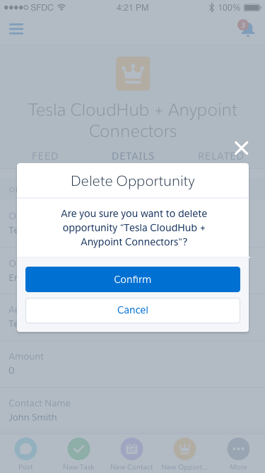
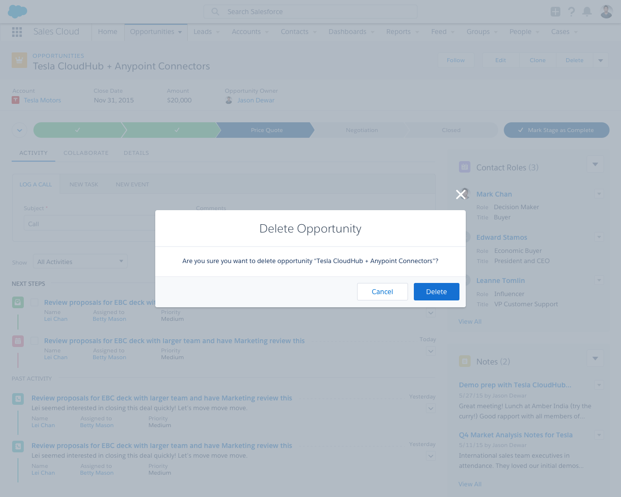
Delete opportunity?
Are you sure you want to delete opportunity “Tesla CloudHub + Anypoint Connectors”?
Variants - Screen Size
Delete Opportunity
- Smaller title
- Full-width buttons
- Don’t include body text unless it adds crucial information about the result of the action
Recommended Specs
Refer to this code sample for the modal markup.
Modals behave the same whether they’re used as a create/edit container or as a messaging container. Use the default modal component specs plus the animation specs below.
| Description | Token | Value |
|---|---|---|
| Background fade in & fade out duration | $duration-quickly | 0.1 seconds |
| Modal grow animation duration | $duration-quickly | 0.1 seconds |
| Modal grow initial size | N/A | 0.9 |
| Modal grow final size | N/A | 1.0 |