Drag and Drop
Drag and drop lets users select and move items on the screen.

Introduction
Users can move elements on the screen by dragging and dropping them, using a mouse, keyboard, or other input device.
Start using our Design Kits
Open in FigmaUsage
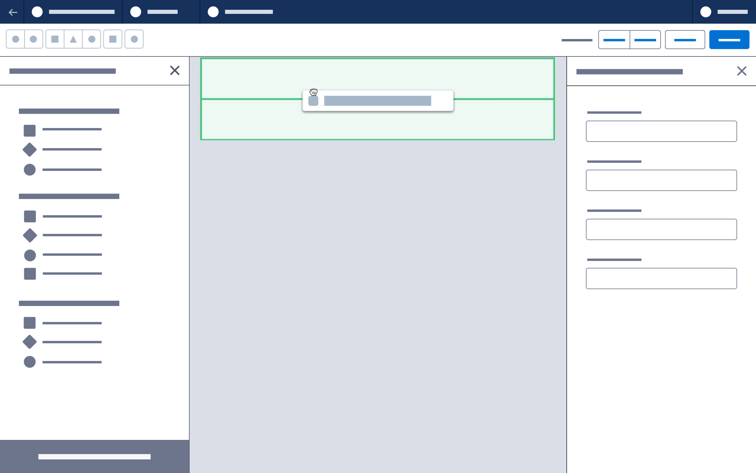
When a component is dragged over an eligible area of the canvas, the drop zone should be the height of the default empty row component minus its default padding.
The drop zone should have a green background, and should push the content below it.
When the user drags over an area with no existing components, fill the entire width of the canvas and the full height of a default row.
Variations
Dragging into a multicolumn row:
- If a component is dragged into an eligible column in a multicolumn row, the drop zone should fill only the bordered region.
Dragging above existing content:
- If a component is dragged above the canvas, existing content should be pushed down to create a drop zone.
Dragging below existing content:
- Until the canvas extends beyond the bottom of the viewport, the entire area below the existing canvas should be an eligible drop zone. This appends the component to the bottom of the canvas.
- Once the canvas extends beyond the viewport (requiring scrolling), the user must drop precisely at the bottom of the last existing element.
Dragging to an ineligible area:
- For areas not eligible for a dropped component, set the cursor CSS value to no-drop.
Accessibility Note: When implementing drag and drop, include a drag handle button. Work with developers to specify and implement equivalent keyboard actions.
Next: Header