Keyboard Interaction Accessibility Guidelines
Guidelines
Prerequisites
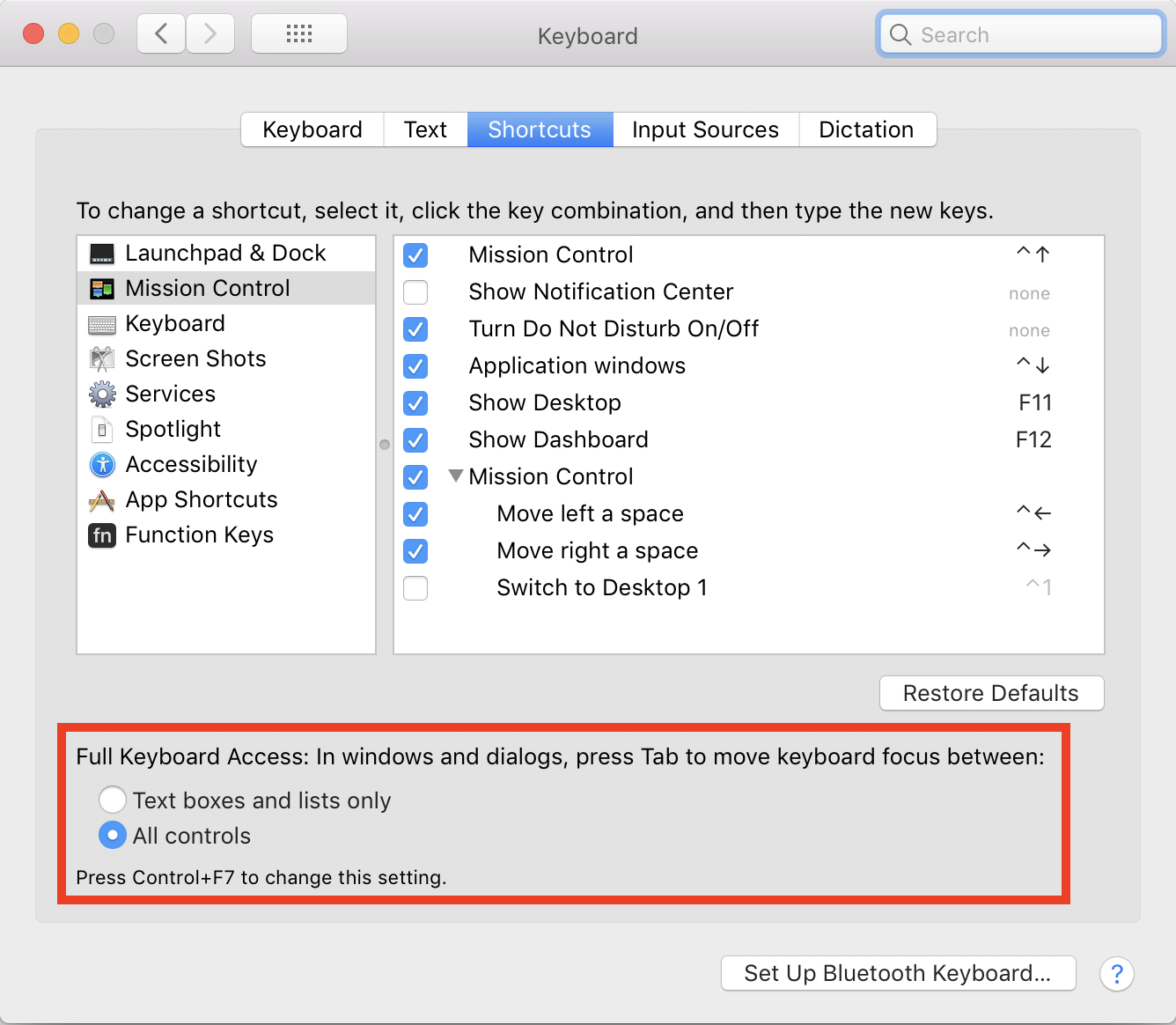
[OS X] Enable keyboard navigation on your computer.
OS X doesn’t have full keyboard access enabled by default, so you’ll need to do a one-time setup.
Enable Keyboard Access on OS X
- Open Keyboard settings in System Preferences.
- Select the Shortcuts tab.
- Under Full Keyboard Access, select All controls.
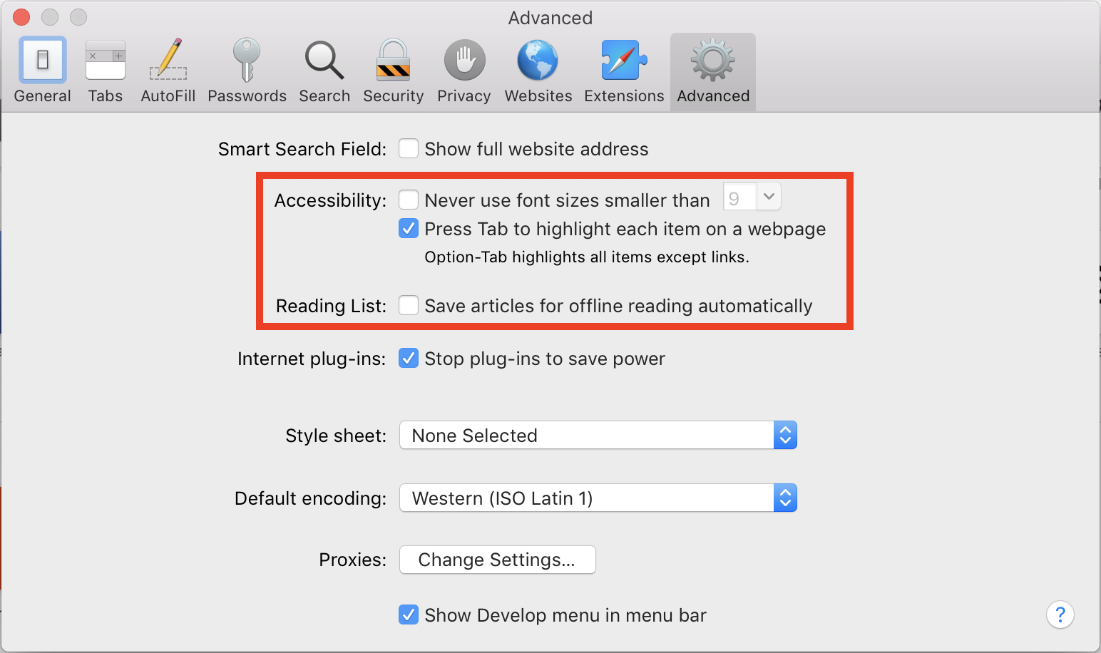
Enable Keyboard Access for Safari
- Open Safari Preferences.
- Select the Advanced tab.
- Under Accessibility, check Press Tab to highlight each item on a webpage.
Understand basic keyboard controls on the web.
- Tab navigates to next focusable element
- Shift+Tab navigates to previous focusable element
- Arrows navigate between related radio buttons, menu items, or widget items
- Enter activates a link or button, or submits a form
- Space activates a button or toggle
- Esc closes menus, modals, and other popover variations
Familiarize yourself with keyboard controls for common widgets:
Many complex UI components are covered by the ARIA specification, which describes a suggested (and often user-expected) like-for-like keyboard interaction model based on desktop software equivalents. The ARIA Authoring Practices is a great place to learn about these interactions. We've also included some common patterns below:
Testing Checklist
1. Can you reach every interactive element?
Interactive elements are those that perform actions. Examples include buttons, links, input fields, toggles, tooltip triggers, tree nodes, and menu options.
You should be able to focus on every interactive element, whether by Tabbing to it or by Tabbing to certain container widgets and using arrow keys to reach an option within the widget.
2. Can you activate every interactive element?
Once you get to an interactive element, can you trigger its primary action using your keyboard? Some interactive elements are activated as soon as you focus on them—for example, tabs and radio inputs. Others can be activated by pressing Enter or Space. Make sure that every click event has a corresponding keyboard event.
3. Can you focus on elements that aren’t interactive?
If you can focus on a noninteractive element, that’s almost always a bug. Images, text elements, disabled buttons, and other static elements should not be focusable.
You might be wondering how screen reader users can read information on a page if they can’t Tab to it. Don’t worry: screen readers have their own special set of keyboard shortcuts for navigating through all elements in the DOM, not just the interactive ones—so you don’t need to make noninteractive elements focusable for screen readers to read them.
4. Can you always visually tell where you are on the page?
The currently focused element should always have a visual focus state that is distinctive from its unfocused state. In Salesforce UIs, focus is commonly represented with a fuzzy blue border and/or an underline.
When navigating the UI with just your keyboard, you should never end up focused on an offscreen element. Always keep the currently focused element in view.
5. Does your focus move appropriately when you take action? Does your focus ever move when you don't take action?
A user's focus should never move without a user's action triggering a change. Interacting with an element often results in a UI change; make sure that your focus moves appropriately when it does. Some examples:
- If pressing an X button on a card removes that card, your focus should move to the next logical place in the DOM, usually the card after it.
- If pressing a button opens a modal, your focus should move into that modal.
See the Global Focus Patterns documentation for expected behavior.
6. Do hover tooltips also appear on focus?
If hovering over an element shows a custom tooltip for that element, focusing should do the same.
7. Do any drag-and-drop features have keyboard support?
Making drag-and-drop keyboard accessible isn't as hard as you think. Check out 4 Major Patterns for Accessible Drag and Drop on the Salesforce UX blog for guidelines on keyboard-accessible drag-and-drop patterns. Find live examples and code in the blog post's corresponding GitHub repo.
Component Interactions
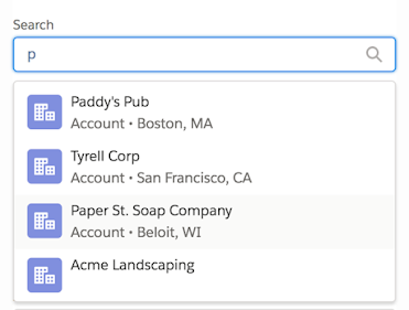
Combobox
- Character keys filter options
- Up and Down arrows select option and keep focus in input
- Left and Right arrows move cursor in the input field
- Enter activates the selected option
- Esc collapses the options list
Additional References:
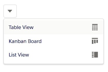
Menu
- Enter/Space opens the menu and focuses first option
- Arrow keys cycle selection among menu items
- Enter activates a menu item
- Esc closes the menu
- Character key typeahead
Additional References
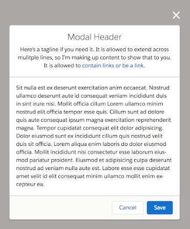
Modal Dialog
- Focus moves to the dialog’s first focusable element when opened, returns to trigger when closed
- Esc closes the dialog
- Enter submits the modal’s form data, if applicable
Modals always trap focus. Pressing Tab while focused in the modal keeps focus in the modal rather than moving it to the underlying page.
Additional References:
- Component Blueprint: Modal
- ARIA Authoring Practices: Modal Dialog
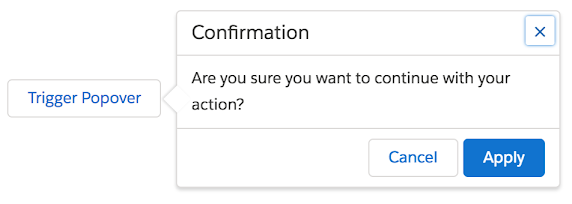
Non-Modal Dialog (Popover)
- Focus moves to dialog’s first focusable element when opened, returns to trigger when closed
- Esc closes the dialog
Non-modal dialogs always trap focus. Pressing Tab while focused in the dialog keeps focus in the dialog rather than moving it to the underlying page.
Additional References:
- Component Blueprint: Popover
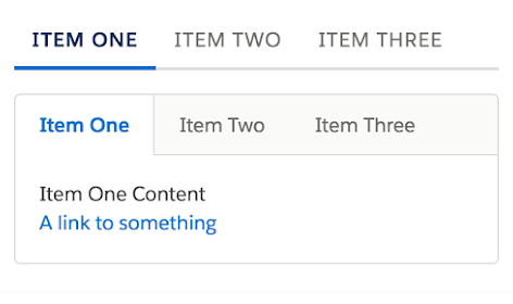
Tabs
- Arrow keys cycle selection among tabs
- Tab/Shift+Tab moves focus between the focusable element before the tabset, the selected tab, and the focusable elements in the visible tab panel
Additional References:
Tables and Data Grids
Just a simple table? Use basic keyboard navigation.
Highly interactive? Infinite scrolling? Use a grid keyboard pattern:
- Arrow keys move among cells
- Enter switches from Nav Mode to Action Mode
- Tab moves between focusable elements in Action Mode
- Esc returns to Nav Mode
Additional References:
- Component Blueprint: Data Tables
- ARIA Authoring Practices: Grid
