Panels
Panels present contextual tasks and information.
Introduction
Panels present momentary tasks, properties, and supplemental information associated with the current builder, or a selection made within the canvas.
Start using our Design Kits
Open in FigmaUsage
Panel hierarchy moves from left to right. The left panel hosts primary functions and tasks used in the builder. The right panel (or a floating variant) hosts secondary functions, plus supplemental information related to active canvas items.
Panel Behavior
By default, panels are non-modal dialogs that float above the canvas on a raised z-index. Use panel overlay behavior if a panel’s content takes temporary focus.
Panels may also open as drawers, reflowing canvas content. Use this option if panel content shares focus with the canvas—for example, where both panel and canvas must be referenced at the same time.
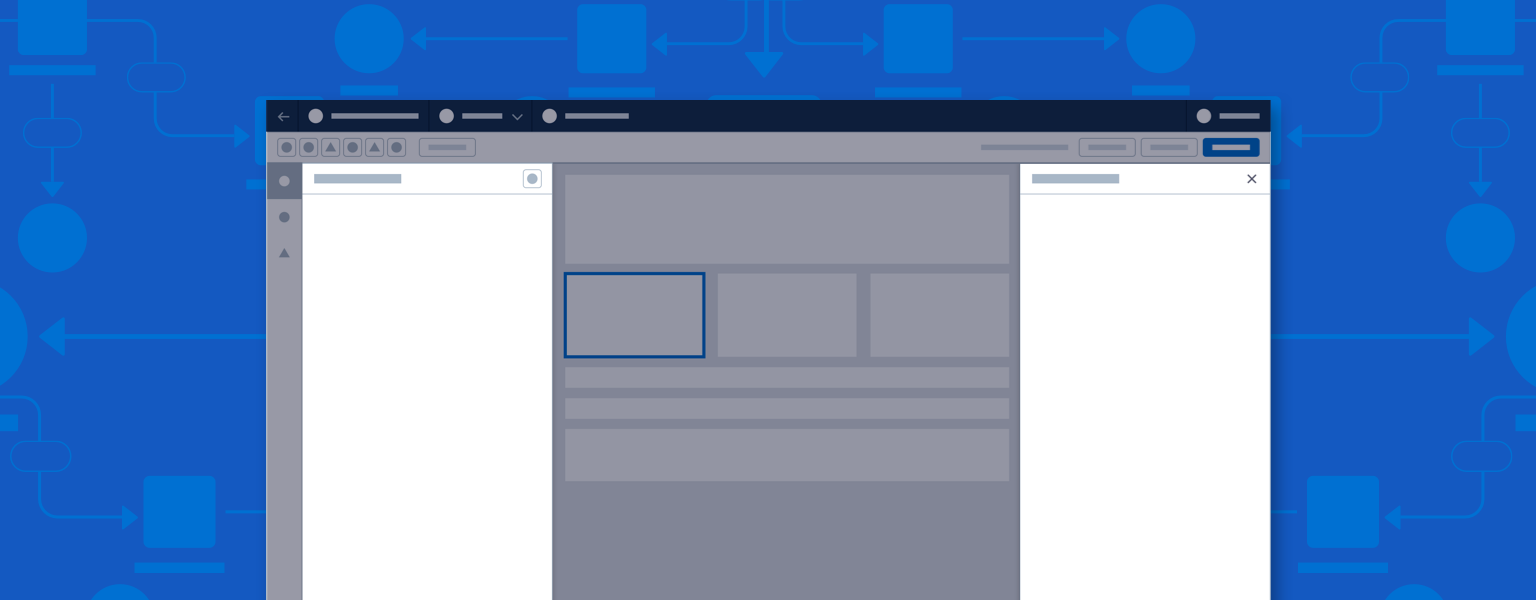
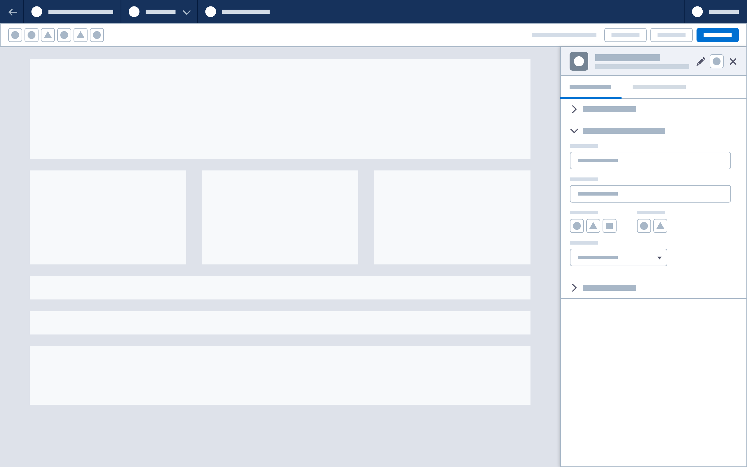
Parts
A panel consists of the following parts:
Header
- Title: Identifies the panel; usually a title or the name of a selected element.
- Close button (as needed): Icon located at the top right of the panel header.
- Dock/undock button (as needed): Icon located at the top right of the panel header. Commonly used with the floating panel variant.
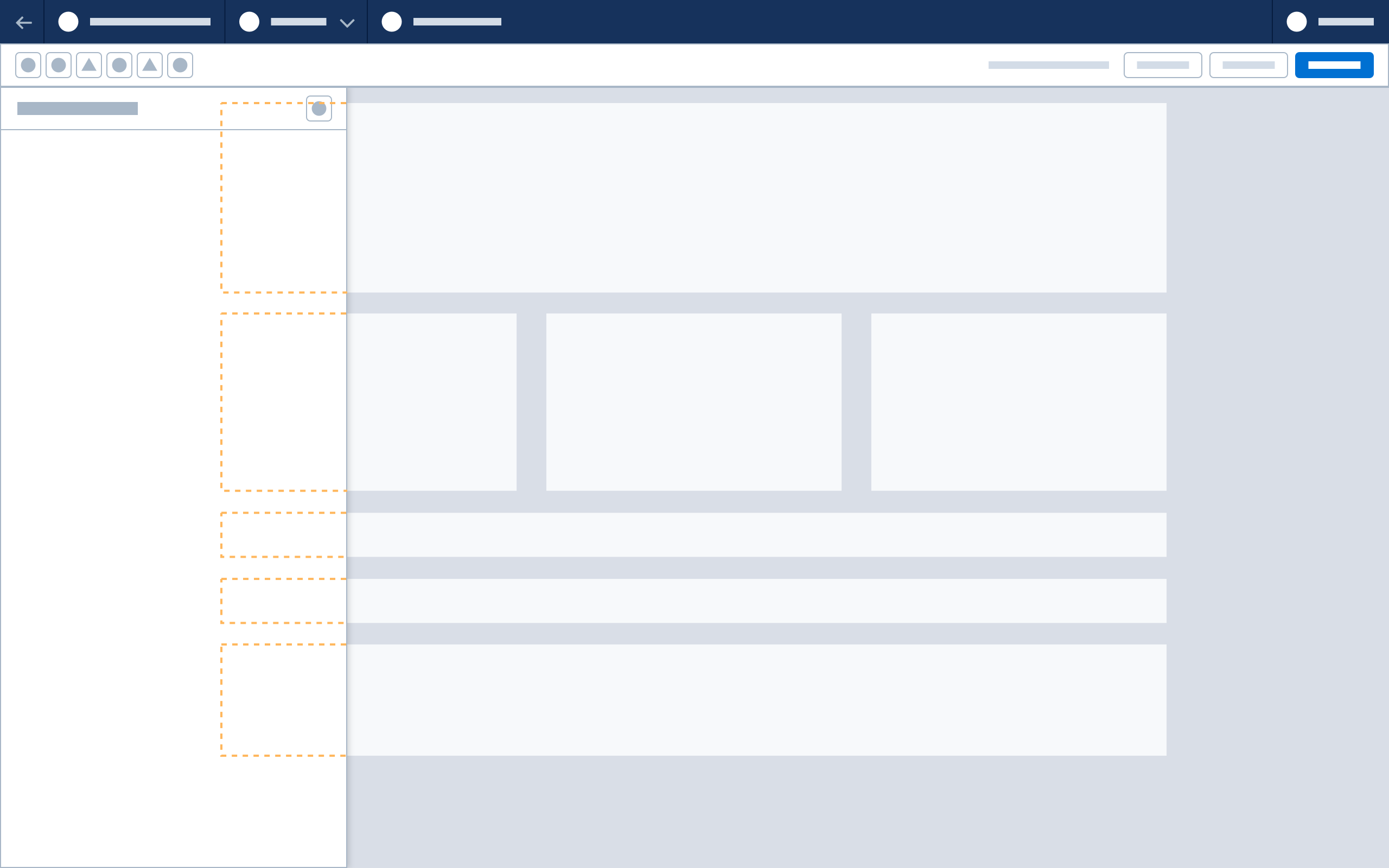
Body
- Display of information, properties, and forms can be customized.
- Group inputs, content, and configuration requirements in sections.
- Tabs may use either accordions or static section headers. Do not use both in one tab.
Horizontal tabs
- Tabs can be implemented between the header and body. Use the SLDS overflow pattern when necessary.
Accordions
- Use accordions to group sections of information, streamline workflow, and minimize scrolling. Do not use accordions with only one section.
- The first accordion should be open by default. Expand only one accordion at a time. Clicking a collapsed accordion expands it and collapses any open accordions.
Static sections
- Panels can be organized with static section titles and subtitles. The panel title may serve as a section title if only one static section is needed.
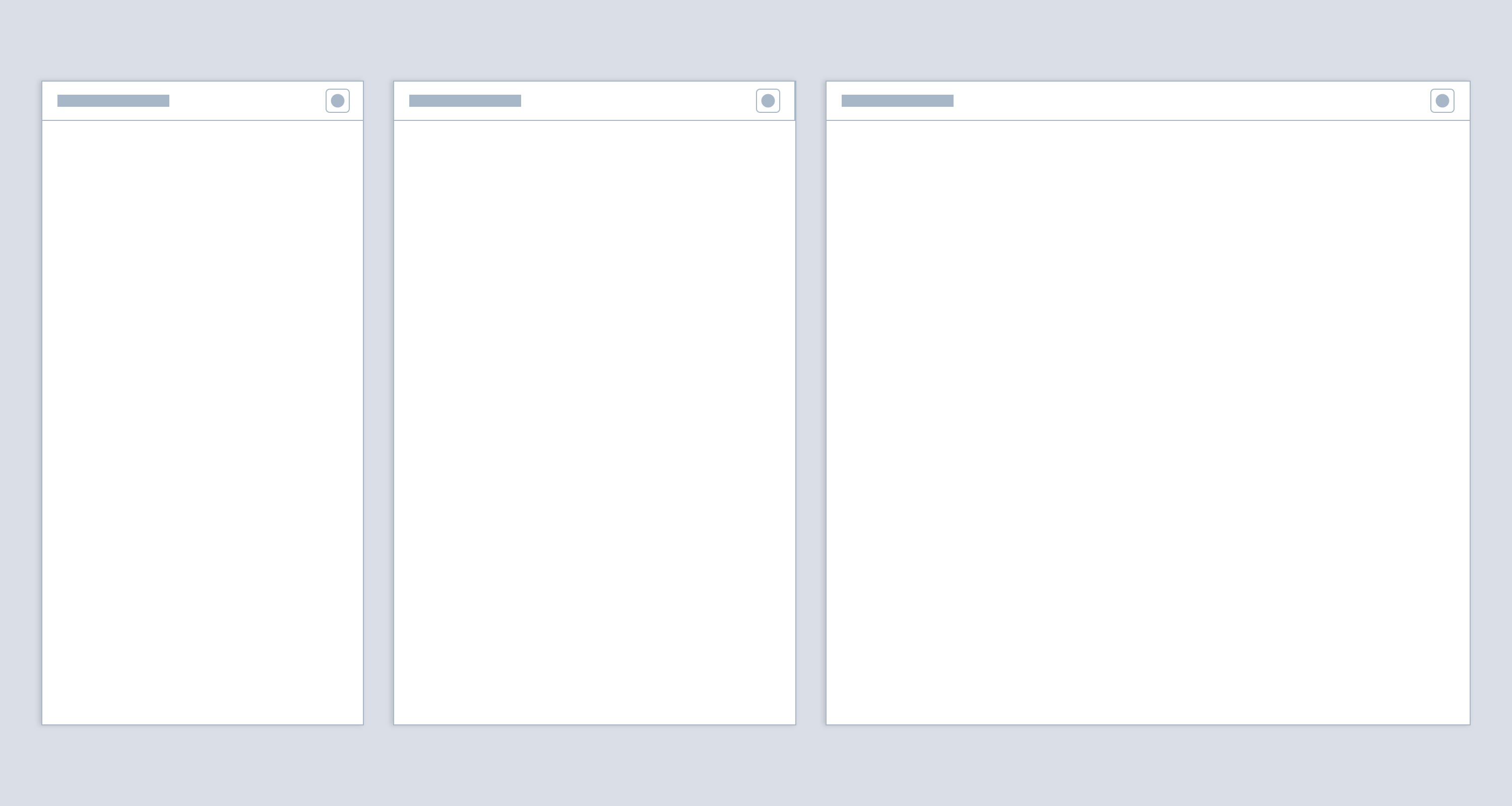
Panel Sizing
Default Builder panel width is 320px. Panel width should be fixed, but may be adjusted to suit content. Fixed panel height should extend from the header to the base of the window.
Default height for floating panels is 400px. Floating panels may be vertically resized.
Panel Navigation
Toggle Panel Visibility
Use a button icon in the builder header toolbar to toggle panel visibility.
Dock Panel to Right Side
Use a button icon in the panel header to dock or undock a floating panel to the side of the window. The canvas will resize when a floating panel is docked and expand when it is undocked.
Note: floating panels are only supported for Experience Builder, Commerce Page Designer and other web content builders.
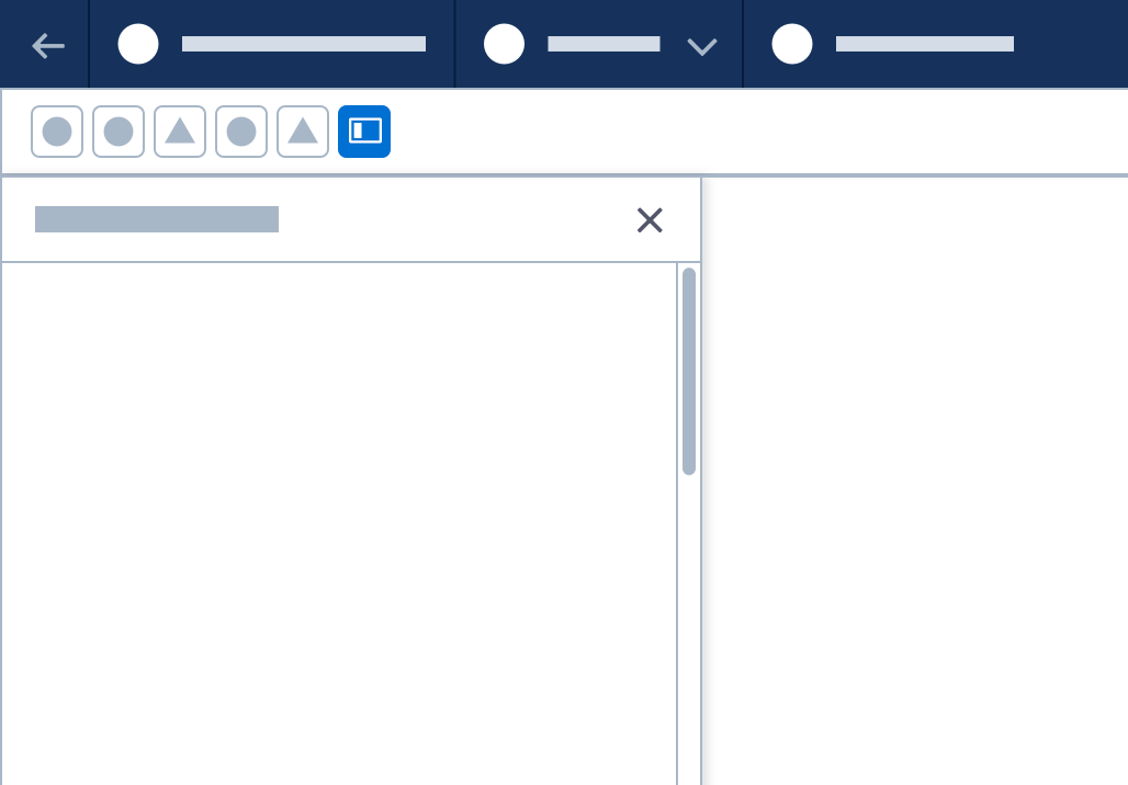
Component Panel Variants for Content Builders
Fixed Component Panel (Base)
The left-hand component panel lists items used on the canvas. It is open by default, and can be closed using a toolbar action button. It uses drawer behavior and does not overlay other elements.
The base version of this panel has a header and a body area. Body content may be organized with tabs, accordions, and static sections. Add a search bar to help users locate components by name.
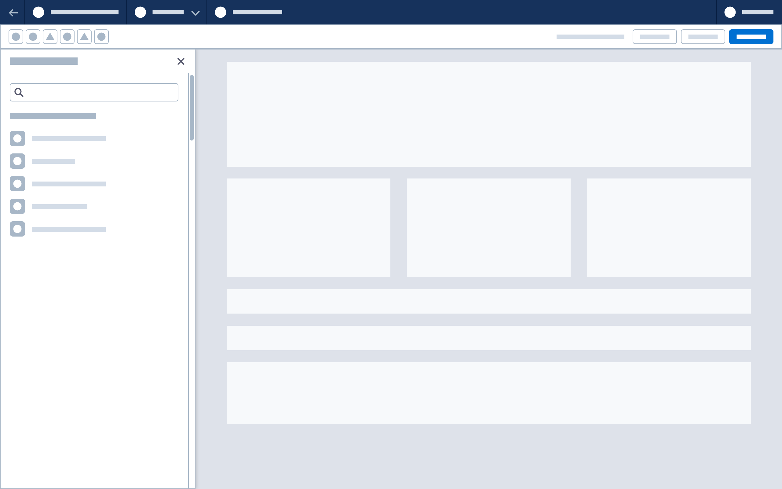
Accessibility Note: For the best keyboard experience, if the sections are a list of elements, build panel sections as HTML listboxes
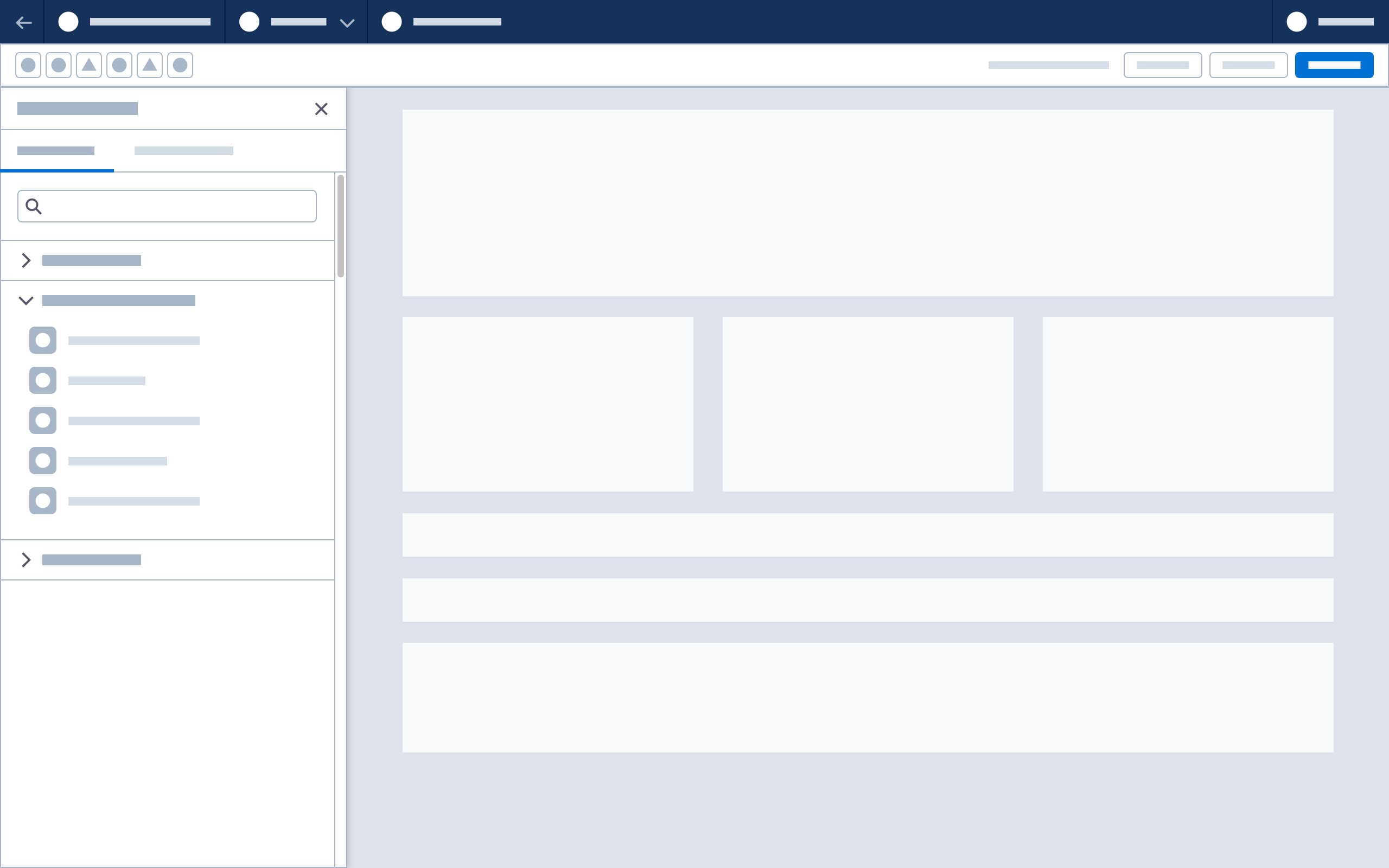
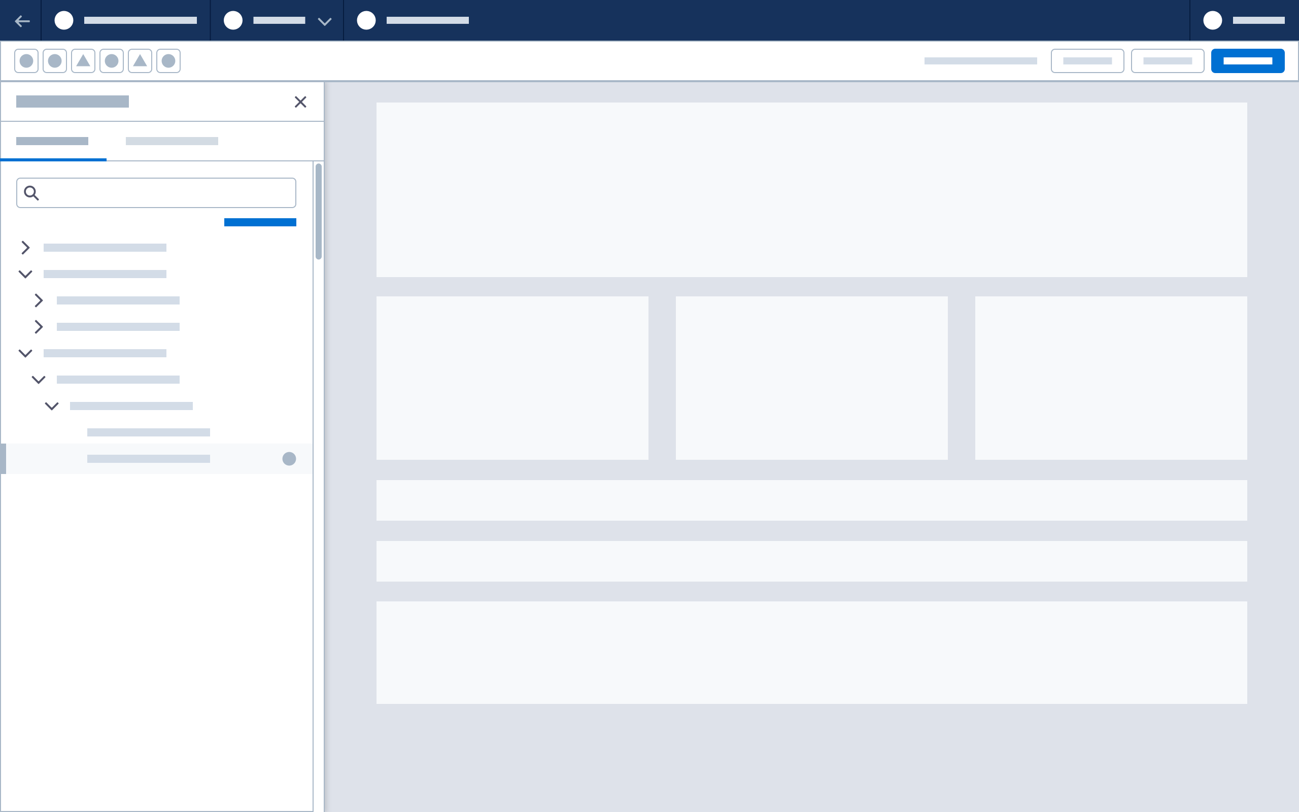
Fixed Component Panel (Page Tree)
Use a page tree to outline the structure and hierarchy of components on the canvas. Select an element in the page tree and the canvas will move and highlight the selection. The page tree supports other actions such as delete or drag and drop to move elements.
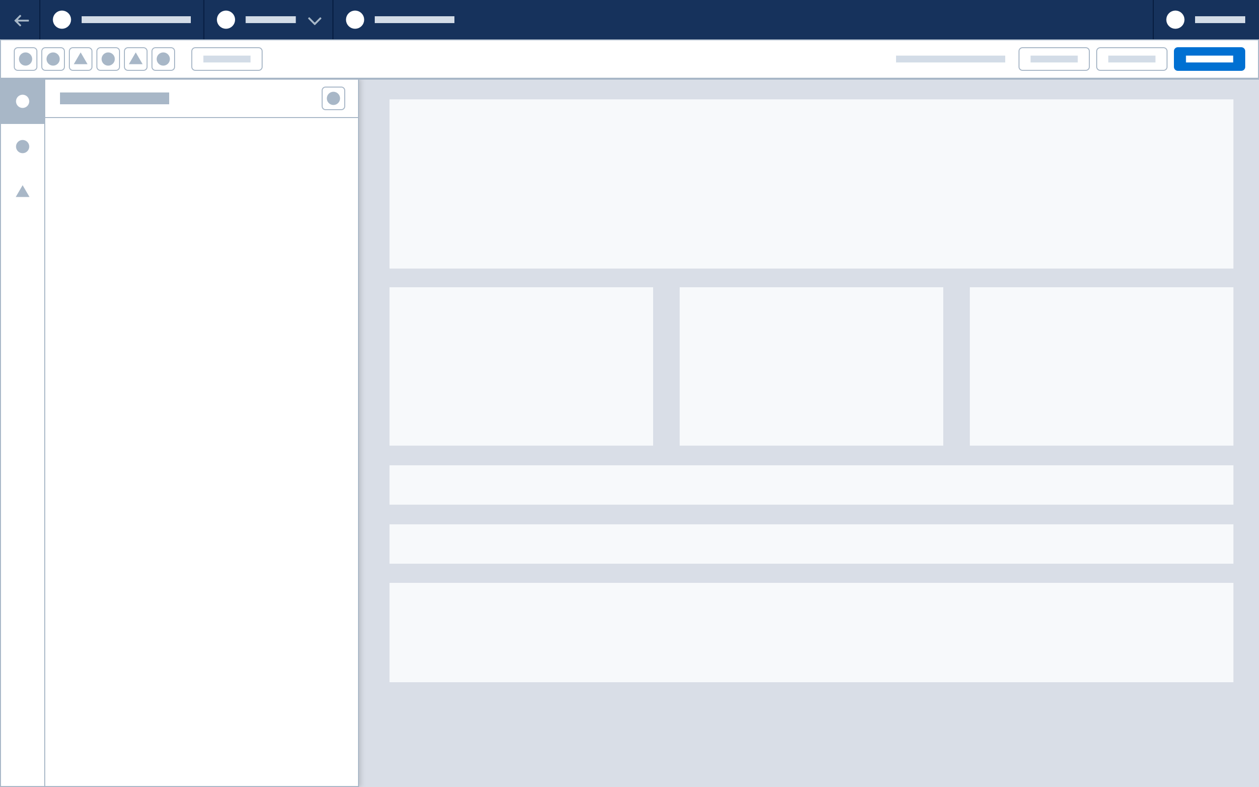
Flexible Component Panel
Add a vertical tab bar or rail to the base component panel to create this variant.
Note:The flexible component panel is only supported for Experience Builder, Commerce Page Designer and other web content builders.
The vertical tab bar sits beside the canvas and provides space for multiple component panel options. Selecting an icon on the bar opens a panel, causing the canvas to resize in the remaining available space. The tab bar and panel use drawer behavior and do not overlay other elements.

Property Panel Variants for Content Builders
Fixed Property Panel (Base)
Content builders use the property panel to configure and style selected content on the canvas. This panel is open by default, and persists unless it is closed; a close button is optional. It uses drawer behavior and does not overlay other elements.
Note: Because canvas updates happen continuously as changes are made, the base panel does not use a footer action bar. See Canvas update recommendations.
The base version of this panel has a header and a body area. Body content may be organized with tabs, accordions, and static sections.
Fixed Property Panel (Content-specific Header)
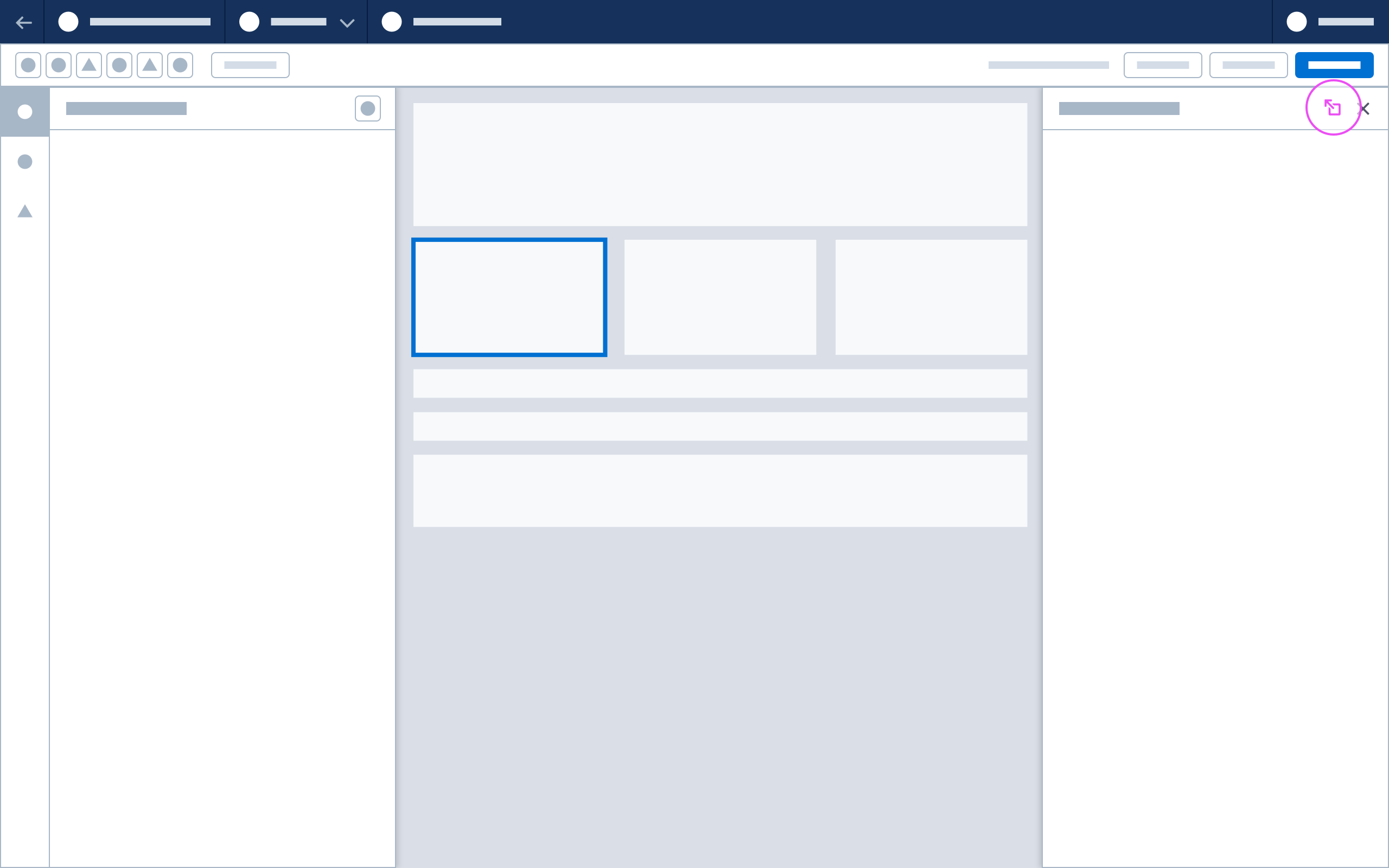
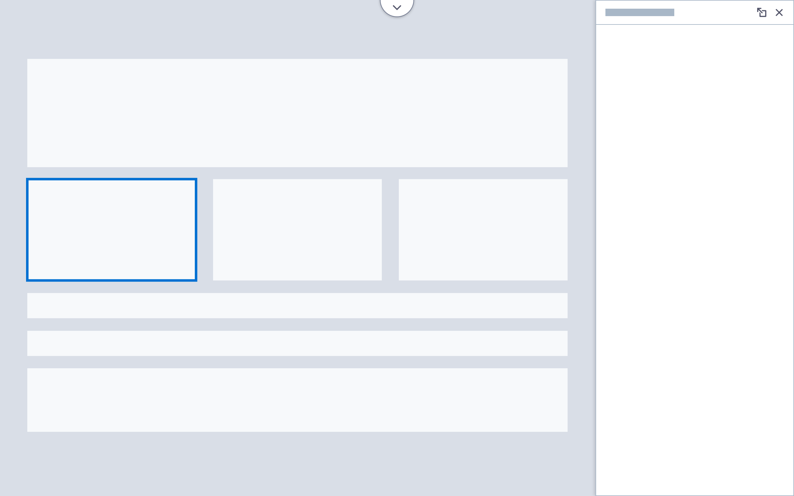
This panel variation is positioned over the base panel. When a component is selected, its header background color and icon change to reflect the chosen component type. The panel may also contain a short component description and action menu.
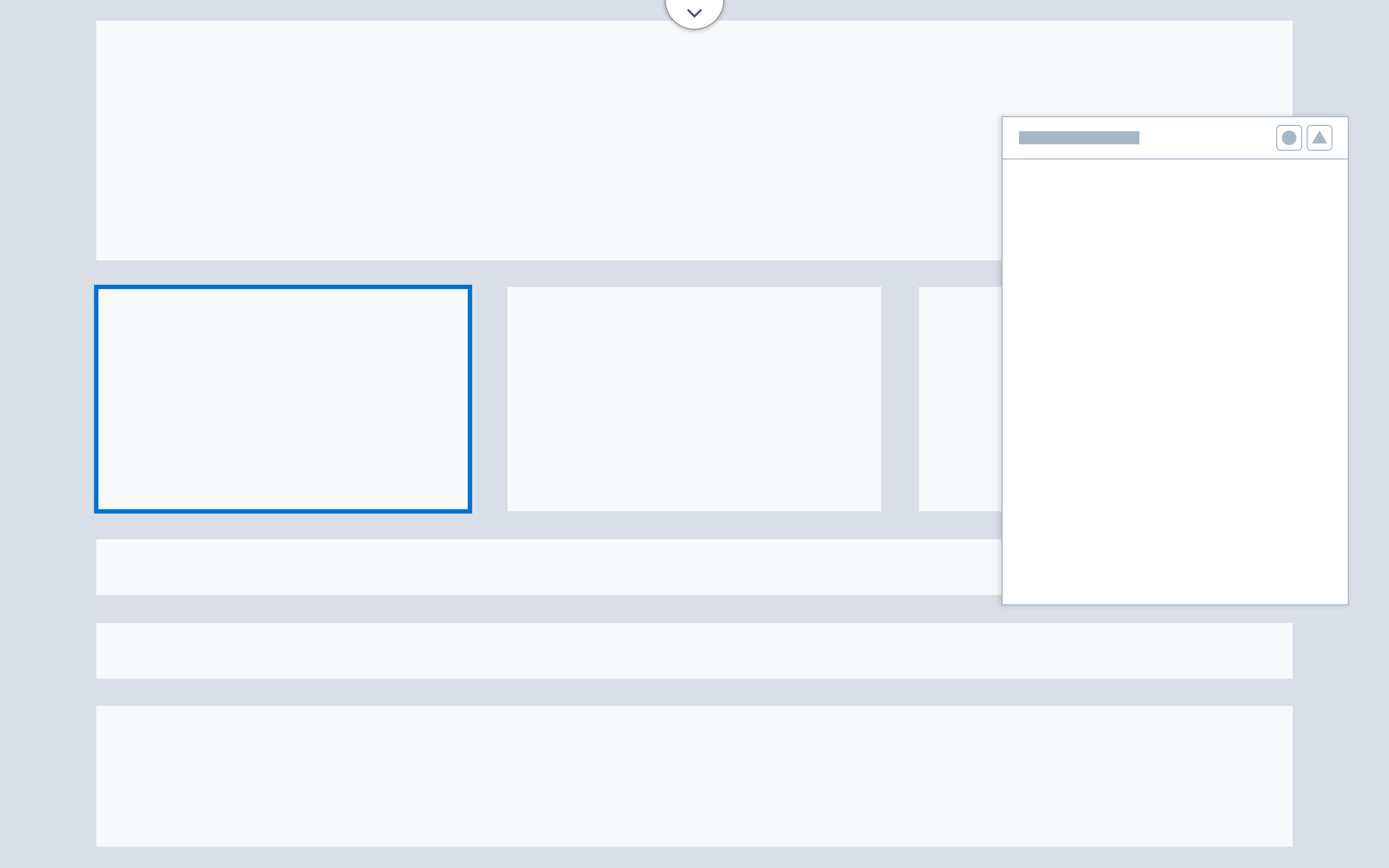
Floating Panel
Floating property panels appear over the canvas to provide context for selected items. This panel variation supports the flexible panel configuration.
Note:The floating panel and flexible panel configuration are only supported for Experience Builder, Commerce Page Designer and other web content builders.
Each floating panel has a header and a body area. The header contains a Dock to Side icon. Body content may be organized with tabs, accordions, and static sections. The body has a minimum height of 310 pixels; floating panels can be resized vertically.
Accessibility Note: If floating panels can be dragged and resized, include a keyboard equivalent for these actions.
| Floating Panel Guidelines | |
| Default Position | When launching a floating panel, initial open position should be in the canvas space to the right of the selected item (determined contextually by canvas scroll position and screen height). Use a consistent distance from the selected item's bounding box to the edge of the floating panel. |
| Size | The default width of a floating panel should remain consistent with base panel size guidelines. Default height varies based on content. Use scrolling for panels containing a large amount of content. Floating panels should not extend beyond the viewable screen area. |
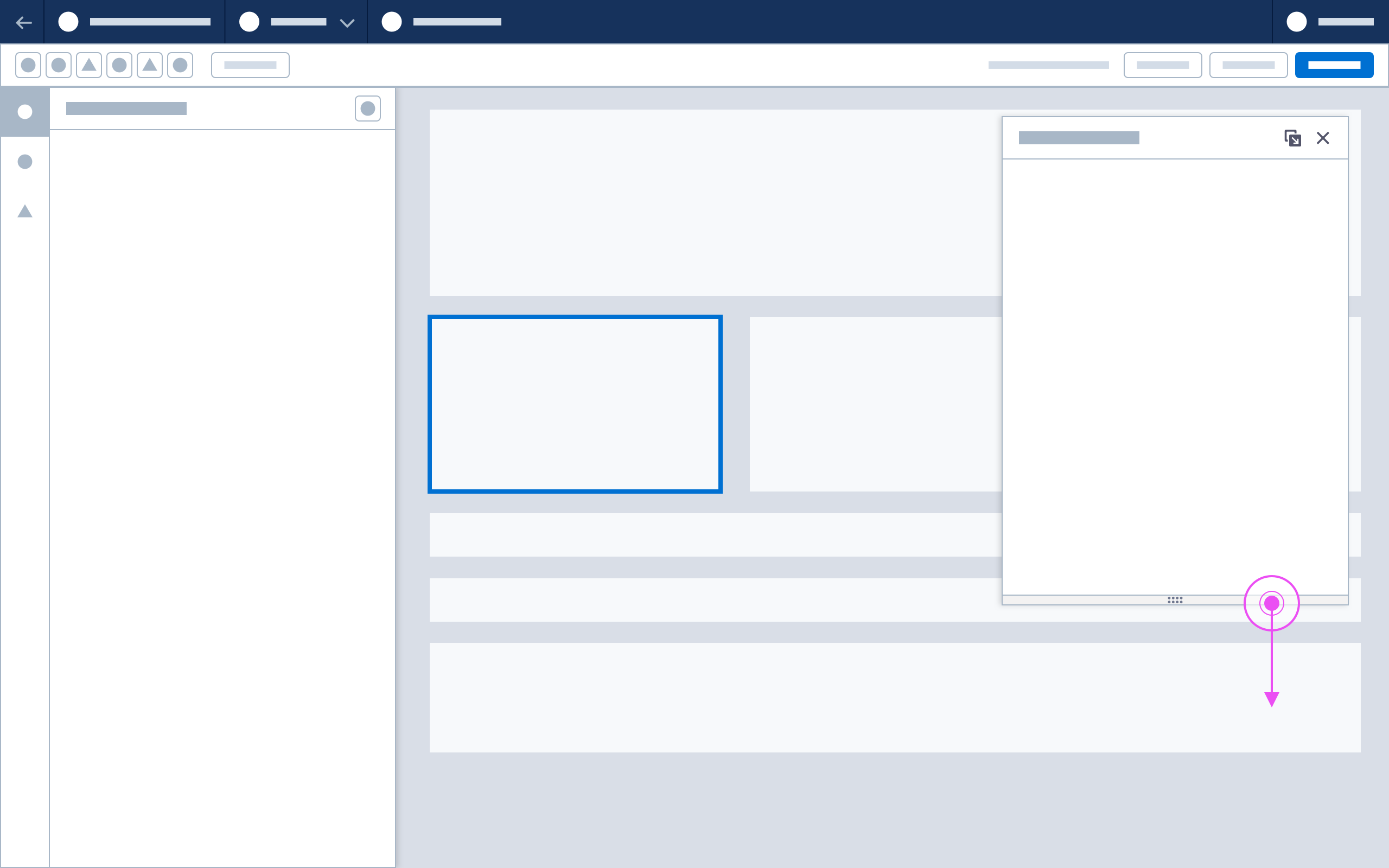
| Moving | Floating panels may be dragged to other points on the canvas. Include a drag icon in the panel header for use by voice command and keyboard users. Upon closing or reopening, the panel inherits all defaults. |
| Docking | Add a Dock icon to the panel header to allow users to dock floating panels. These panels dock at the right side of the builder, follow fixed panel guidelines, and cause the canvas to resize. Their docked state persists when the user navigates to other components or closes and reopens the builder. |
| Resizing | If resizing is implemented, include a resize bar at the bottom of the floating panel. The user can extend panel height by hovering over the resize bar located at the bottom of the floating panel. When hovering over the resize bar the mouse cursor reveals handles to indicate resize functionality. Upon closing or reopening, the panel inherits all defaults |
Property Panel Inputs
Content builders require specific inputs for common use cases such as adding images, HTML editing, and personalization. Each input should have a persistent, visible label associated with it.
HTML/Code Input
When editing a code property, such as the contents of a code block, use a textarea input with $font-family-monospace. Use a toolbar for actions such as Merge Fields.
Text Input with Actions
For basic text properties, include neutral action buttons below the text field or textarea, spaced at $spacing-xx-small.
For properties that require rich text formatting (e.g., font weight, bullets, and alignment), use the Rich Text Editor and include actions in the toolbar.
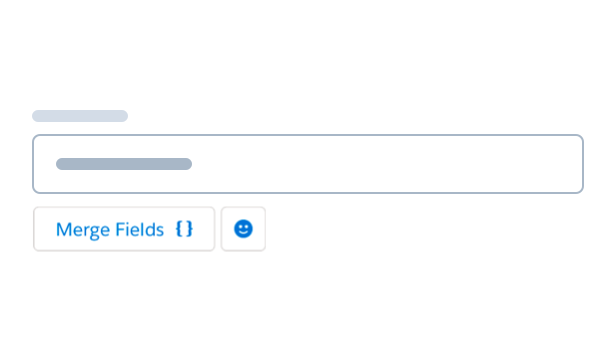
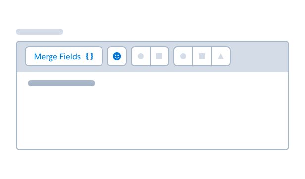
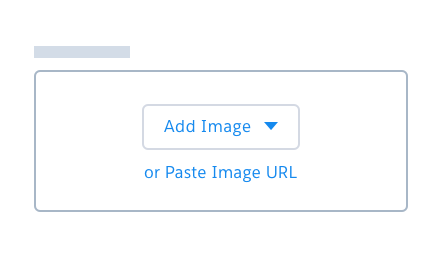
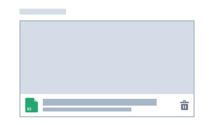
Image Selection
Use the image selection pattern when selecting an image, especially from a library.
In the default empty state, use the file selector - image component.
- The primary button opens a dropdown list of available sources.
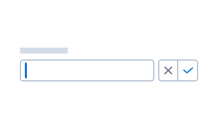
- The secondary button replaces the empty state with an input field, where the user can enter a prehosted URL.
- The cancel button returns to the empty state.
When the user selects an image, the files component generates a preview.
Deleting the image returns to the empty state.
Accessibility Note: There should be a way for users to add alt text to the images they upload.
Color Picker
See Color Picker Component Blueprint for more information
Use color picker component variants to control the color options available for the user.
- When the user can specify any color, use the custom-only version of the SLDS color picker.
- If user-defined colors are allowed and the user has defined swatches, use the base version of the color picker.
- Consider using the predefined-only version to show a limited set of brand colors.
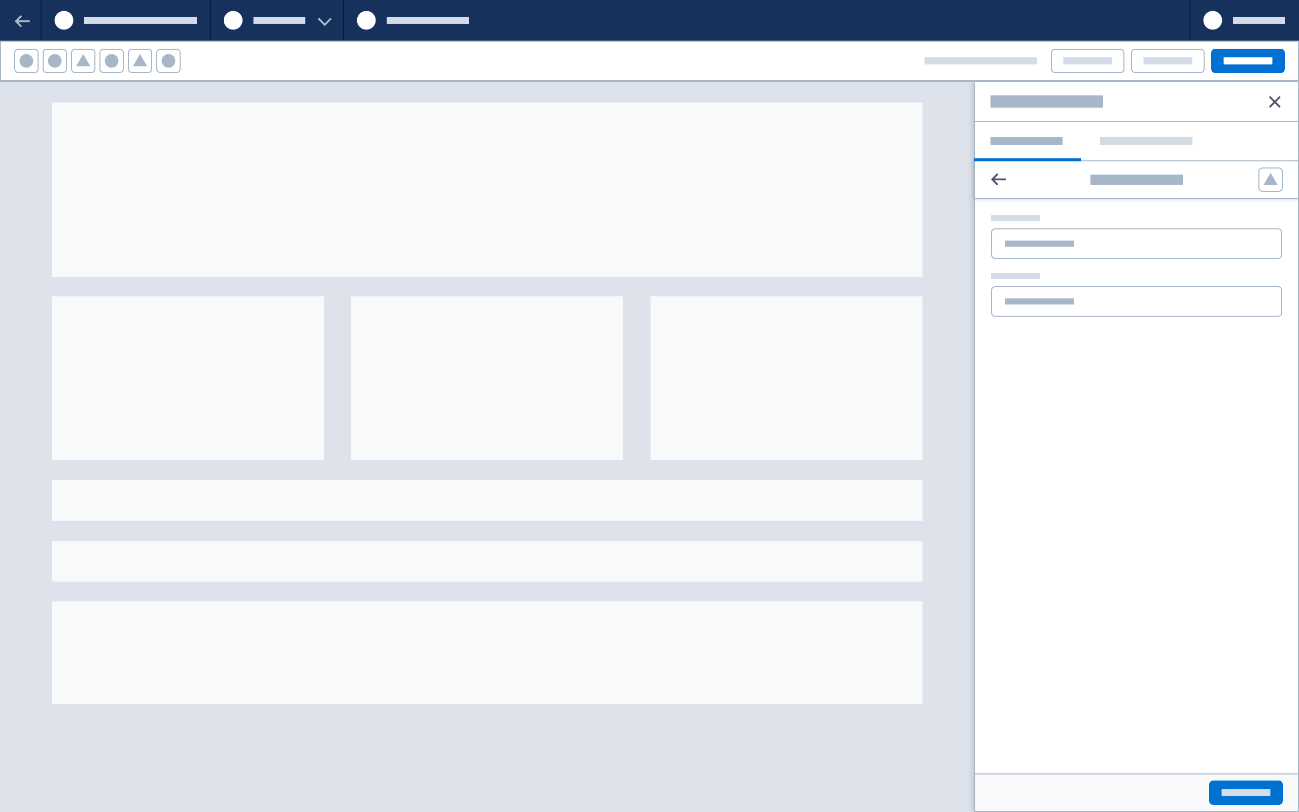
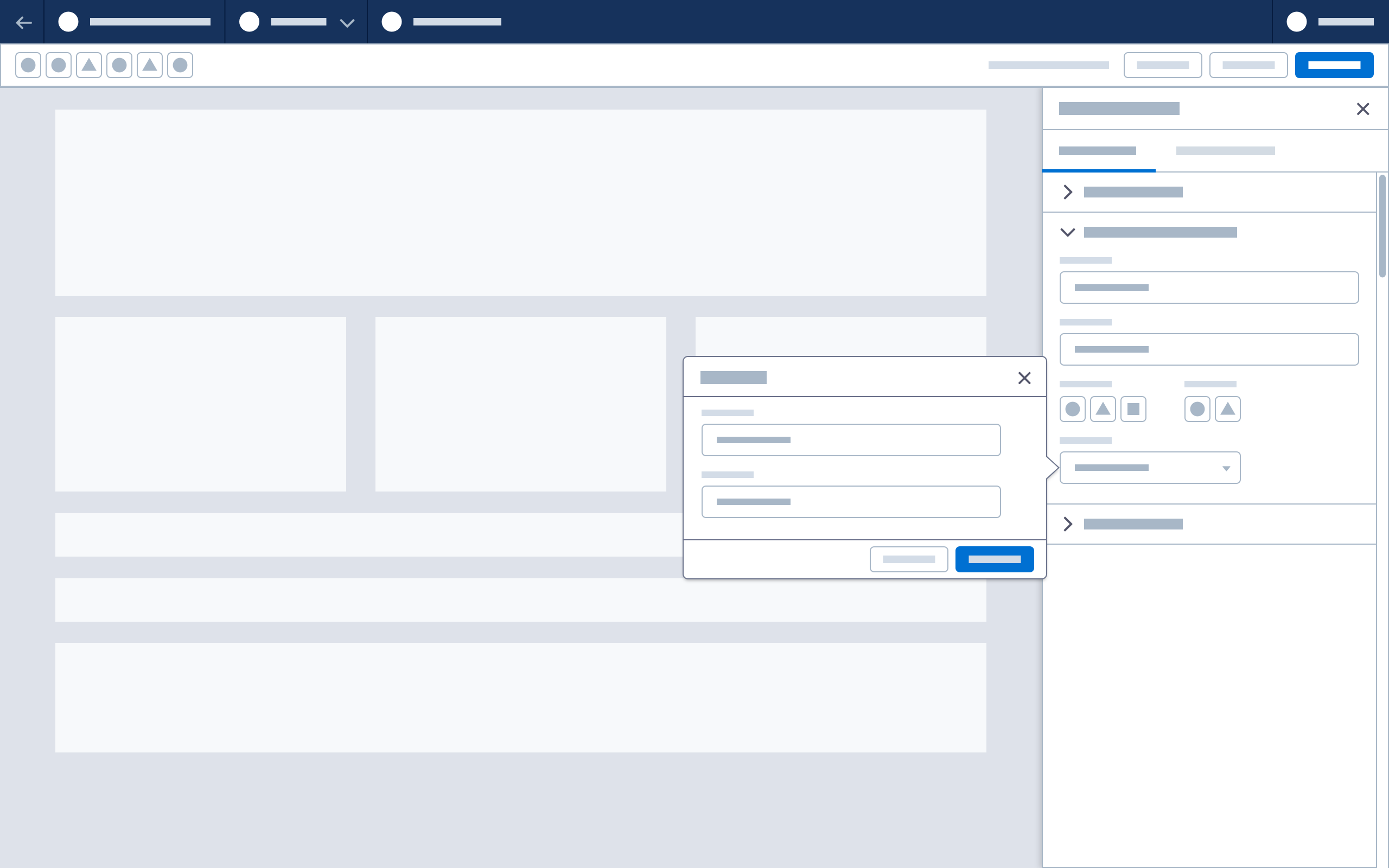
Panel Drill-in and Expansion
Panel Drill-in
A panel drill-in shows a second level of builder content in a panel. When a user selects its base-layer element, the drill-in layer slides over the existing panel body (below the panel header and any existing tabs).
The drill-in layer has a header with a back button and title, plus optional actions. It may include a confirmation footer if needed.
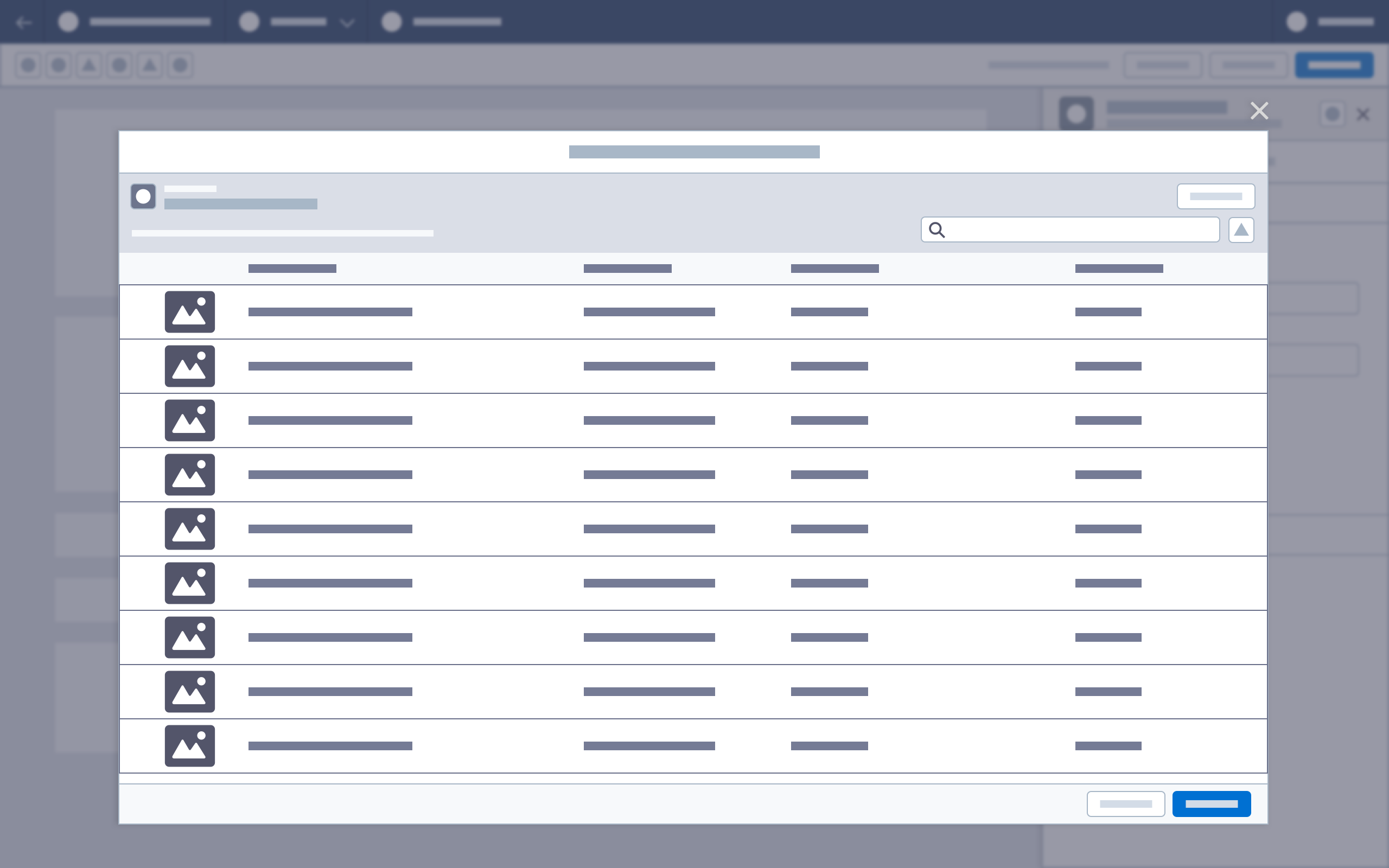
Modal
When more space is needed, a modal can be triggered from within a panel.
Modals are often used for content selection. When the user chooses content from a property panel, a modal launches the media browser. Once actions are performed in the modal, the user selects Done or Save to return focus to the panel, with the panel state and canvas updated.
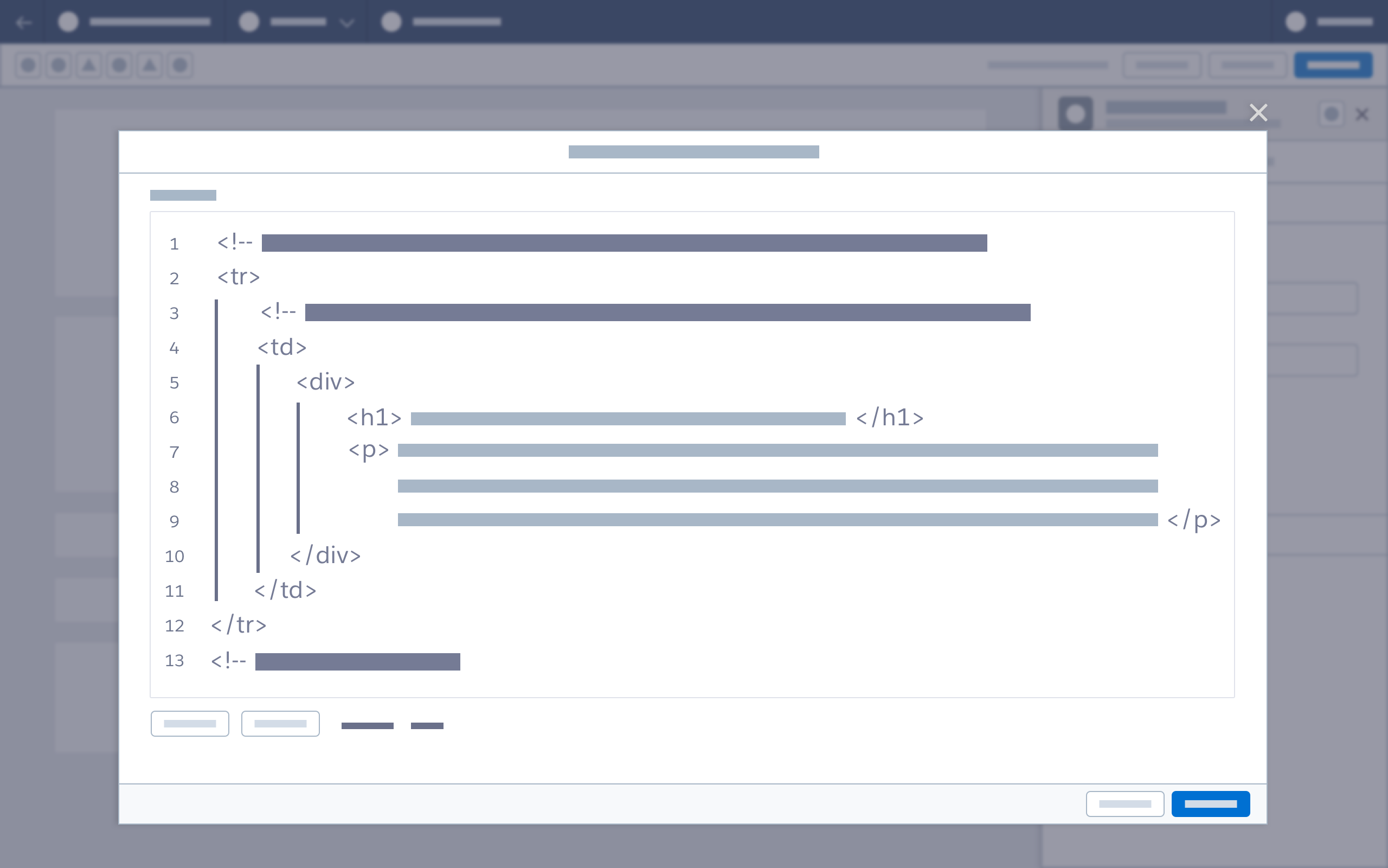
A modal can also offer an expanded view for HTML editing, formula editing, or expression building.
Popover
A popover is a nonmodal dialog used to display contextual information. Launched by a clickable trigger element in a panel, it contains at least one focusable element. Popovers can be used to edit a component title and description, update an image name, or set conditional visibility on a component.
Panel Validation
Panels may also display warnings and errors as part of a builder’s validation system.
Field validation should follow SLDS guidelines for required fields and incomplete or invalid input.
Tabs and accordions may contain warning or error icons. The associated alerts should also be surfaced to the header and canvas.
See Validation for more information
Canvas Update
The canvas should update whenever an action if performed.
| Action | Canvas Update | ||
| Base panel input change | Refresh canvas on field blur or property change | ||
| Drill-in panel input change (canvas-related) | Refresh canvas on field blur or property change | ||
| Drill-in panel input change (configuration-related) | Commit on confirmation action (Done) | ||
| Popover input change | Refresh canvas on confirmation action (Done) | ||
| Modal input change | Refresh canvas on confirmation action (Done) |
When a user enters text or code (for example, basic text, rich text, or HTML), the canvas should refresh continuously based on delimiting/debouncing settings. This update interval should also be tracked in the undo/redo action queue.
Properties such as as radio buttons, check boxes, and image selections should refresh the canvas on field blur or property change.
Undo/Redo
User actions (defined as updates to canvas components and changes to component content or properties) are recorded and linked to the toolbar’s undo/redo buttons.
Text/code property changes: each recorded action is based on a string delimiter
Examples:
- Delimit by space - typing “hello, friends” > hit undo > the value is now “hello,”
- By a command on the text - bold “hello” > hit undo > “hello” is now unbolded
Nontext property changes: the new property value is a recorded action
Example:
- Choose new option from picklist > hit undo > reverted to previous selection
Canvas component changes position or is deleted: each change represents a recorded action
Example:
- Move a component > hit undo > returns to previous position
Accessibility note: Undo/Redo should provide screen readers with highly specific, visually hidden updates—for example, changes to component x undone instead of changes undone.
Saving
Changes are saved locally each time the canvas is updated. If a panel is closed, any changes will have been saved locally at the time of the canvas update.
Server-side saves require a Save button. Warn users against using the Back button and closing tabs with unsaved changes.
Accessibility note: There should be a visually hidden screen reader announcement to let users know the builder saved.
Next: Popover