Accessible Web Design Guidelines
Starting Your Design Process
Use existing SLDS components when possible.
SLDS uses global web interaction patterns and visual accessibility affordances. Our goal is to provide a consistent user experience for all users, whether they’re navigating with a mouse/touchscreen, keyboard, or screen reader.
When designing new UIs, rely as much as possible on these existing, accessible patterns, and include links to relevant components in your engineering specs. If you're creating a new component or pattern (one that doesn't exist in SLDS), discuss it with an accessibility specialist to identify any requirements before implementation.
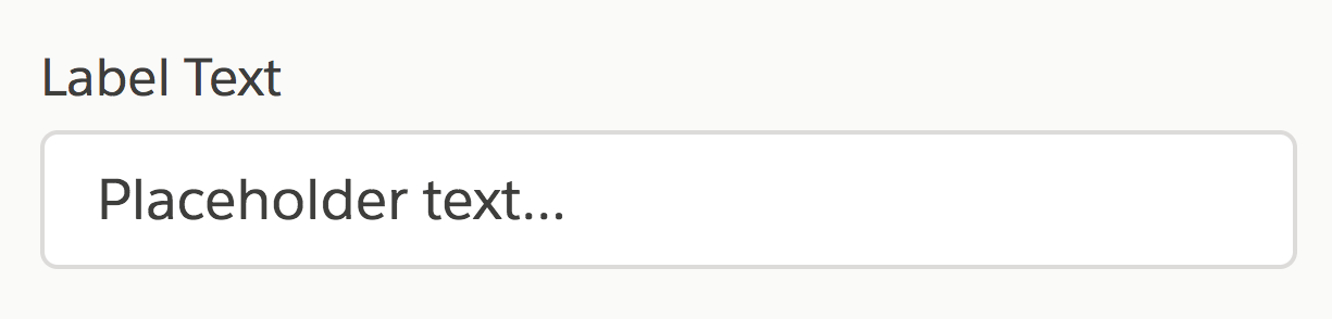
Give every form field a visible label.
Placeholder text isn’t enough—it can deeply confuse users when it disappears.
The only exceptions to this rule (which still require a visually hidden label for assistive technology users):
- Search fields, where the magnifying glass icon serves as a visible label
- Publishers’ rich text area, where surrounding elements provide context
Show a visible trigger for every action.
Make sure that users don’t have to hover over, or click in, arbitrary whitespace to make available actions appear, and that each action's tap target is large enough for users to select without error.
Keep in mind that many users navigate without a mouse. For instance, users of voice dictation require visible actions for all mouse actions, and touchscreen users have no equivalent hover function for progressive disclosure techniques.
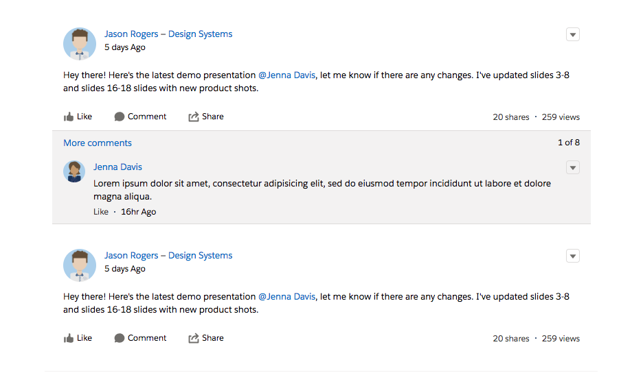
Do: Always show available actions for rows.
This helps users discover available actions and gives users a visible click, tap, or keypress target for performing them.
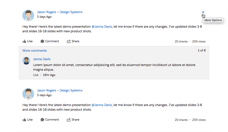
Don't: Show actions only on row hover.
Users navigating via keyboard, touchscreen, or voice dictation may not find these.
When a user action causes a UI element to appear or disappear, make it easy for the user to discover that change.
Keyboard and screen reader users often progress linearly through a page. For example, in English, a user would move top to bottom, left to right, using the tab or arrow keys. Avoid making changes above the user’s current place in the UI. Use screen reader announcements and focus management to guide the user. For best practices, see the Global Focus Patterns documentation.
For Example
Imagine that you’re designing a new Chatter publisher UI. When the user navigates into the publisher input, the publisher expands into a modal with additional editing functionality. Where do you put the theming options?
Do: Add new functionality after the user's current place.
If you add a list of theming options below the input field, keyboard and screen reader users will naturally navigate to it after filling in their status.
Don't: Add new functionality above the user's current place.
If you add a list of theming options above the input field, users navigating with a keyboard will have to go back to access it. Screenreader users might not even know that these options are available.
Always consider how users navigating with keyboard or assistive technology will interact with your product.
For desktop UIs, deliver a keyboard path with your design specs. During product development, test the most common workflows using only a keyboard. For every element a mouse user can click on and perform an action with, a keyboard-only user must be able to perform the same action with just key presses. Consult our Keyboard Guide for best practices.
Make custom gestures and keyboard shortcuts easily discoverable. Include accessible help text to describe their behavior for screen reader users. Every custom gesture should also have a one-finger equivalent, so users with limited motor capabilities can use it.
Refining Your Design
Don't use color as the only visual means of conveying information.
Differentiate elements with a second indicator, such as informational text, icons, textures, or thicker borders. For example, instead of using green text to indicate success and red to indicate failure, use a green checkmark and a red X.
Ensure that text and informational icons have enough color contrast.
Not everyone has 20/20 vision or $1,000 Retina monitors. Plug your colors into www.AreMyColorsAccessible.com to ensure that most users can see them, with a ratio of 4.5:1 or higher for regular-sized text, 3:1 for icons and large text (24px and above or 18px bolded text). Disabled elements, such as a gray noninteractive buttons, do not need to pass contrast requirements.
Use SLDS tokens semantically. For example, don’t use colorTextWarning to make an item red; use it only for warning-state text.
Don't let text get lost in busy backgrounds.
Avoid placing text on top of backgrounds that aren’t a solid color (such as clouds, images, and gradients). If you do, follow the Text on Background Guidelines to make sure the text is legible.
Preparing Specs for Developers
Define hover, focused, and active states for all interactive elements.
Always make it visually apparent to users which element they’re interacting with. Some interactive elements, such as tabs and vertical navigation, also require a distinction between selected+unfocused and selected+focused states.
For focused states, use SLDS patterns (blue box-shadow, text underline, etc.) whenever possible. When designing custom focus states, do more than change the font or outline color. If you’re unsure, use the default browser focus.
Define alternative text for icons and images in your design specs.
In your design specs, provide good descriptions for informational images, and indicate when images are purely decorative (if you need the image to understand the UI, it’s informational). Unsure? Consult your friendly neighborhood doc writer or accessibility specialist, or check out WebAIM: Alternative Text.