Design Guidelines
Help and Troubleshooting
Anticipate users' requests for assistance with contextual tools and mechanisms.
Help and troubleshooting content should be accessible, clear, and empathetic. A good help experience acknowledges that a user may feel lost or frustrated, but always offers options for solutions, maintaining a confident and optimistic tone. Provide enough friction to allow users to learn as they go, but not so much that they feel alienated and ignored.
Usage
User Is Off Course
If a user is off course but unaware of the problem, offer course correction with these components:
- Show a message—via inline text or a prompt — with guidance and next steps.
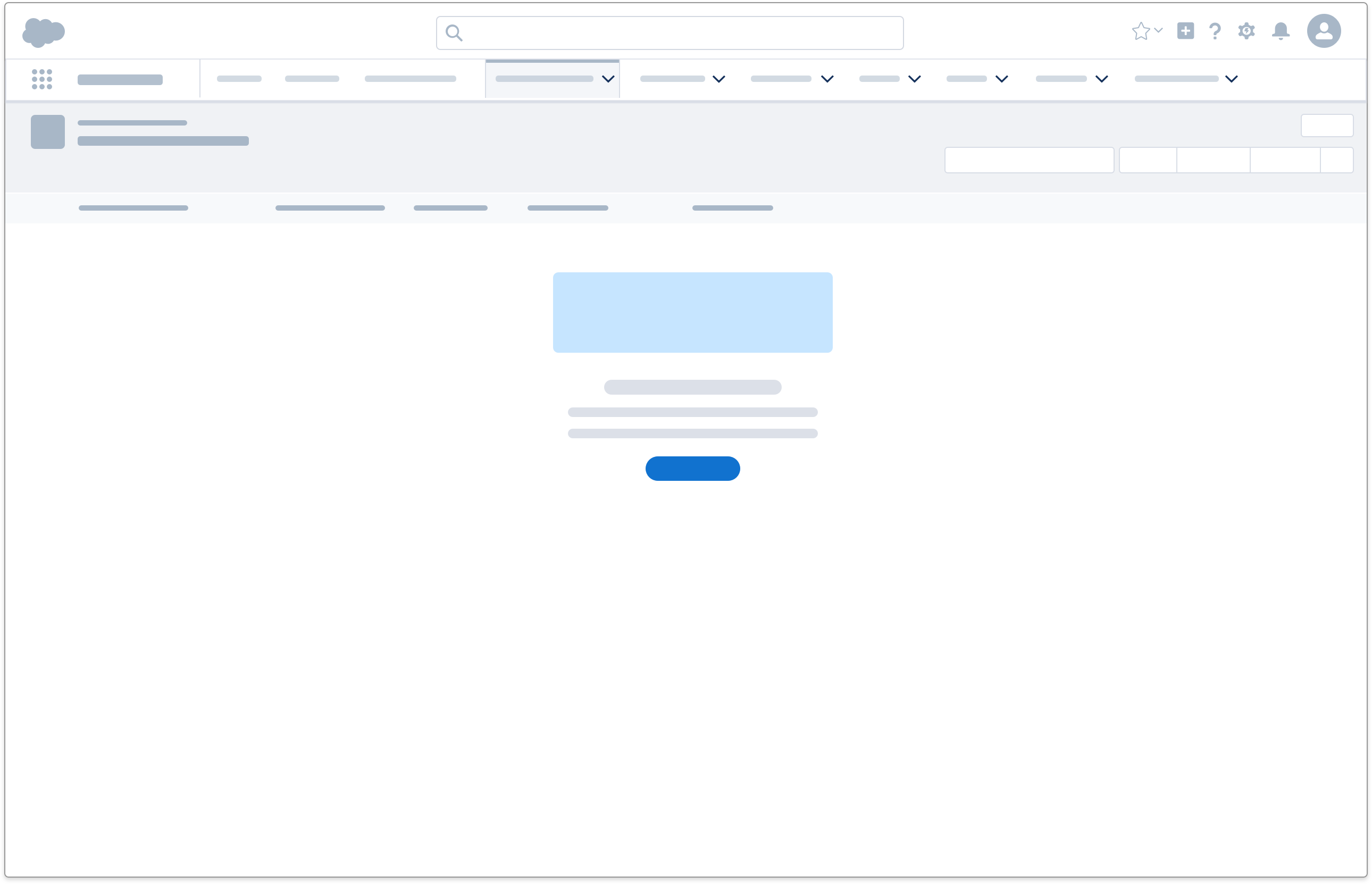
- Use an empty state to show users what they might be missing.
User Has a Question or Problem
Users with specific questions or issues are often motivated to seek out help, but reluctant to leave their workflows. Provide clear entry points to relevant content within the workflow with these components:
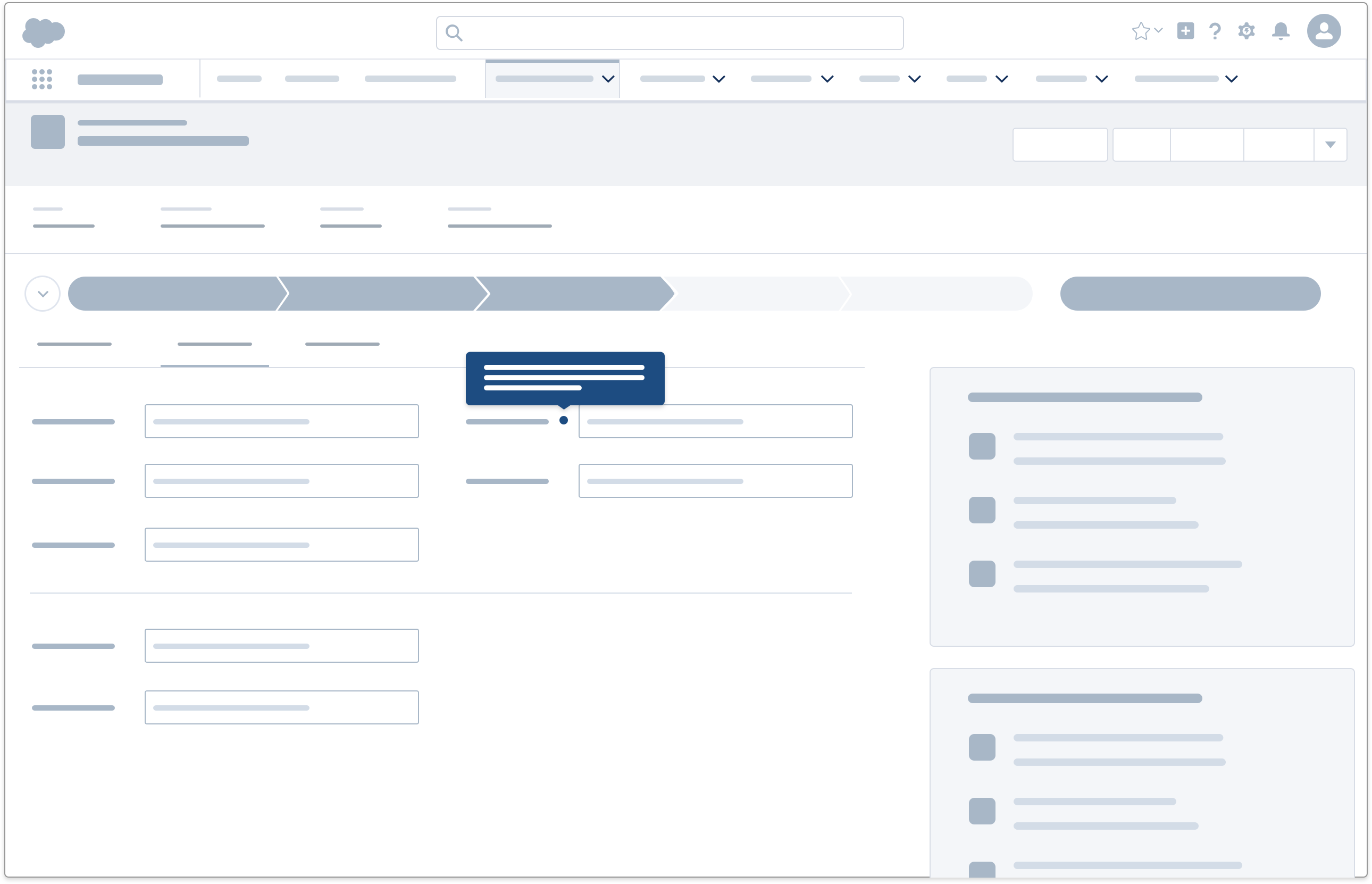
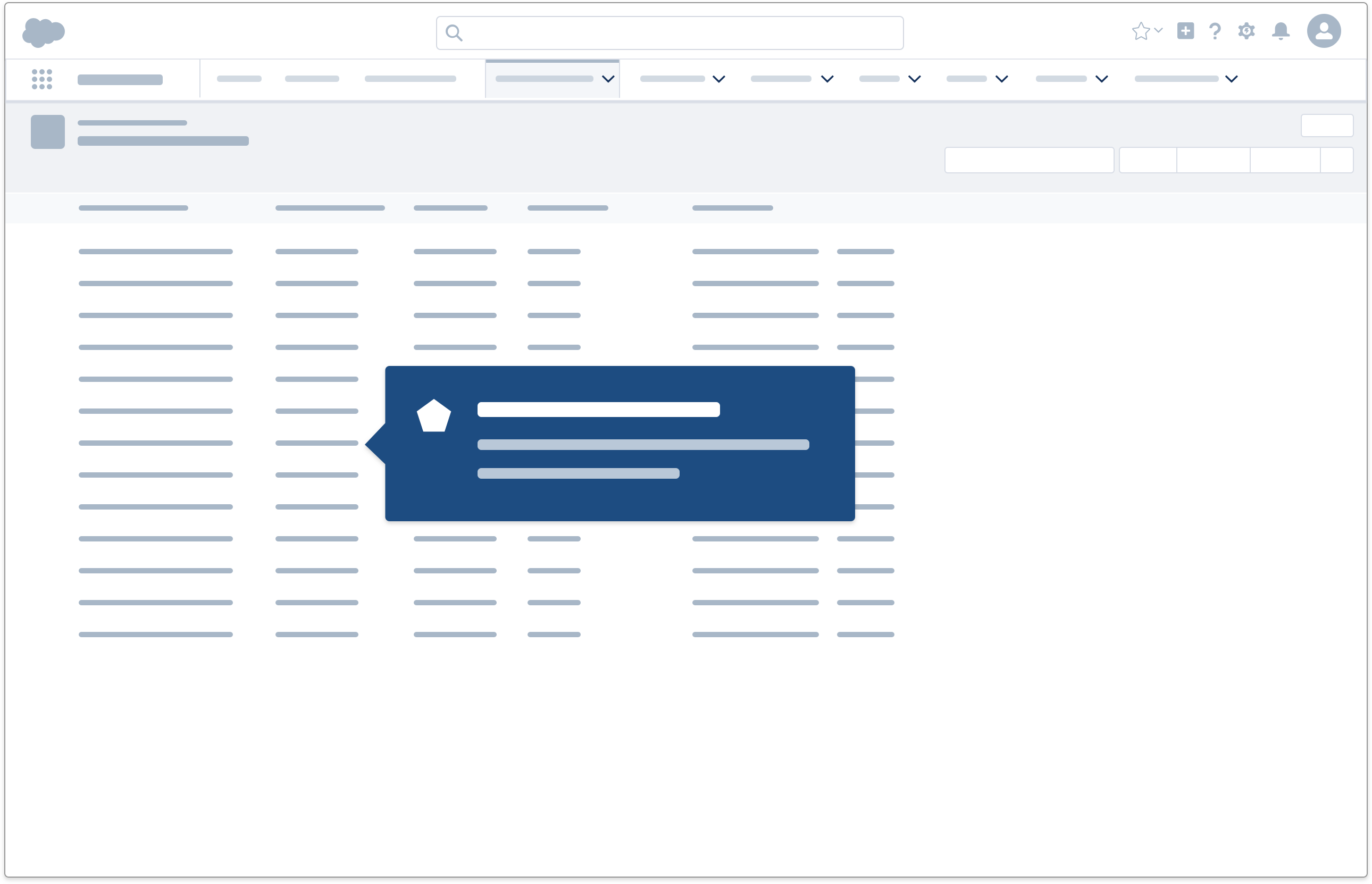
- Field-level help, such as an infobubble with tooltip, can clarify an item's purpose and function.
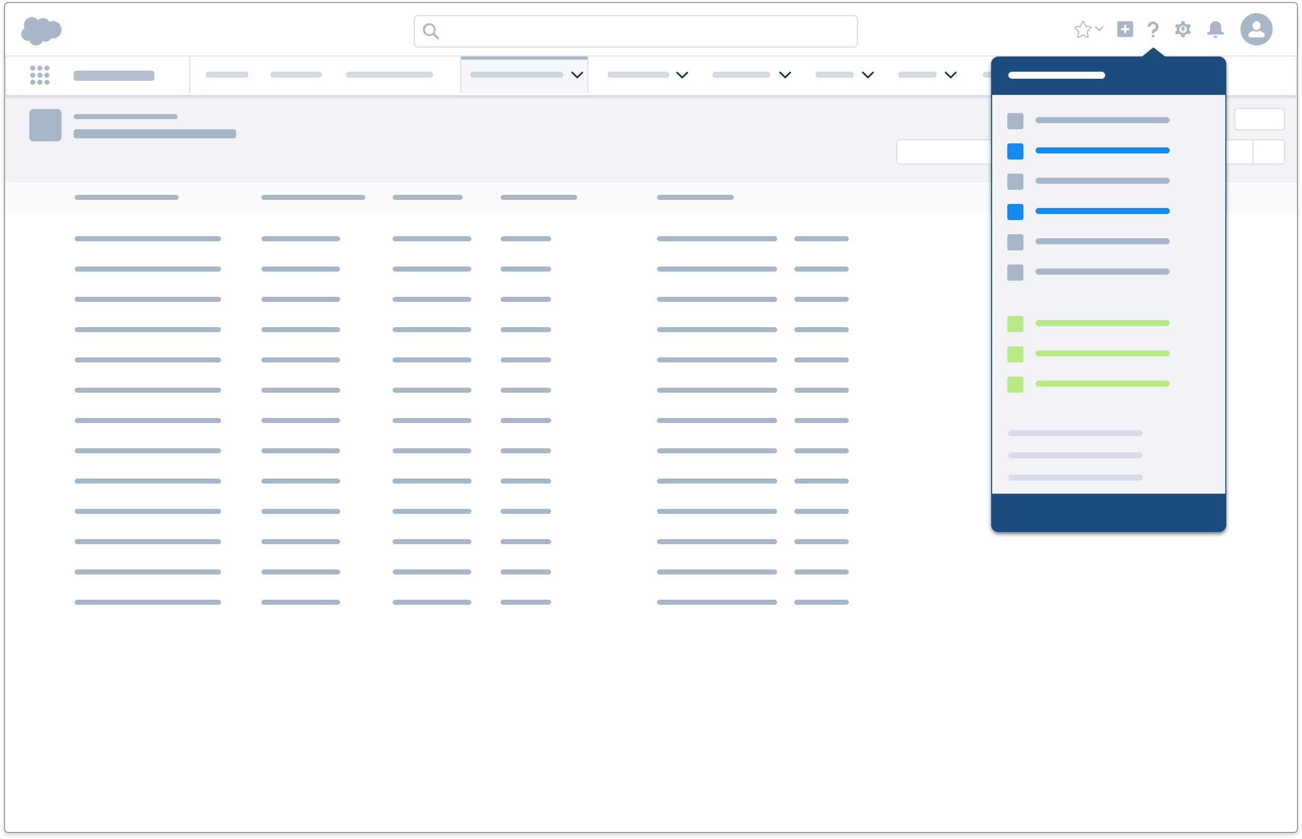
- A help menu links to help topics or videos that contain relevant how-to content and concept definitions contextual to the page the user is on.
