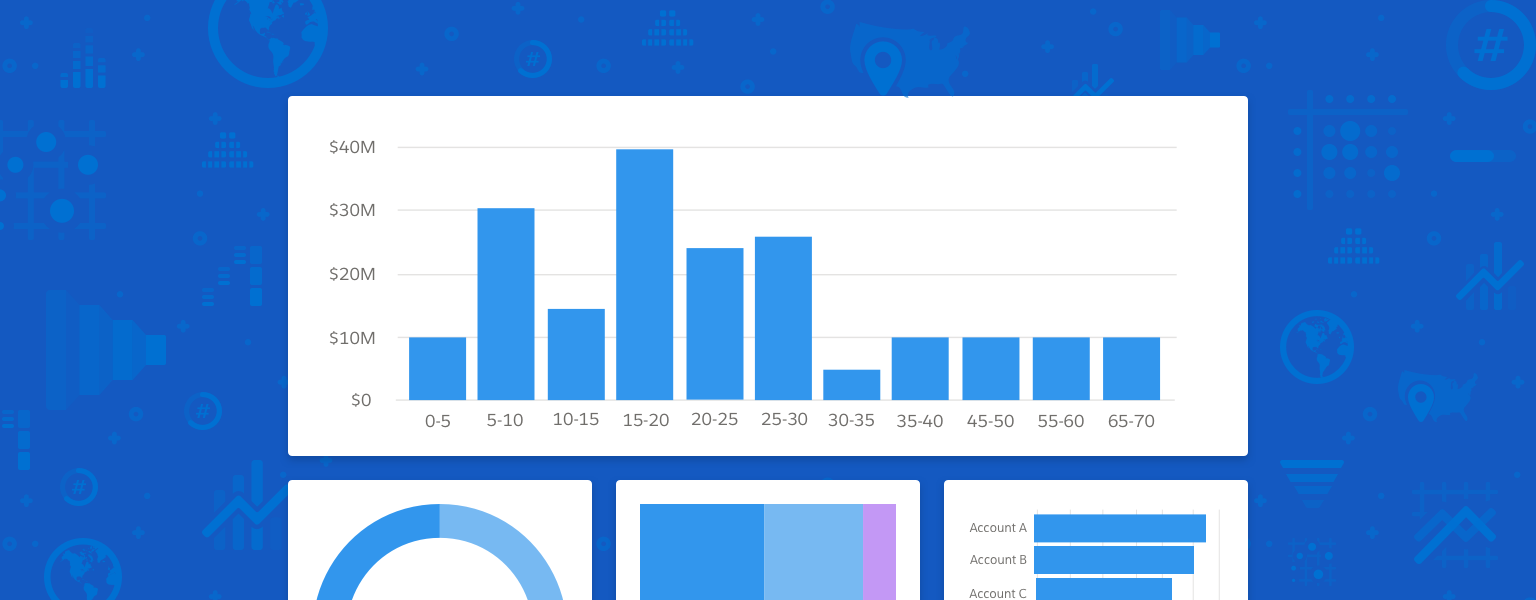
Charts
Charts illustrate—and give us insight into—complex data relationships.
Introduction
Charts tell the story of information. They make abstract data complete; give us an intuitive grasp of patterns; and help us identify trends, make comparisons, and track progress.
Design Resources
Download Sketch KitUsage
To tell the story of the data you're presenting, you need to choose the chart that most clearly presents the main insight you want to share. Use the wrong chart type, and you risk misrepresenting the underlying data—and confusing or even misleading your audience.
So how do you choose the right chart for your data?
- First, think about intent. What is the essence of the information you want to convey?
- Who is your audience, and how do they prefer to consume information?
- Is the data used to show:
- Comparison: difference or similarity between different values?
- Trending: data that has changed over time?
- Relationship: correlation in data values?
- Composition: relative makeup of a value?
- Distribution: volume distribution and identification of outliers?
- Metric: measuring progress at a glance?
- Location: values on a geographical coordinate system?
- Pipeline: stages (or flow between stages) of a process?
Chart Types
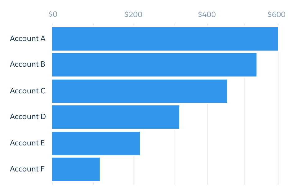
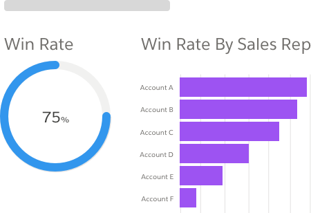
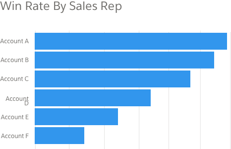
Comparison
Comparison charts are used to show differences and similarities in data values. They include bar and column charts and dot plots.
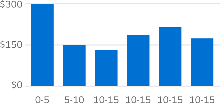
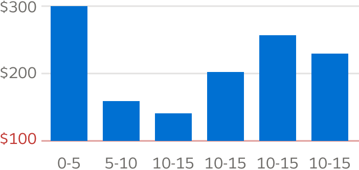
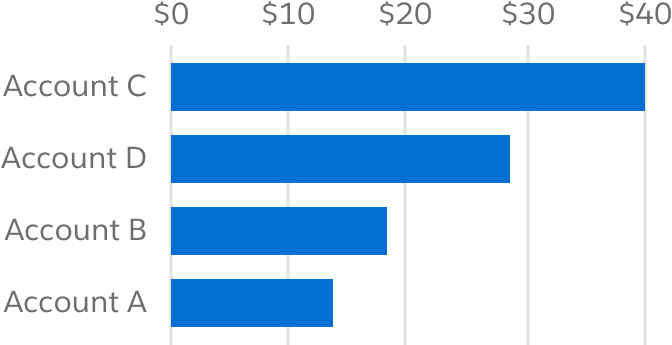
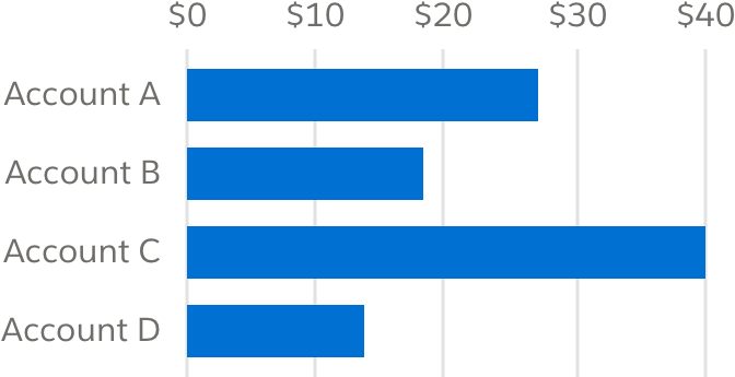
Bar and Column Charts
The bar chart is the workhorse of analytics. Because our eyes can quickly discern differences in height and length, it's a good choice for presenting simple nominal or ordinal data. The column chart is a common variant of a bar chart, used to compare ordinal values.
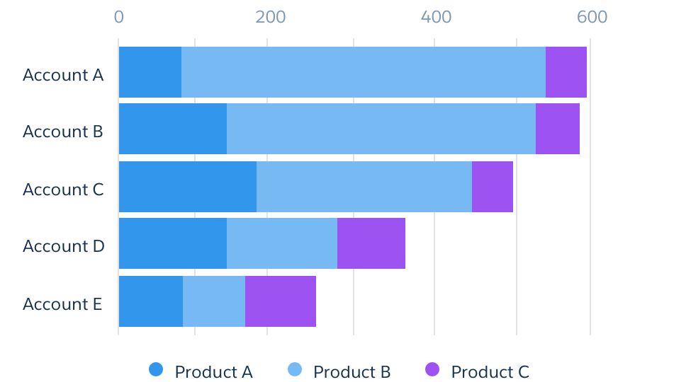
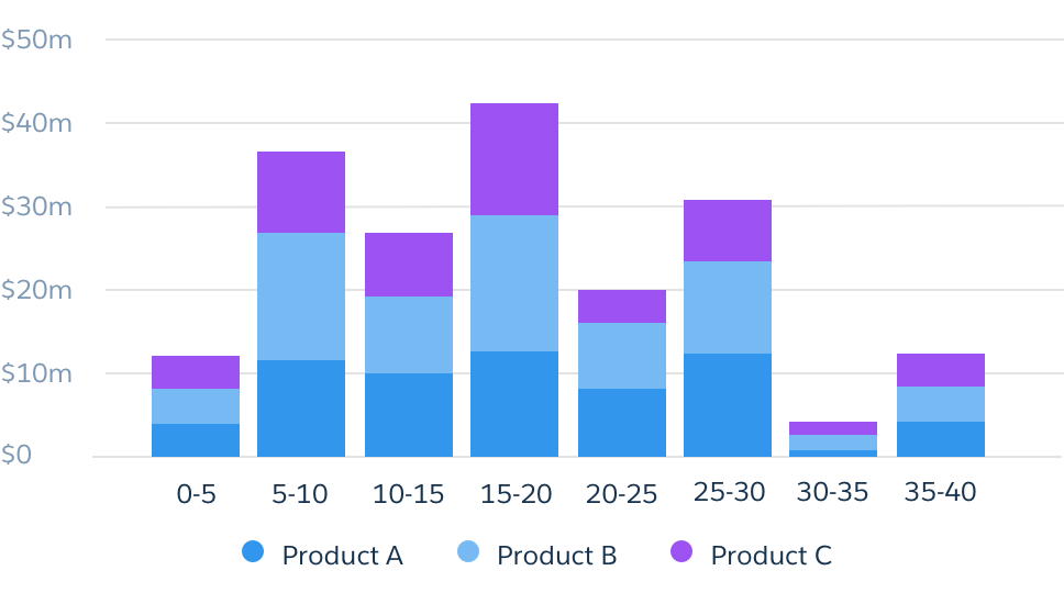
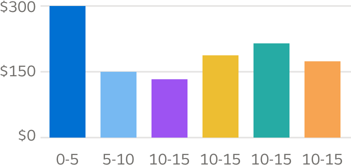
Stacked Bar and Column Chart
Stacked bar charts are good for showing group relationships and value differences across more complex categories and subcategories. Stacked column charts can also be used to show group relationships within subsets of ordinal data.

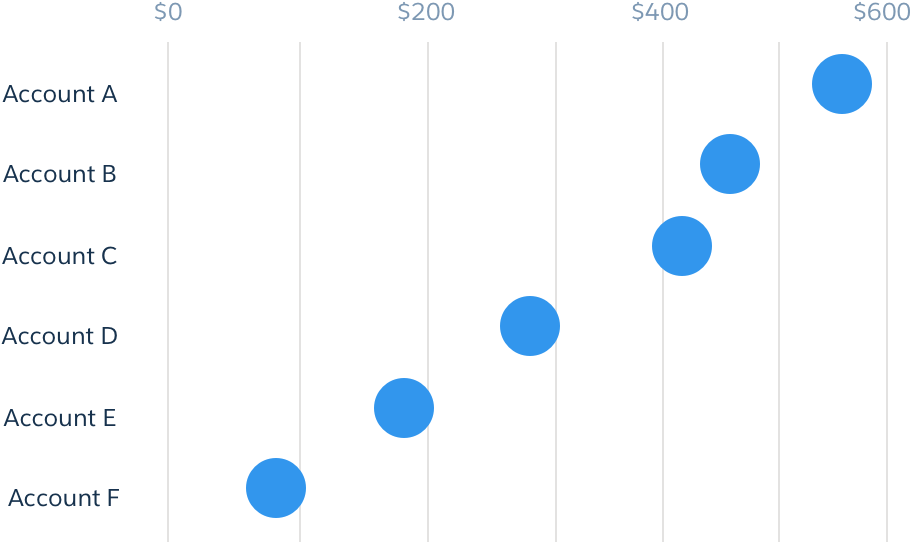
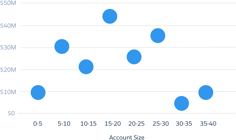
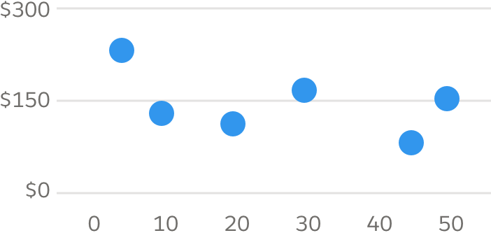
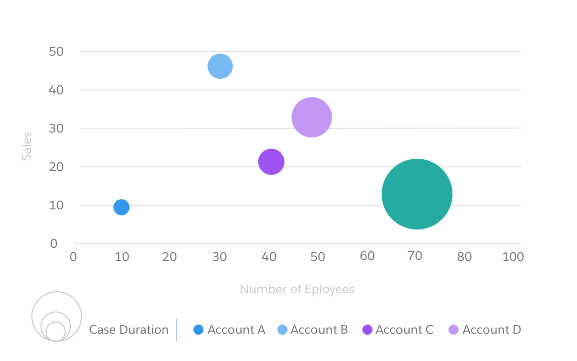
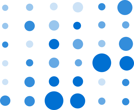
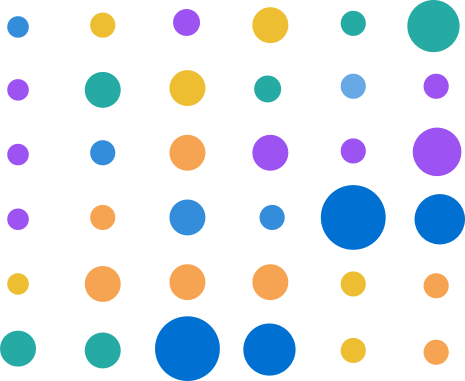
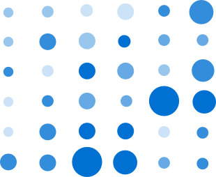
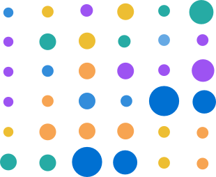
Dot Plot
The dot plot uses circles to map values across x and y axes, then adds third or fourth measures in the form of dot size and color/intensity. It's a favorite of design guru Edward Tufte, due to its judicious use of ink and ability to convey complex information in a relatively uncluttered space.
Trending
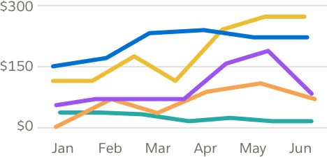
Trending charts, such as line charts, are used to represent data that has changed over time.
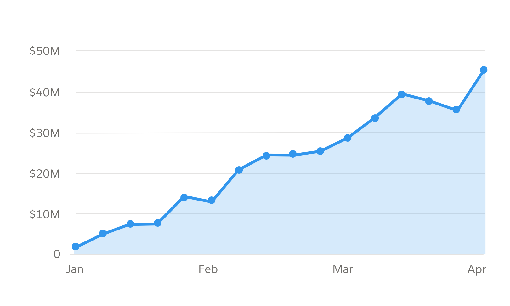
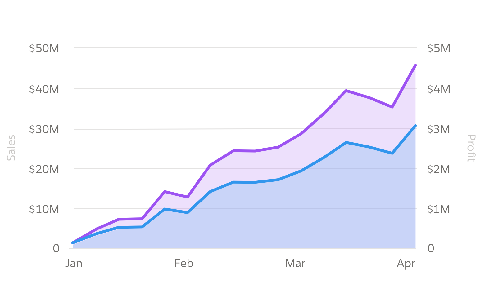
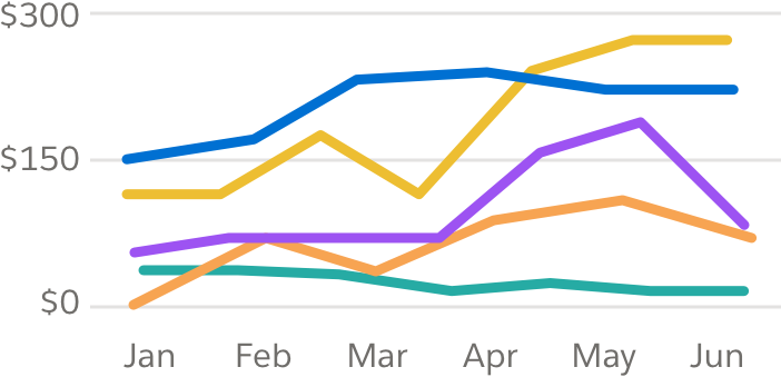
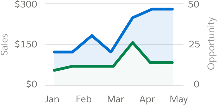
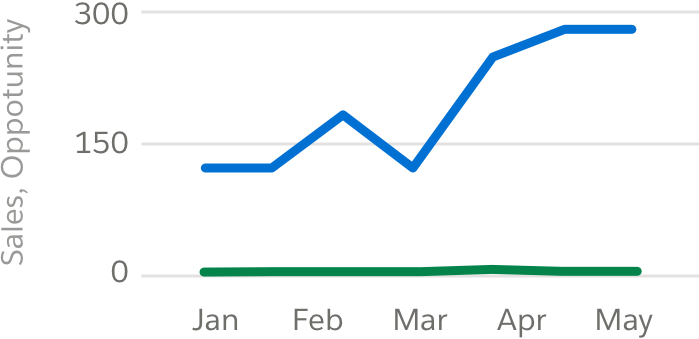
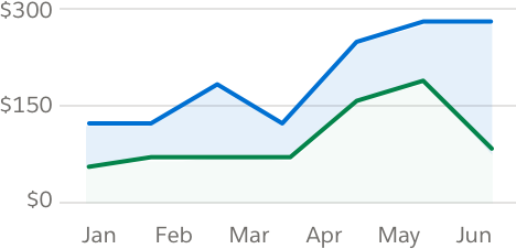
Line Chart
Line charts are good for representing changes in one or more values over time, especially trending data. Overlay multiple values (up to four) in one chart to help readers visualize the relationship between values.

Relationship
Relationship charts, such as scatter plots, are used to show relationships and correlation between values in data.
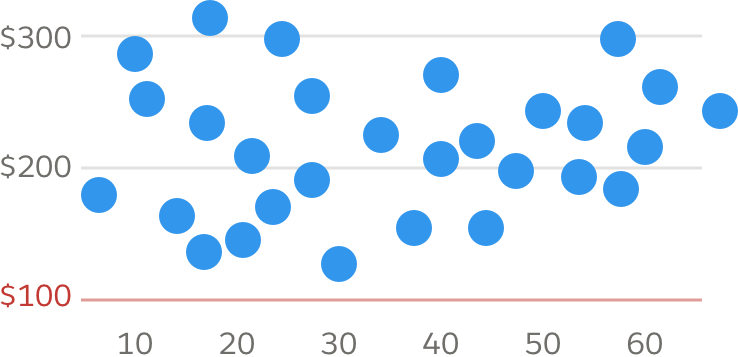
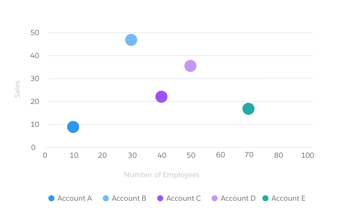
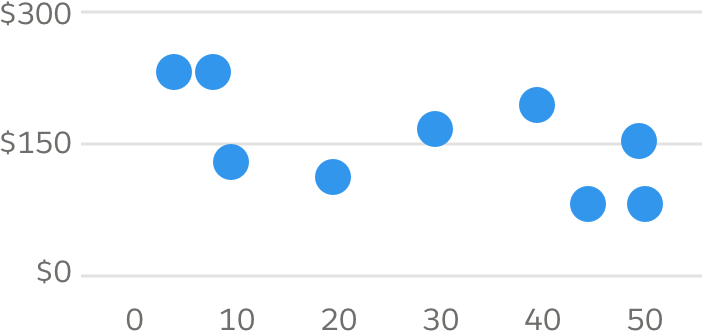
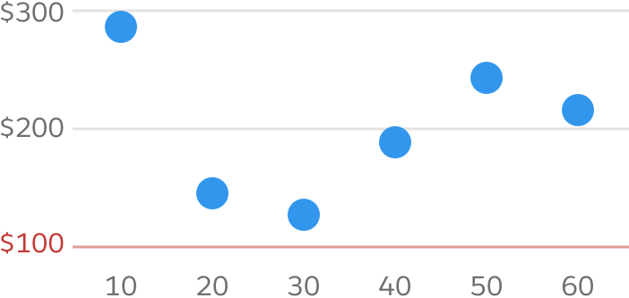
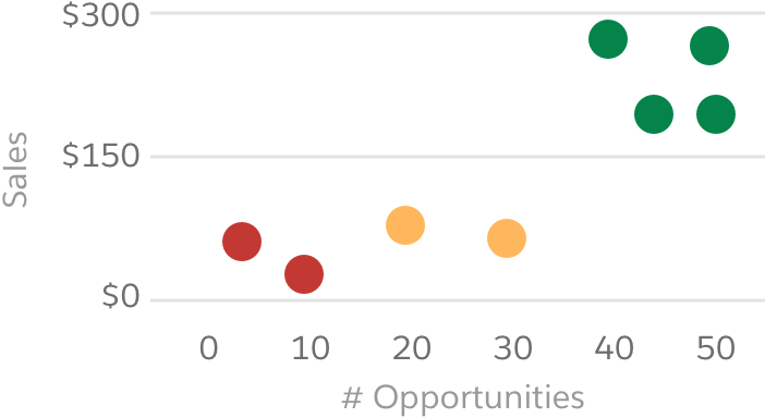
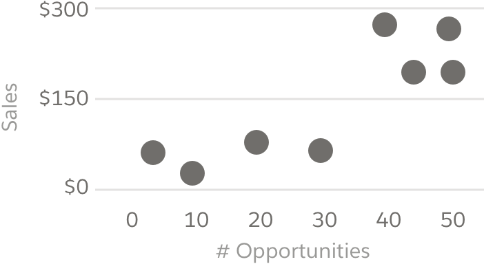
Scatter Plot
Scatter plots are useful for showing more complex data relationships, including correlation of multiple variables. For example, to illustrate correlation of revenue with number of open opportunities, plot the two measures on the x and y axis. As with the dot plot, dot size and color/intensity can convey additional information.
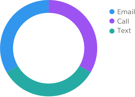
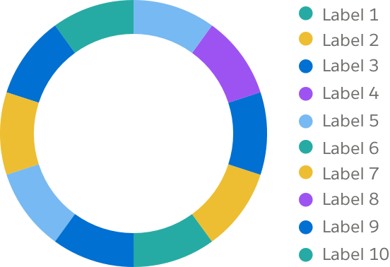
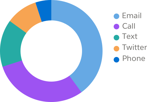
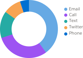
Compositions
Composition charts are used to show relative value, or represent relative makeup of a value, across a group. They include pie charts and treemaps.
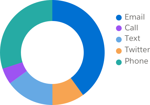
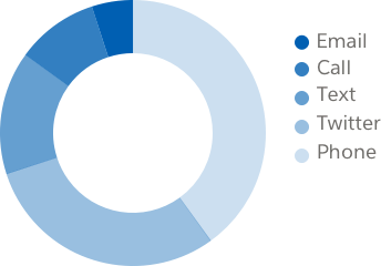
Pie Chart
A pie chart maps relative value, or relative makeup of a value, across a data set. These charts highlight relative value (e.g., percentages) rather than absolute value.

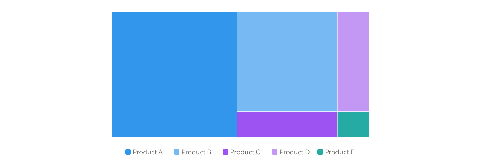
Treemap
A treemap shows the composition of hierarchical data using nested rectangles.
Distribution
Distribution charts are used to visualize volume distribution and spot outliers or anomalies. They include heatmaps and matrix charts.
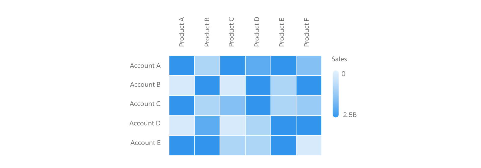
Heatmap
Heatmaps use color density to show concentration patterns for a single variable.
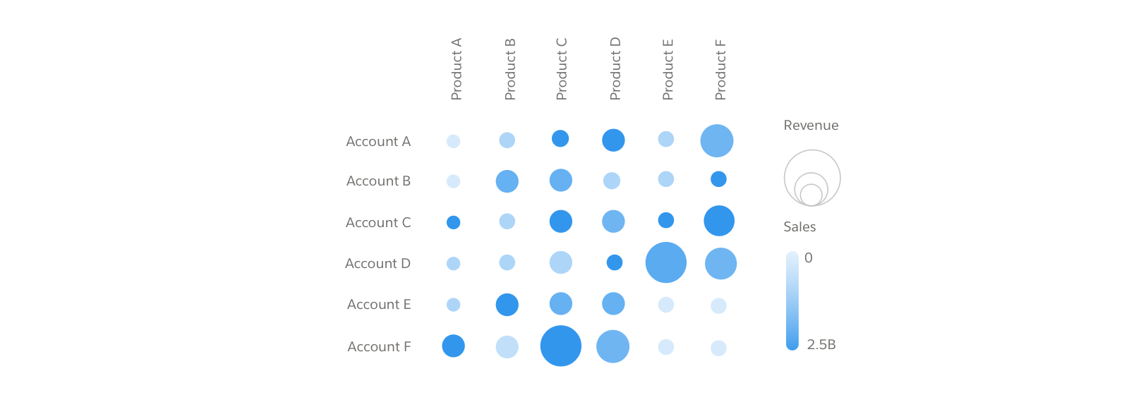
Matrix Chart
Matrix charts use color density and bubble size to show concentration patterns for two variables.
Metric
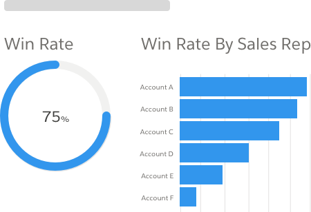
Metric charts show progress at a glance. They include flat and polar gauges and ratings charts.
Flat Gauge
A flat gauge shows progress toward a specific metric. It's useful where space may be limited.

Polar Gauge
A polar gauge also shows progress toward a specific metric, with the circle representing 100% of the goal.
Polar gauges can progress either by filling or draining, depending on the information conveyed.

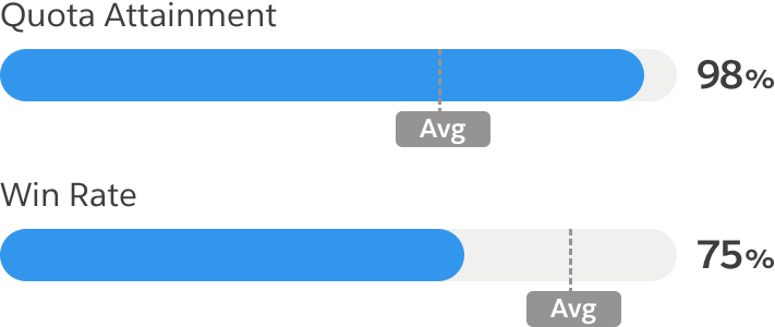
Ratings Chart
A ratings chart works much like a polar gauge, with the addition of comparison against a target quantity or expectation.


Location
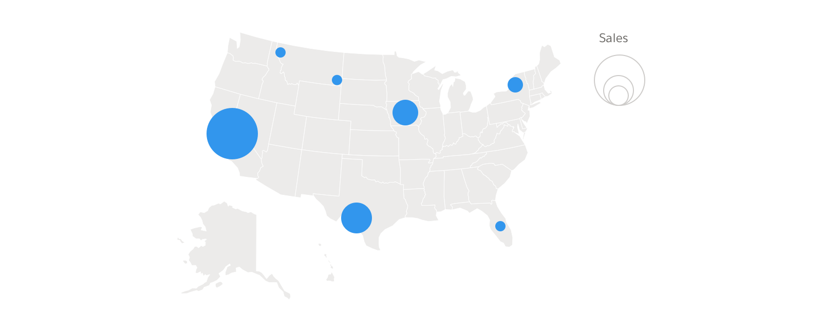
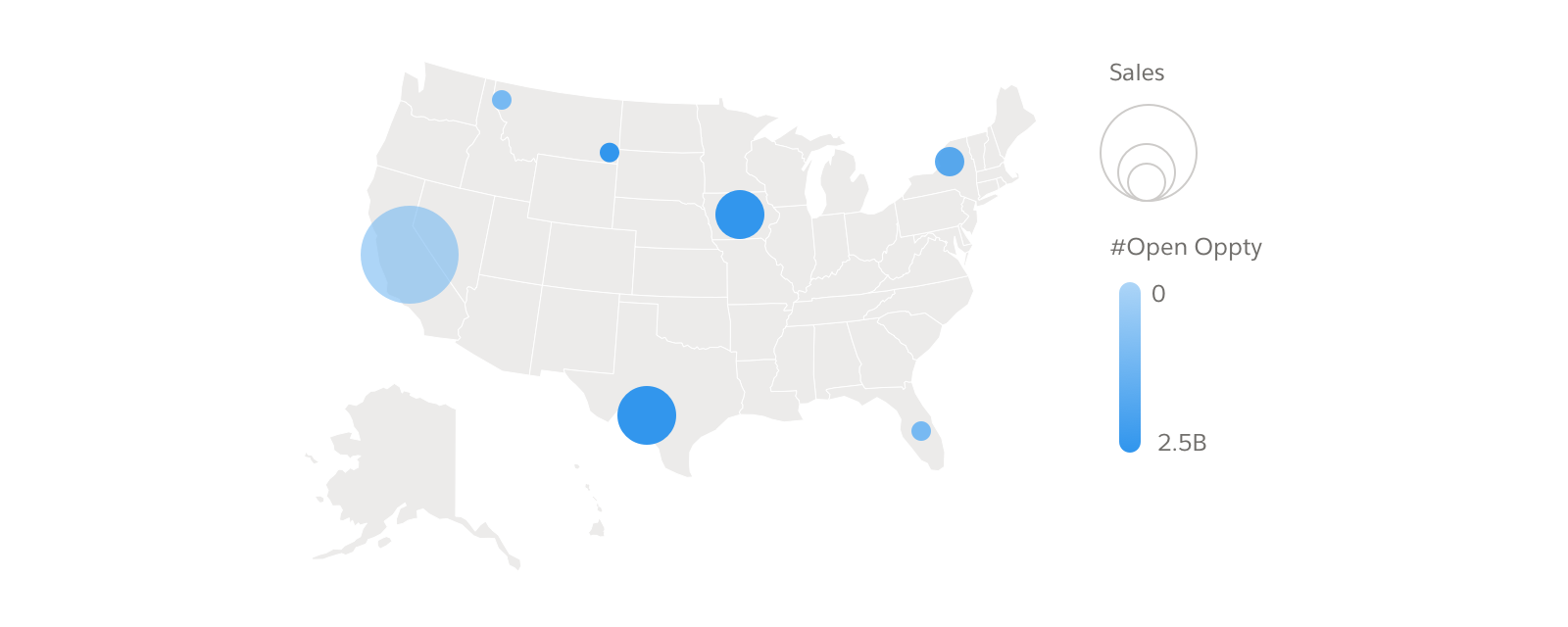
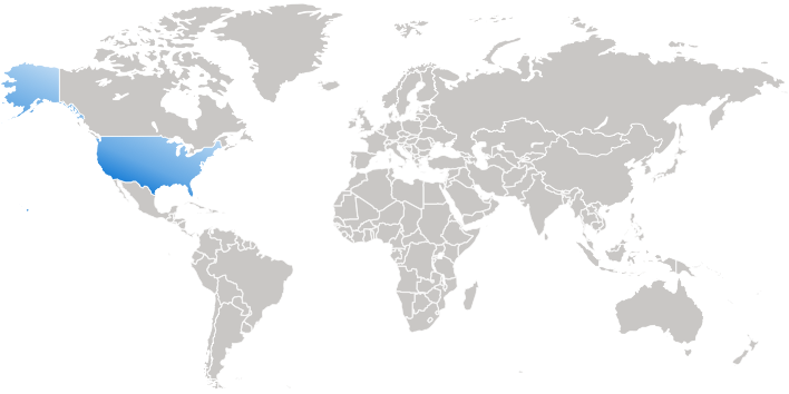
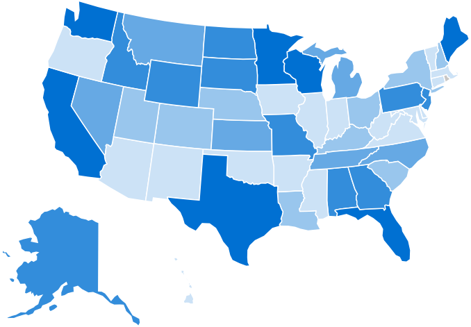
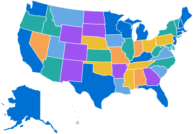
Location charts show values using a geographical or coordinate map. Variations include bubble maps and geo maps.
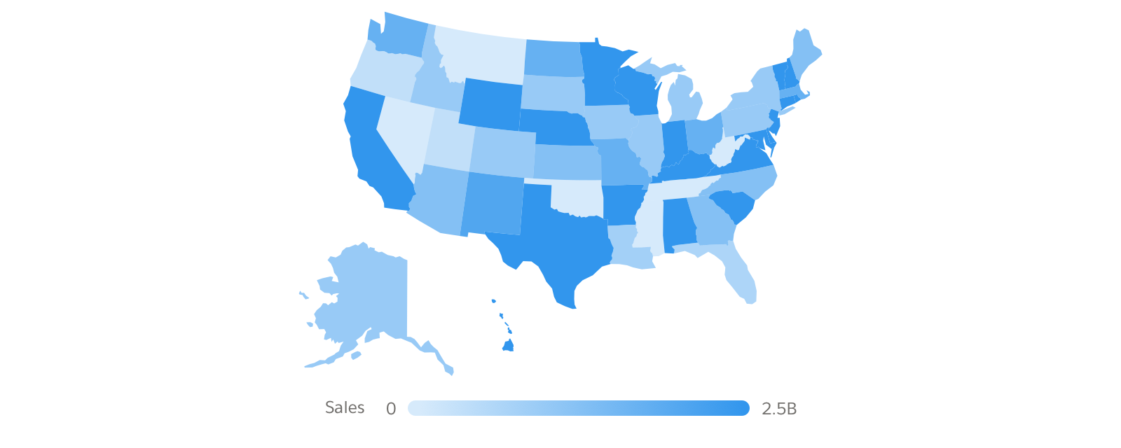
Map
A standard location chart maps data values to a map or other geographical component. Areas of the map are shaded in proportion to related values, highlighting high- or low-value areas.
Bubble Map Variation
A bubble map functions much like a location chart. As in the dot plot, dot size and color/intensity can convey additional information about each plotted point.
Geo Map Variation
Geo maps help readers visualize data that contains geographical coordinates (latitude and longitude). The coordinates allow more precise connection of data elements to locations.

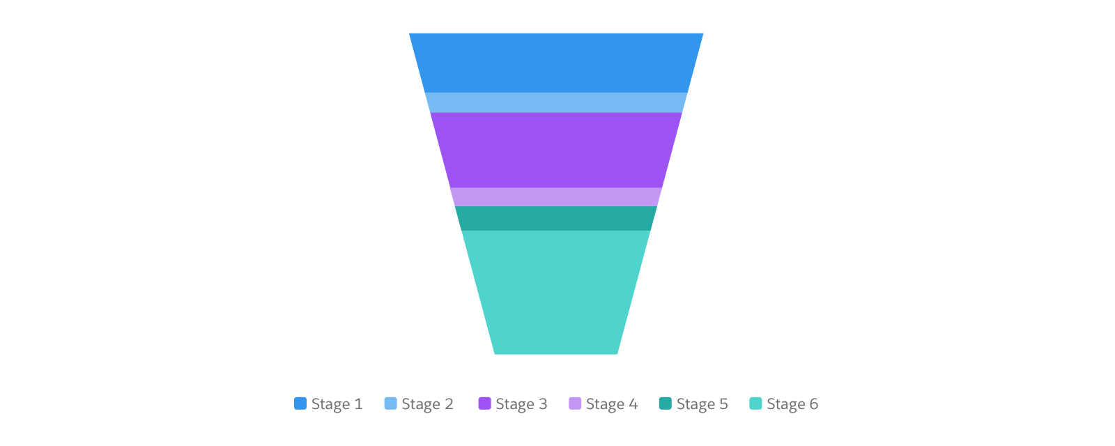
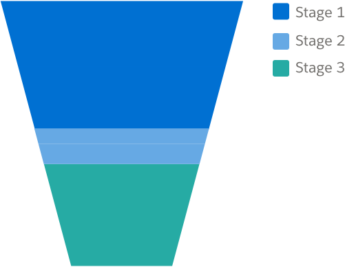
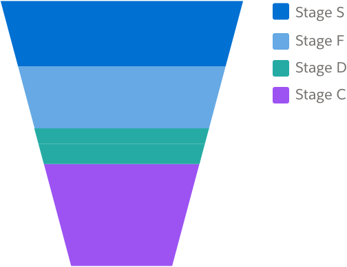
Pipeline
Pipeline charts show stages of a process, and the flow between those stages. They include funnel, waterfall, origami, and sankey charts.
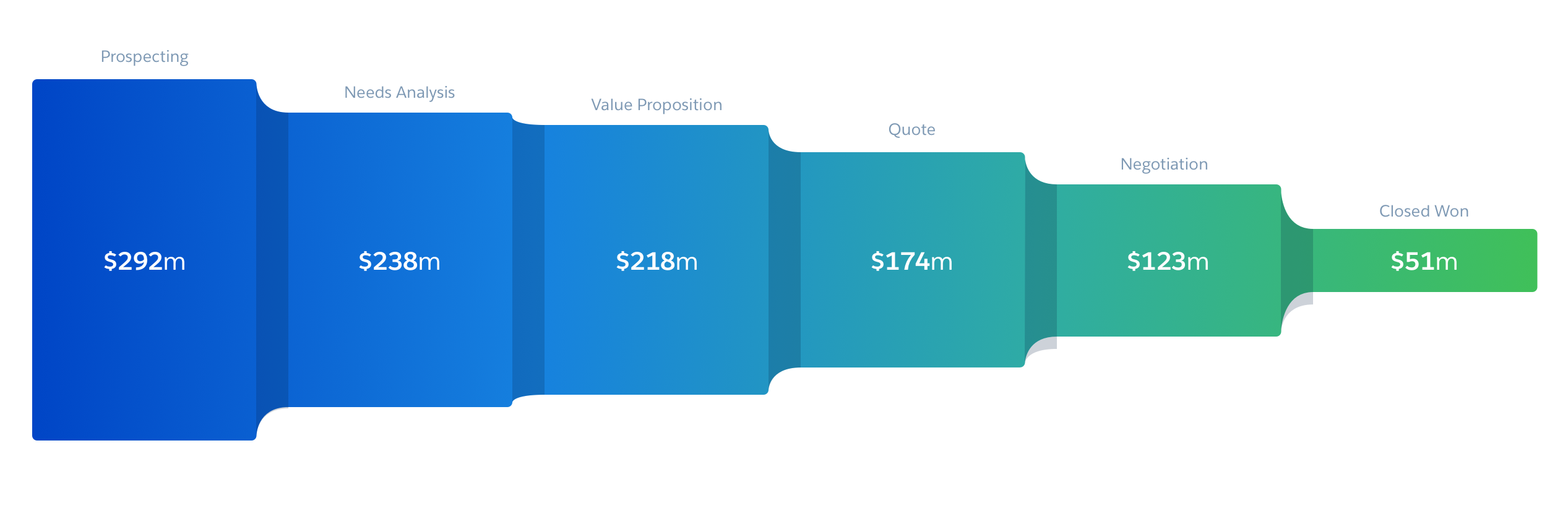
Funnel Chart
A funnel chart is used to represent stages in the sales or marketing process, with a value for each stage.
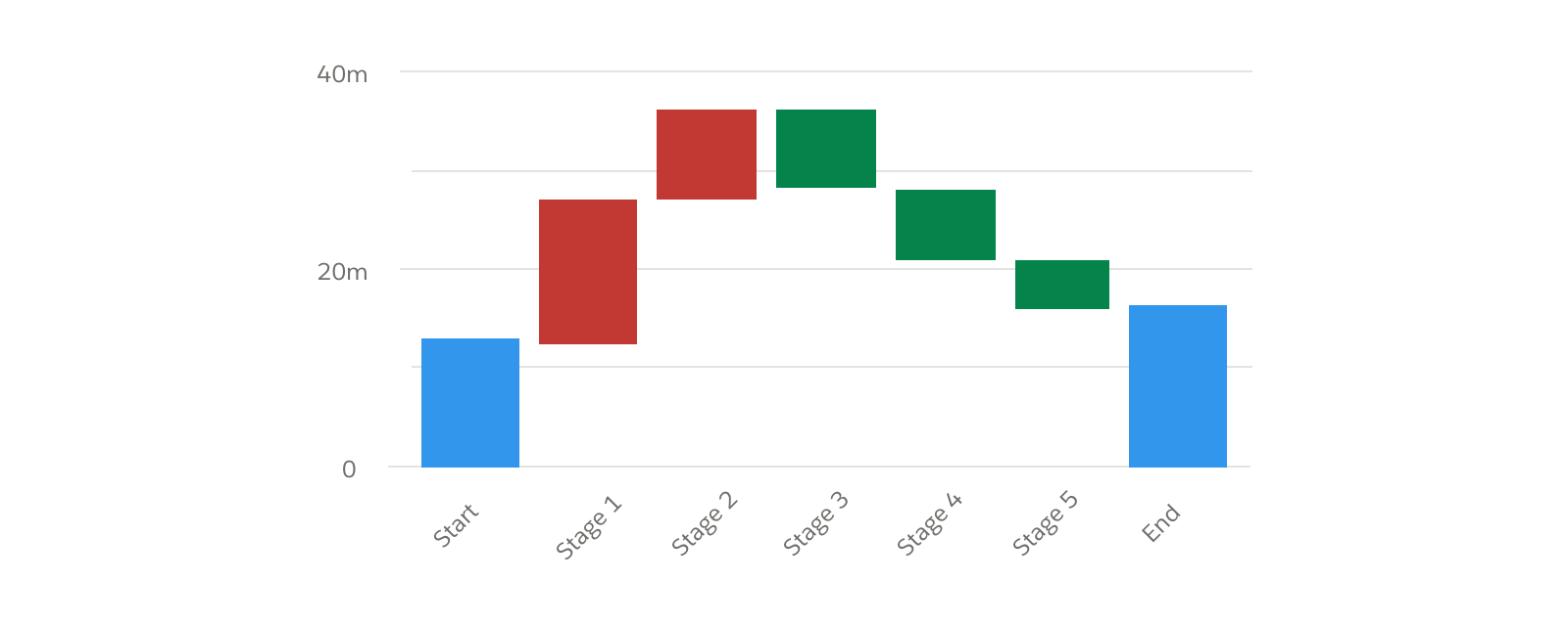
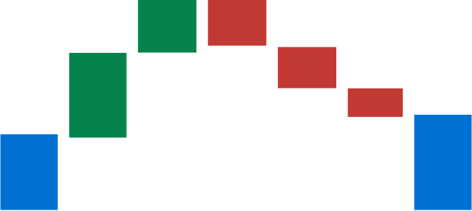
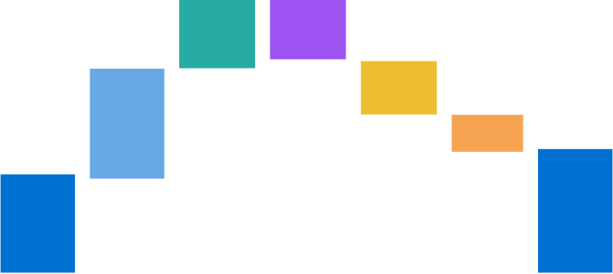
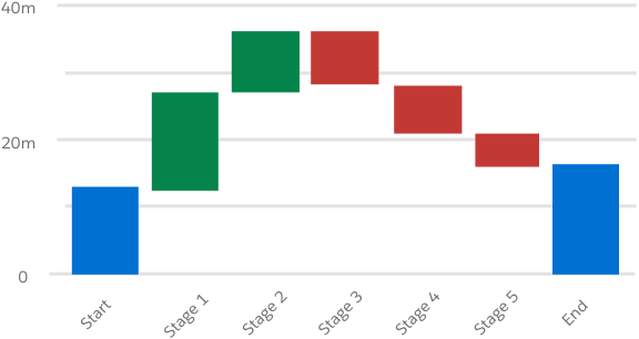
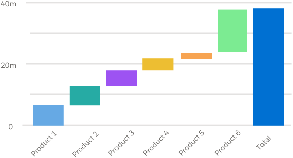
Waterfall Chart
A waterfall chart is used to show starting, intermediate, and final values for the stages of a process.
Origami Chart
Origami charts display pop-out values in data with a single measure and grouping. You can also use them to show variability in stages whose values don’t decrease sequentially. They can work well to highlight values that are performing well relative to others in a category.
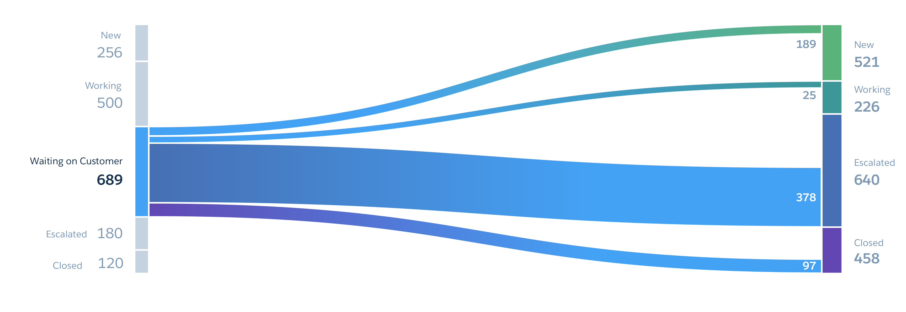
Sankey Chart
Sankey charts show how values flow between two groupings, demonstrating how a given metric is distributed as it moves from one to another. A Sankey chart can display negative numbers and calculate their effect on overall totals.
Color
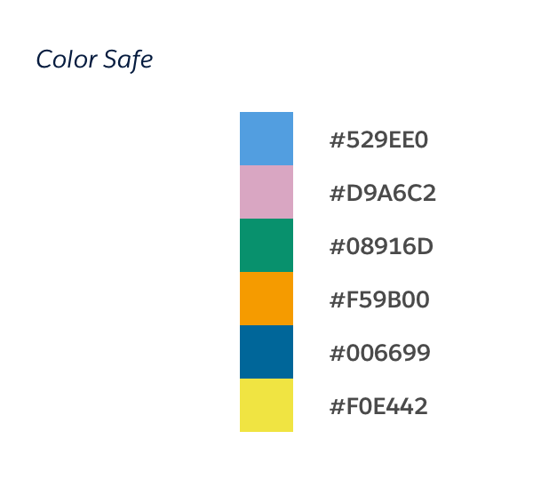
Color is important for data visualization. Colors help tell a story, guiding the user to view alerts or outliers and take desired actions.
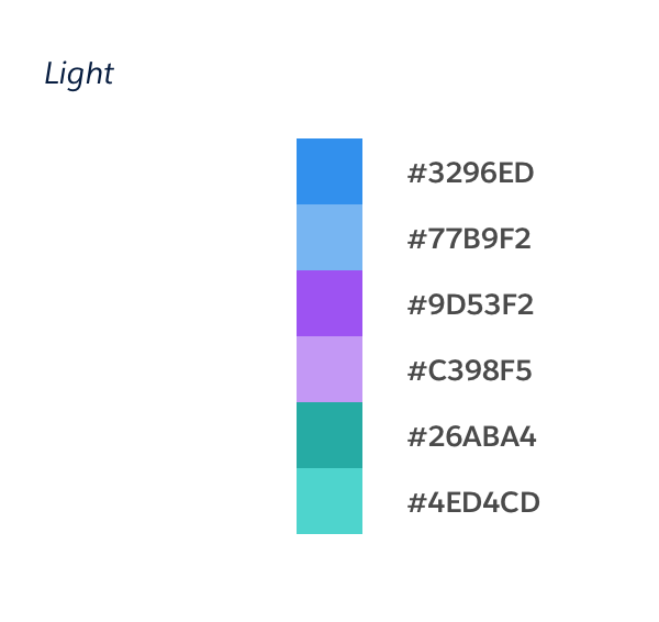
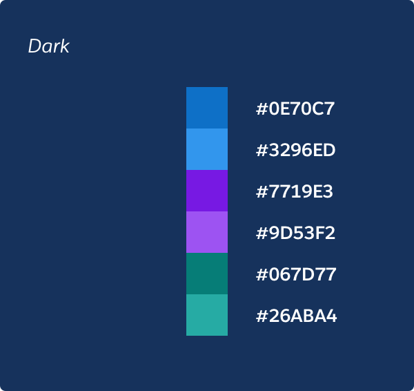
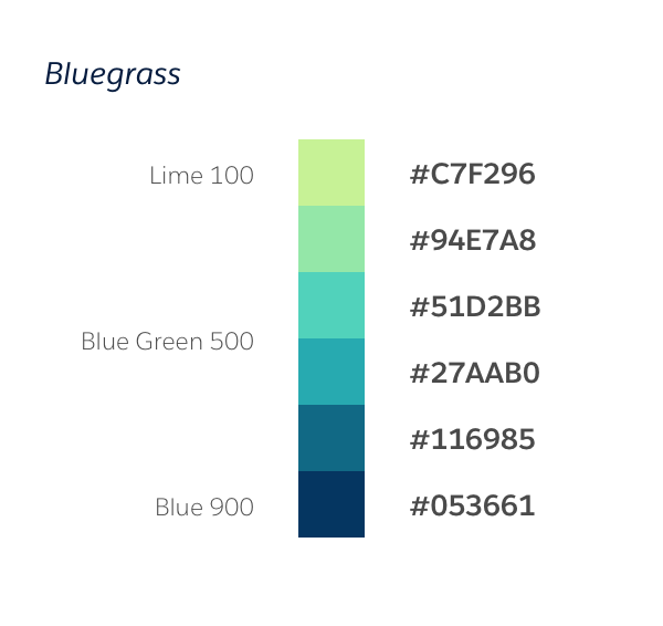
Chart Color
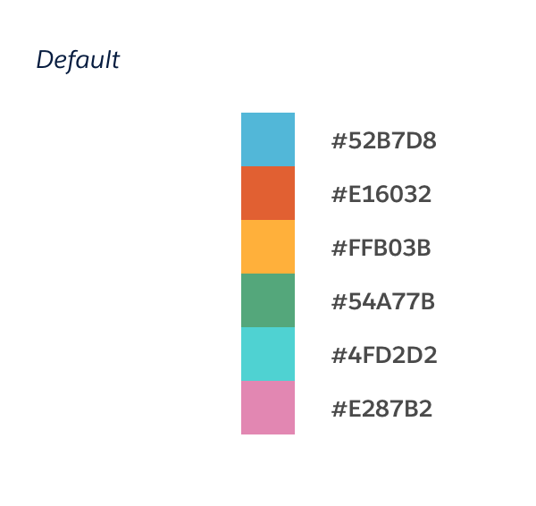
Color plays an integral part of narrating stories through a data visualization. Our team conducted user research and came up with color themes that were accessible, easy to distinguish and had enough colors to show categories in data.
Users can select color themes from the Salesforce charting library. The default palette uses midtone hues from around the color wheel. All other themes have hues that are roughly 180 degrees from each other in the color wheel. Depending on hue chromaticity, certain hues have different RGB curves. Our accessible color-safe theme passes WCAG 2.0 guidelines for contrast accessibility.
Color Best Practices
- Consistently match a color to value. For example, if you use blue to represent sales win rate in one chart, use it to represent that value in all other charts.
- Use same color to show same metric for different categories in a bar chart.
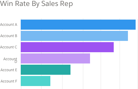
- Use different colors to represent categorical data points in donut or tree-map.
- To show continuous values, use one color, or a gradient of that color, to represent the high and low.
- Using too many colors defeats the purpose of associating numbers with colors. Research shows that most people's short-term memory can retain up to five pieces of information at one time, making five a good maximum for color choices. (show scatter plot)
- Keep accessibility in mind. When using color to distinguish chart elements, always use symbols or text as well. Use color-safe themes whenever possible.

- Use color as a metaphor when not working across multiple cultures. For example, in western cultures, it's common to use red to show bad and green to show good. Keep in mind, however, that colors can have different meanings in different cultures.