User Engagement Overview
Guidelines
The Lightning User Engagement Framework consists of design guidelines for onboarding, adoption, assistance, and learning patterns across the Salesforce ecosystem.
Introduction
Throughout the Salesforce product ecosystem, we use engagement patterns to onboard, guide, assist, and educate users. These user engagement guidelines will help designers and their teams identify business goals and plan accordingly, put best practices to work, and leverage sample recipes for common scenarios.
Start using our Design Kits
Open in FigmaPlanning the Scope of Your Project

- Identity the "aha moment."
The "aha moment" is when a user first realizes value in your product or solution. It usually happens first during onboarding, but can and should reoccur as the user grows and becomes increasingly proficient. - Address needs at all stages of the user journey.
Help maximize users' experience and efficiency. Are you designing for beginners, advanced users, or somewhere in between? New users need an onboarding flow that extends beyond the first five minutes after logging in. Existing users need flows for new features. Inactive users need flows that refamiliarize them with the product. - Fit the experience to the persona.
How do you want users to think or feel? What do you want them to do? Consider familiarity with the product and industry, motivation level, and product complexity. Then storyboard your flow before choosing how to deliver it. Explore the Salesforce user research personas and learn how to use them at your business on Trailhead. - Experiment and optimize.
Choose a metric (for example, "trial to paid conversion" or "seven friends in ten days") that drives your users to the aha moment. What can you do to encourage this behavior? Use conversion research: What behaviors did long-lasting users display early on? What trends can you identify? Identity correlations between behavior and retention.
Best Practices
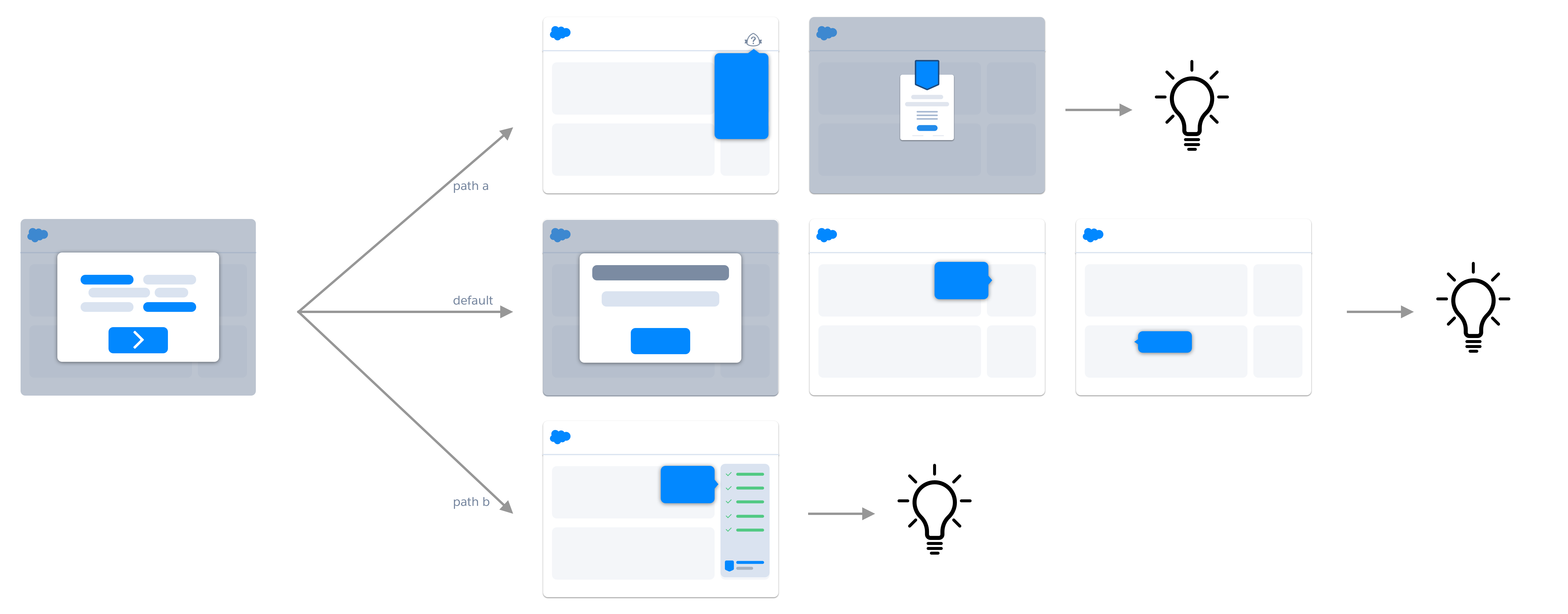
To help determine the right engagement experience for each user and situation, consider these factors:
M.A.P. (message, audience, purpose)
Identify the message, audience, and purpose of your content. Write out what you want your target user to learn, understand, or achieve (for example, I want users to get the lay of the land in Lightning Experience, and quickly understand how to do common tasks, so they can be productive.). Are you onboarding admins to a new product that they must configure and roll out? Introducing established customers to a new product feature? Your answers will help you begin to design the user experience.
Gauge complexity
How complex is your feature? How steep of a learning curve will new users have? Established users? Novice admins? How long before the user becomes proficient?
Storyboard
Imagine a user’s first experience with your feature. What’s the most helpful information you can offer right away? On second or third run? Is your feature something the user can take action on, or is it more informational?
Support, don’t disrupt
Is each in-app prompt both helpful and timely? Is it necessary? To avoid “pop-up-alooza,” check with others to make sure you're not creating competing or simultaneous content.
Think beyond your channel
Work with your product owner and product marketing manager to plan a multichannel rollout. For example, pair an in-app onboarding journey with an email nurture campaign that build on each other.
Keep it local
As much as possible, provide help, tips, guidance, and solutions in the UI itself, where users have the most context.
Make it relevant
Personalize content to fit the user, organization, and other factors specific to the user experience (as in persona-based flows). Anticipate users’ needs using data (historical usage data, click paths, search terms, engagement metrics) and user research.
Push or pull?
Do you need to push content to users that they wouldn’t otherwise notice, or will they be motivated to seek it out?
Offer a secondary source
If appropriate, give users a way to reinvoke content pushed to them. Let users know where they can find tips and guidance in your app.
Scenarios
Four scenarios illustrate the most common user engagement experiences:
- Onboarding
- Feature discovery and adoption
- Help and troubleshooting
- In-app learning and skill growth
These guidelines include example flows for each scenario. Think of them as representative use cases—or base recipes that you can adapt to meet your own needs.
Use this table to help you select the right user engagement mechanism for each scenario.
| SLDS Blueprint | Welcome Mat | Setup Assistant | Prompts | Docked Assistant | Empty State | Field-level Help | Help Menu | |
|---|---|---|---|---|---|---|---|---|
| Onboarding | ||||||||
| First time in trial or new product/feature area | Yes | No | No | Yes | No | No | Yes | |
| Setting up new product or feature | No | Yes | Yes | No | No | No | No | |
| First time in a new release | Yes | No | No | Yes | No | No | No | |
| Feature Discovery and Adoption | ||||||||
| New feature now enabled/available | No | No | Yes | Yes | No | No | No | |
| Encouraging best practices to support efficiency or otherwise improve the user experience | No | No | Yes | Yes | Yes | Yes | No | |
| Help and Trouble Shooting | ||||||||
| User is off course | No | No | Yes | No | Yes | No | No | |
| User has a question or problem | No | No | No | No | No | Yes | Yes | |
| Learning | ||||||||
| Deeper understanding of new product/feature | Yes | Yes | Yes | Yes | Yes | No | Yes | |
Scenario Overviews
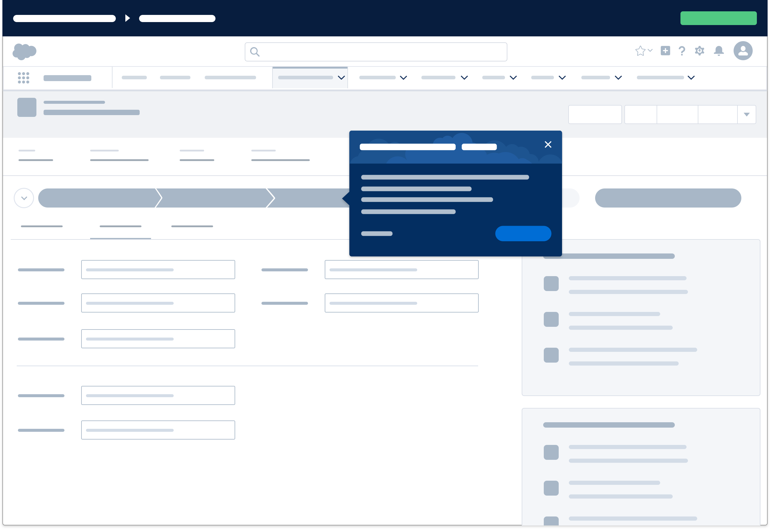
Onboarding
Who: User who is new to a trial, product, feature area, or release.
What: Getting-started content including setup guidance, feature or product value proposition, help topics, videos, walkthroughs, tips, rewards for learning.
Why: Show users where to begin, along with what’s available, new, or changed. Get them to the "aha moment" quickly.
Feature Discovery and Adoption
Who:
User A: User isn't using the product to its full potential; needs tips and tricks for saving time and increasing productivity, plus direction to undiscovered features and efficiencies.
User B: Experienced user who just updated to the latest release; needs to know what’s new, changed, or improved without workflow interruption.
What: Tips, feature demos, new-release info, shortcuts, best practices, targeted help, rewards for learning.
Why: Help beginners become experts; help experienced users learn new things; raise awareness of new features and releases.
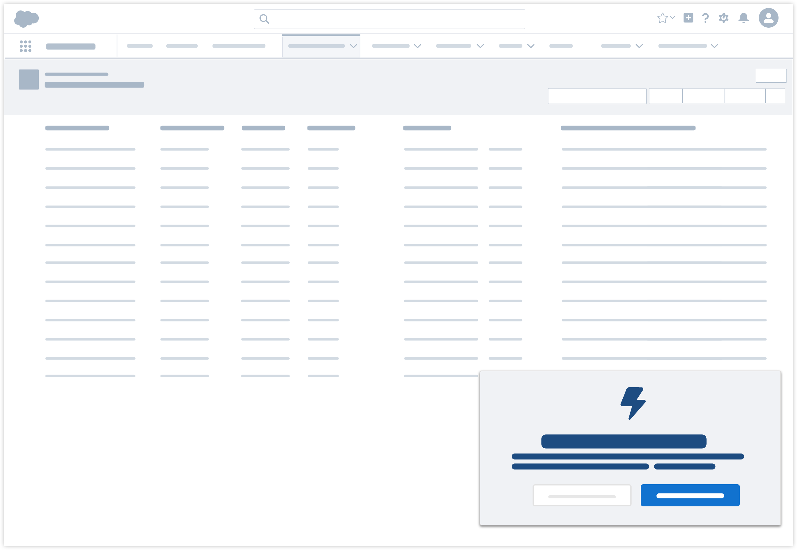
Help and Troubleshooting
Who: User who is off course, and may or may not know it.
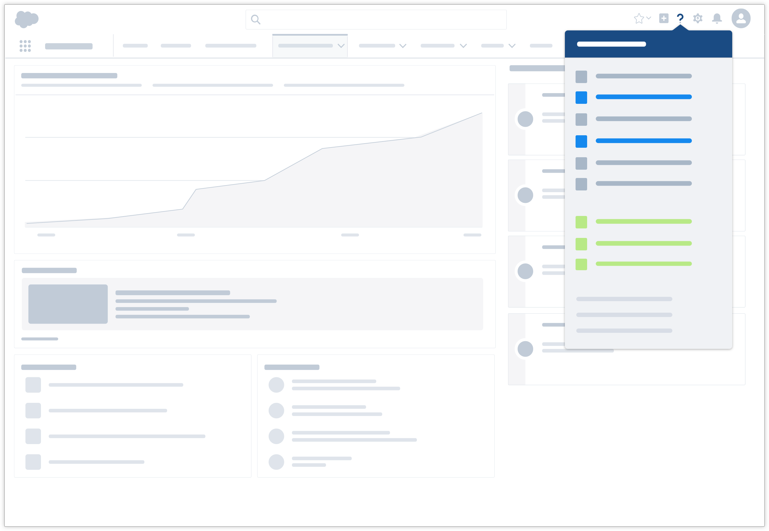
What: Tips, visual cues, contextual help menu, solution-oriented messaging, and preemptive guidance.
Why: Just-in-time prompts that help users learn by doing. Reliable resources and access to support.
Learning
Who: All Trailblazers.
What: Provide a deeper understanding of features and products, along with context around how different features or products work together; provide deeper training and explanations of features, products, and new releases; share efficiencies, shortcuts, and tips.
Why: Give users the skills and information they need to get as much as possible out of your product or application.
Platform Support
Throughout these User Engagement guidelines we will make reference to a variety of different prompt mechanisms and design patterns. Some of these prompts can be created directly from within Lightning Setup with declarative tools. Others will require programmatic approaches. The below matrix of prompts gives an overview of which have declarative support and which do not. Over time Lightning Prompt Authoring will provide support for more and more prompts declaratively.
Declarative Prompts and Assistance

Docked Assistant and Non-Modal Prompts. Use clicks, not code, to create in-app guidance and engage users directly. Write your own content; in the prompts, you can include action buttons that take users to specified URLs. For each prompt, you can choose a target audience, along with where and for how long it appears. Lean more about in-app guidance for training, onboarding, and news here.
Contextual Help Menu. The Help icon in the header opens a menu of contextual help topics, Trailhead modules, videos, and more items chosen by Salesforce. You can supplement these recommended resources by adding a section with links to your own content. Your section appears at the top of the help menu on each page. Lean more about customizing the help menu.
Field-level Help (Tooltip). Define custom help text for your organization’s fields, giving users a helpful description of any field on all detail and edit pages where it appears. Users can view the field-level help text by hovering over the Info icon next to the field. Learn more about defining field-level help.
Programmatic Prompts and Assistance

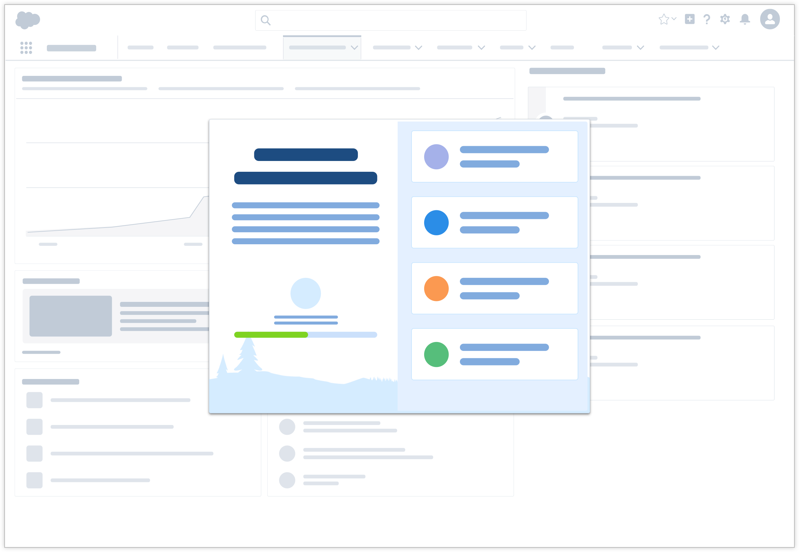
Lightning Experience Welcome Mat. Lay out the welcome mat for new users with onboarding resources such as videos and Trailhead modules. Use Salesforce's default content or display your own custom content. If you’re customizing, you can control the welcome mat that appears for first-time Lightning Experience users and for those automatically switched to Lightning Experience on a daily or weekly basis. Learn more about customizing the welcome mat here.
Feature prompts and setup assistants can be added programmatically to your custom application to boost adoption and onboarding. To get started, see the SLDS blueprints for Feature Prompts and Setup Assistant. Walkthroughs can also be added using custom code and the walkthrough prompt blueprint, or you can use a Salesforce partner solution such as Pendo, WalkMe, or Improved Apps. Emulate Salesforce's own trial experience in your custom applications with the trial bar blueprint shown here. Most empty state messages are automatically provided by the platform; to configure a custom empty state see these guidelines.