Global Search
Search is the most used feature in Salesforce, and users expect it to be fast, intelligent, and simple. With global search, users can get right to records and apps by entering simple keywords or using powerful advanced search features.
Default State
Global search lives in the header of your app, where it’s highly discoverable and always available for your users.

Placeholder Text
The placeholder text intelligently adapts to the page a user is on in the org, and lets them know what types of results to expect. For example, the placeholder text may read "Search Setup" when the user has navigated to the Setup page, or "Search Groups and more..." when the user has navigated to the Groups tab.

Focus
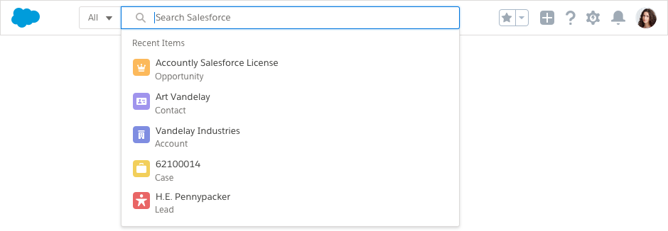
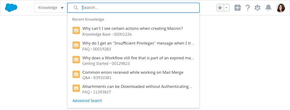
When a user first clicks into the search input, the user's five most recently used records and apps appear in a dropdown list.
Each item shows the object icon, the record name, such as "Vandelay Industries", and the object name, such as "Account".
Instant Results
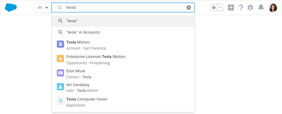
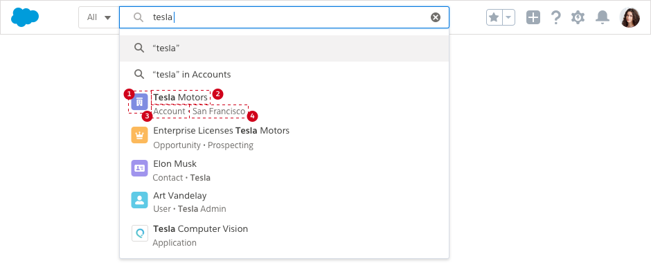
As the user types, the top five results are shown instantly, allowing users to find what they need without pressing Enter to run a full search.
The secondary field, also called the disambiguation field, provides more context and makes it easier to find the right record in a limited interface. For example, the secondary field for an opportunity may read "Opportunity - Prospecting", allowing the user to learn the stage of the opportunity without having to click on the item.
After the user has typed a character into the input, a "clear" icon appears in the input, making reformulation easy.
Behavior
Instant results is flexible and can support various user needs. From within the instant results dropdown, users can:
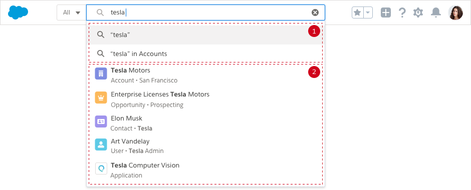
- Use search shortcuts. Shortcuts provide search options for users. The first option is the default action taken when the user presses Enter. Secondary shortcuts include options that allow users to search within the object they're on, pre-scope searches (that is, limit a search to a specific object before entering their keywords), and search other objects. Limit the number of shortcut options to three to avoid pushing the search results too far down.
- Find records and apps without being exact. Instant results supports stemming (returning different forms of a word), synonyms (when synonyms are enabled in an org), and spell-correction.
Relevance Indicators
Several visual cues help users quickly find the right record:
- Icons help users instantly identify frequently used objects and apps.
- The record name shows highlighted matched characters.
- The object type clearly identifies a record when the user isn’t familiar with the object icon.
- A secondary field, also called the disambiguation field, helps users differentiate similarly named or duplicate records. Characters matching the user's search term are also highlighted here.
Feedback
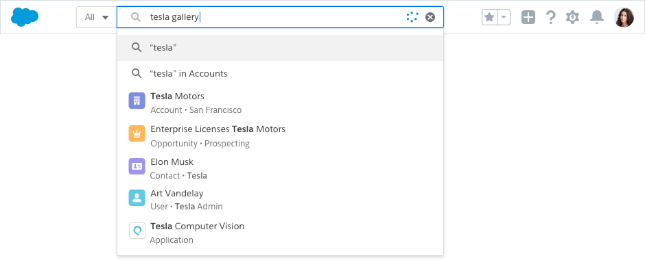
Users on slow or mobile connections may experience some performance degradation when results are being returned as they type. Showing a spinner in the input lets the user know that search is still working in the background.
Pre-Scoping
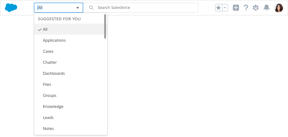
When users know exactly what they need, they can narrow their search to only the record type they need at that moment by selecting an object from the combobox in front of the search input. When focused, the combobox expands and the user can type the name of the entity they want to search against.
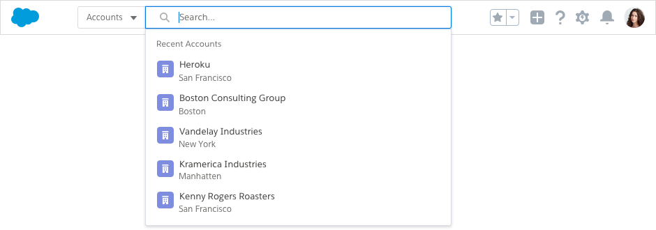
Selecting an entity from the combobox narrows the scope of the user's search to that record type.
Pre-Filtering
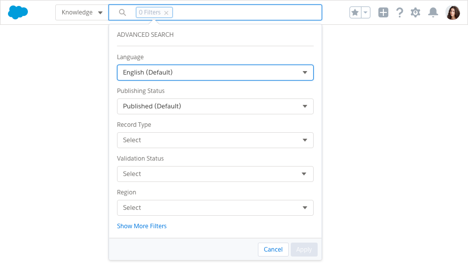
Pre-filtering gives users even more control over what’s searched. Once the user chooses a record type, a secondary link, titled "Advanced Search", can be displayed to give users advanced search options.
Clicking the "Advanced Search" link in a Knowledge example produces a popover with options like Language, Publishing Status, Record Type, Validation Status, and Region, as well as an option to Show More Filters. Clicking save in this popover adds another pill to the input with the number of filters applied, like "2 Filters".
Results
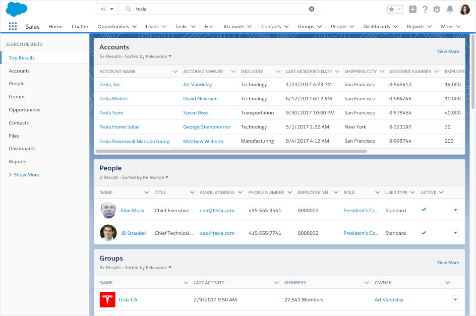
When your users execute a search, we query objects based on personalized usage and intelligent prediction. Those results are returned on a "Top Results" page that groups results together, making it easy to scan relevant results of different record types.
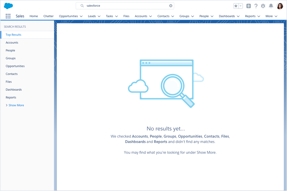
No Results
Even when there are no results, users should have an idea of what they can do next. Should they look for more results, create a new record, or check out Trailhead?
