Popovers
Popovers calls attention to a problem or a potential problem with a field or record.

Usage
- Visual: Visible
- Voice & Tone: Conversational—Informational
- Motion: Static—Delicate
- Duration: Dismissible
- Audio: Muted
A popover can show one of the following states:
- Error: to communicate error messages after a user submits their data.
- Warning: when the system nudges the user to engage with a record that hasn’t had recent activities.
A popover contains a title and body with optional inline links.
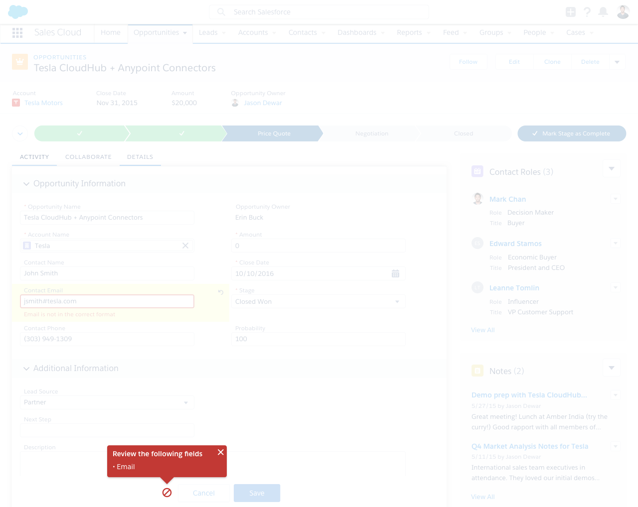
In error scenarios, a red alert icon is displayed to the left of the action buttons (typically Save and Cancel). The popover is also red and appears above the icon. An error popover is displayed in conjunction with one or more field level error messages. This is more noticeable than an inline message but still doesn’t block other components. Show error popovers by default (after user submits the form, if there are errors). In case of multiple errors, the body text can be a bulleted list.

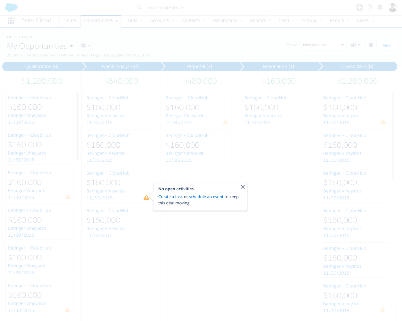
In engagement/warning scenarios, the relevant item displays a yellow alert icon, and the popover typically appears to the right of the icon. Users display engagement popovers by clicking the icon. Don’t show engagement popovers by default.

Popover in Context
Dos and Don’ts
Do
- Do use animation to show/hide the popover.
- Do make sure that links and the close button inside the popover are accessible via keyboard.
Do not
- Do not use error popover outside of forms.
- Do not use warning popover liberally. Make sure the criteria for calling a warning popover is flexible enough so the user doesn’t constantly feel pestered.
Variants - State
Variants - Screen Size
N/A (do not use this pattern in mobile)
UI Text
| State | Example Title | Example Body |
|---|---|---|
| Warning | No open activities | |
| Error | Review the following errors |
|
Recommended Specs
Refer to this code sample for the popover markup.
| Description | Token | Value |
|---|---|---|
| Fade in & fade out duration | $duration-promptly | .2s |
| Sliding distance | $spacing-medium | 16px |