Zoom Controls
Guidelines
Zoom controls let users magnify or minimize their screen view.

Introduction
Use a Button Group to create a zoom tool that allows users to magnify or minimize the screen view, zooming in or out on items viewed.
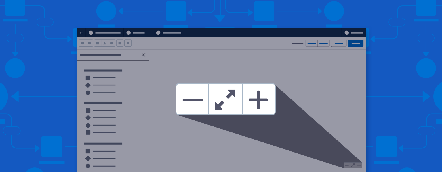
The preferred mode is incremental zoom, a button group using the minus, plus, and expand/contract icons. Users can click to incrementally zoom out (-) or zoom in (+), and can toggle between zoom-to-fit (contract) and zoom-to-100% (expand) views of the canvas.
Note: Use Utility icons: dash, expand_alt, contract_alt, add.
Start using our Design Kits
Open in FigmaUsage
When first opening a record, users view the canvas at 100%, with the first node in a workflow at the upper left of the canvas. Zooms in and out are based on the current center point of the canvas in view; users can pan to shift the center point.
If a user clicks on a node or other canvas element, that element becomes the center point of any zooming action.
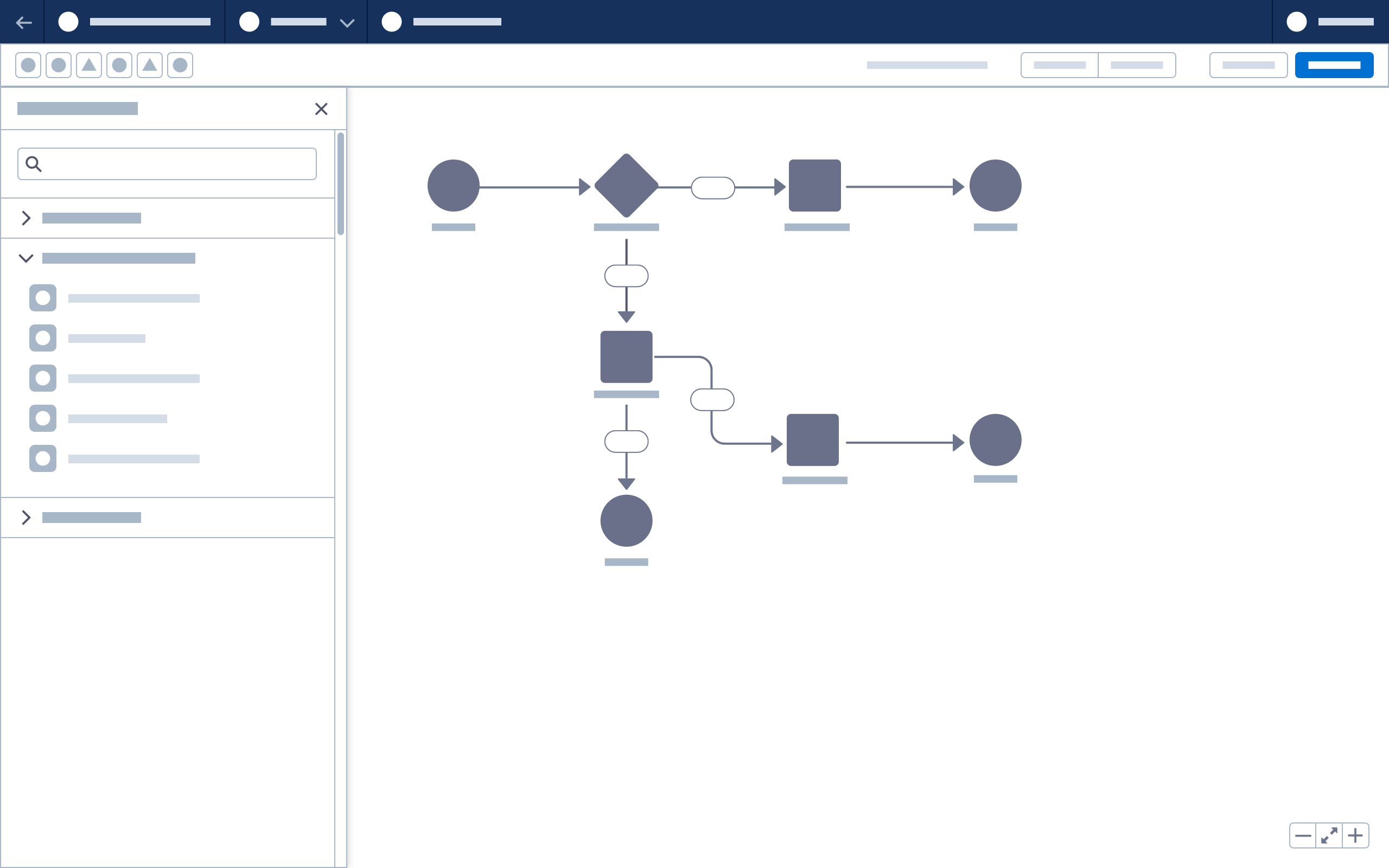
- Place the zoom button group inside the canvas, ideally at the bottom right, as shown below.
- Set canvas zoom speed at 250ms per increment.
- When maximum or minimum zoom threshold is reached, disable the corresponding - or + button.


Toggle Zoom Variant
Toggle zoom lets users switch between two views, 100%, and zoom-to-fit. If zoom functionality is controlled in the toolbar, use toggle zoom.
