Deeper Learning
Guidelines
Learning is an ongoing journey. Users who are new to a product or feature and expert users alike can benefit from ongoing learning opportunities.
Introduction
Great content turns customers into Trailblazers. Great learning experiences contain more than content alone. To take advantage of all a product has to offer, many users seek out deeper learning experiences, encompassing a wide range of resources:
- Explanations of products and features, and how they work together
- Examples showing the best ways to use the product
- Tips and shortcuts to help users be more efficient and productive
- Videos showing highlights of the product or good ways to optimize the user experience
- Practice using the features in a safe environment before making changes in production
- In-app achievement markers, such as Trailhead badges or custom rewards, help gamify the learning experience and keep users engaged
A strong learning strategy uses effective patterns informed by a thoughtful content strategy and compelling content—whether you're engaging with users in the first 30 seconds or after months of experienced use.
Start using our Design Kits
Open in Figma
Usage
Users wanting, or required, to learn more can seek out learning via resources such as Trailhead. Make your learning content searchable in these channels, taking search engine optimization into account.
Opportunities for deeper learning should also be interwoven throughout your product—in the UI itself as well as within other user engagement patters, wherever more advanced users might benefit from a deeper understanding. Use links to more information in these user engagement components.
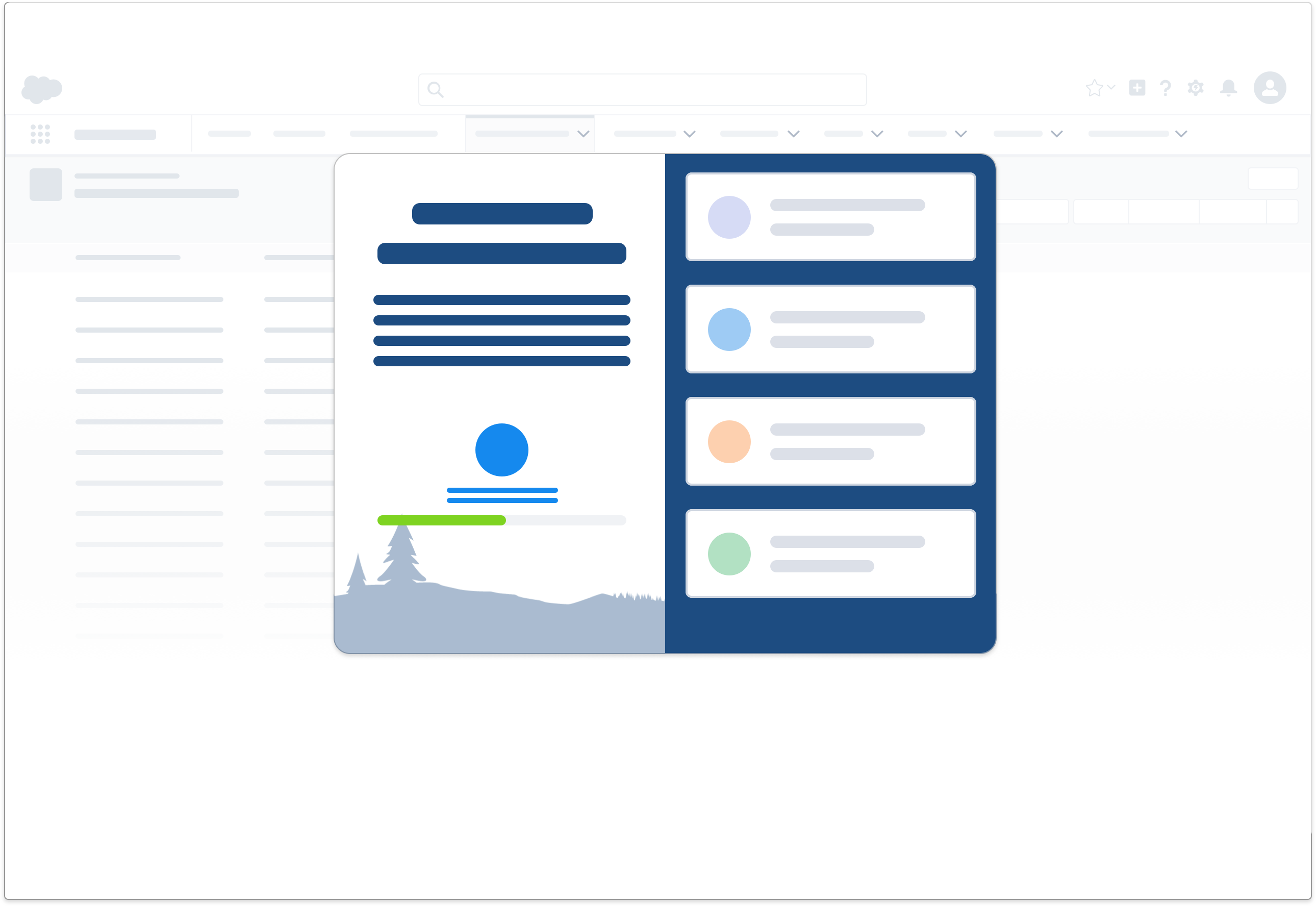
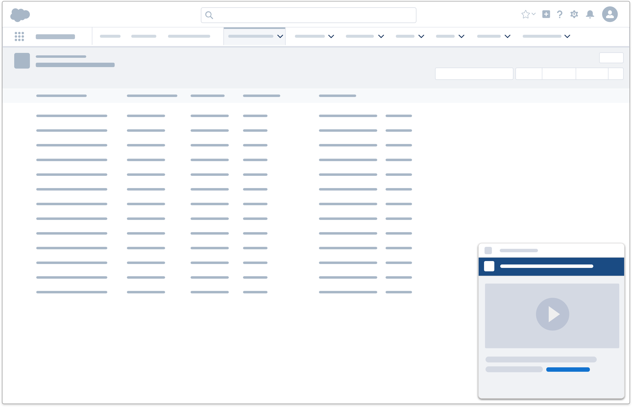
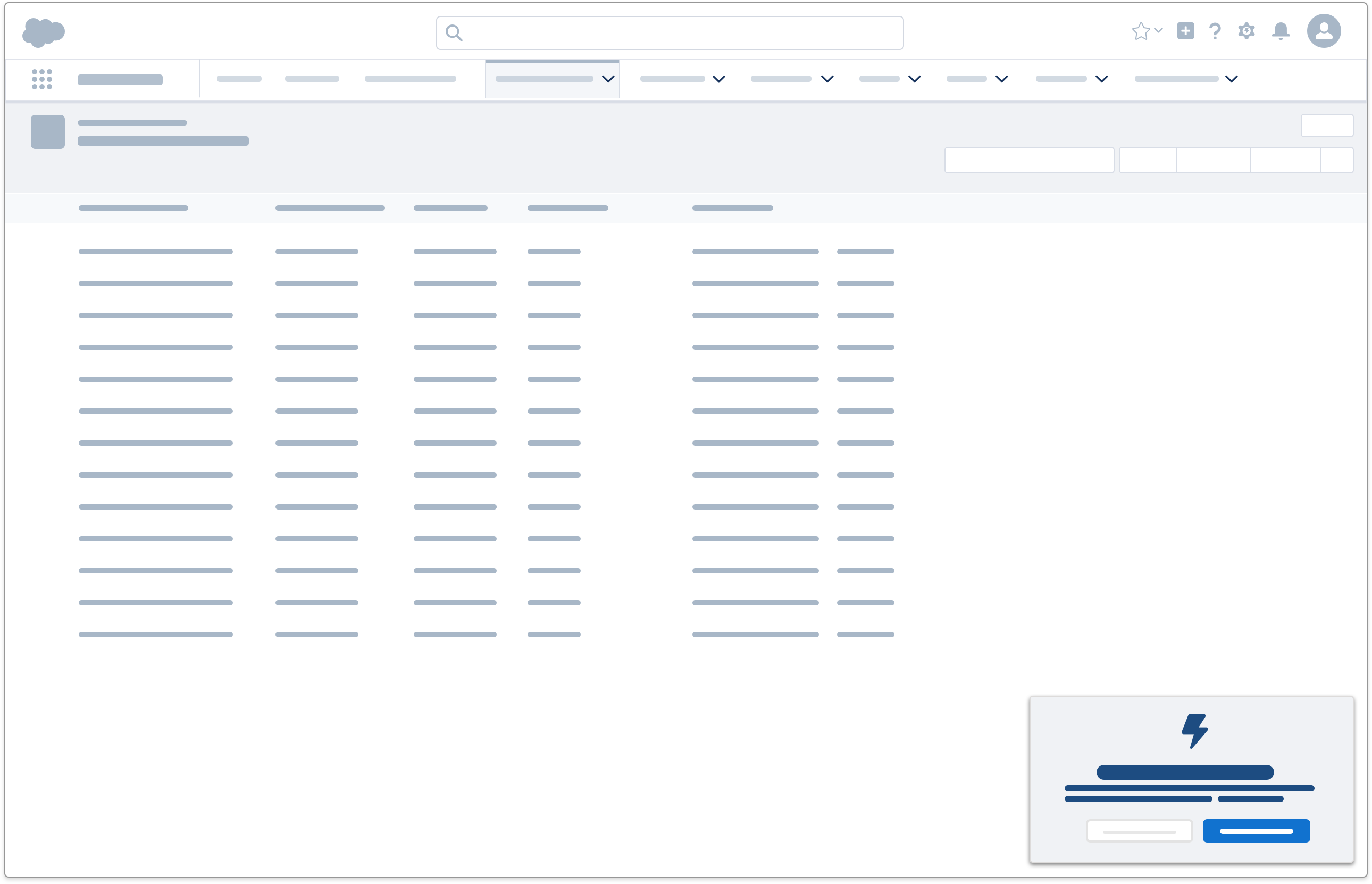
- Welcome Mat: Link to walkthroughs, videos, or Trailhead to guide users through more complex concepts or tasks.
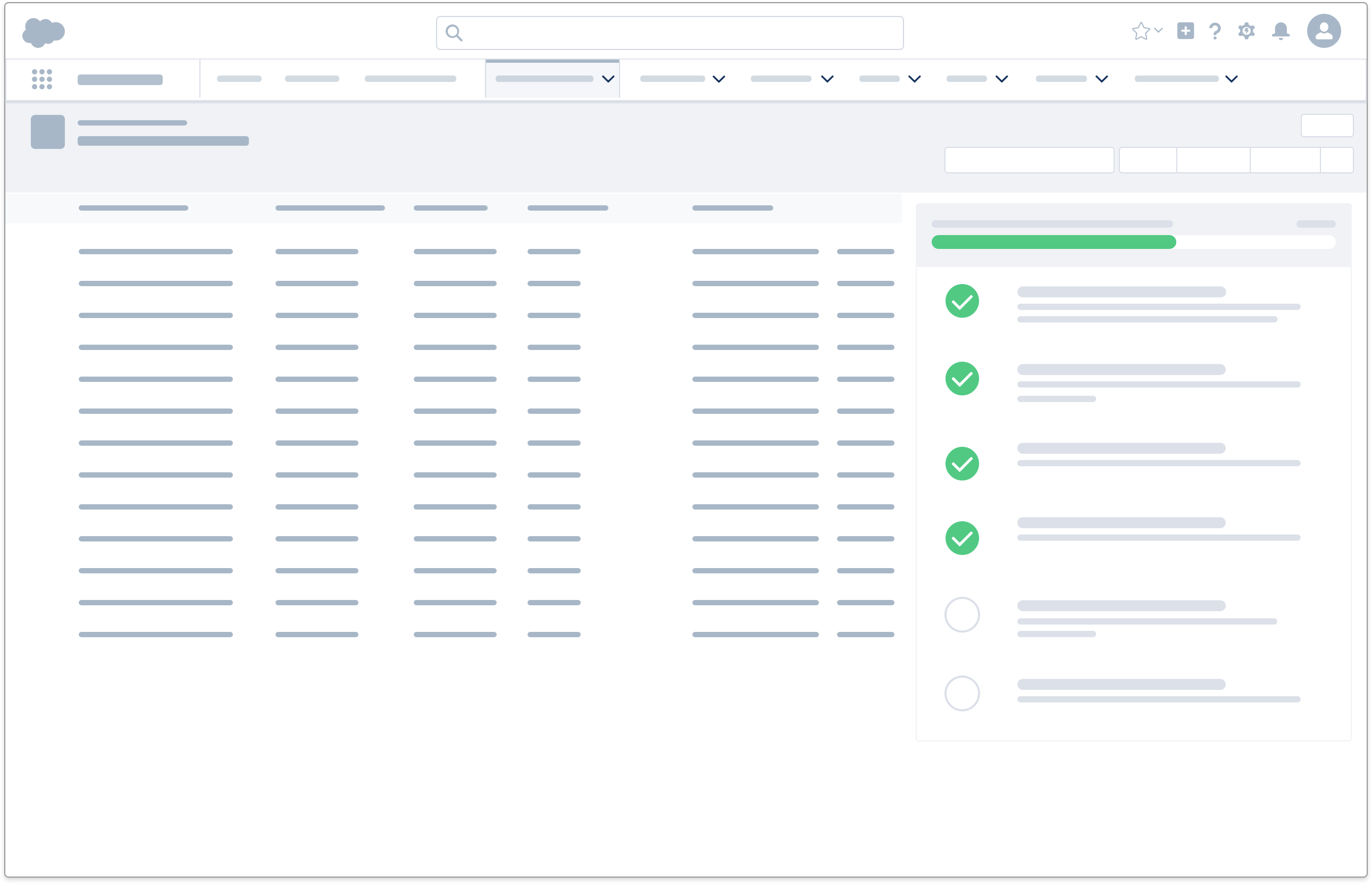
- Setup Assistant: Link to walkthroughs or concept help topics to explain why something is configured in a certain way.
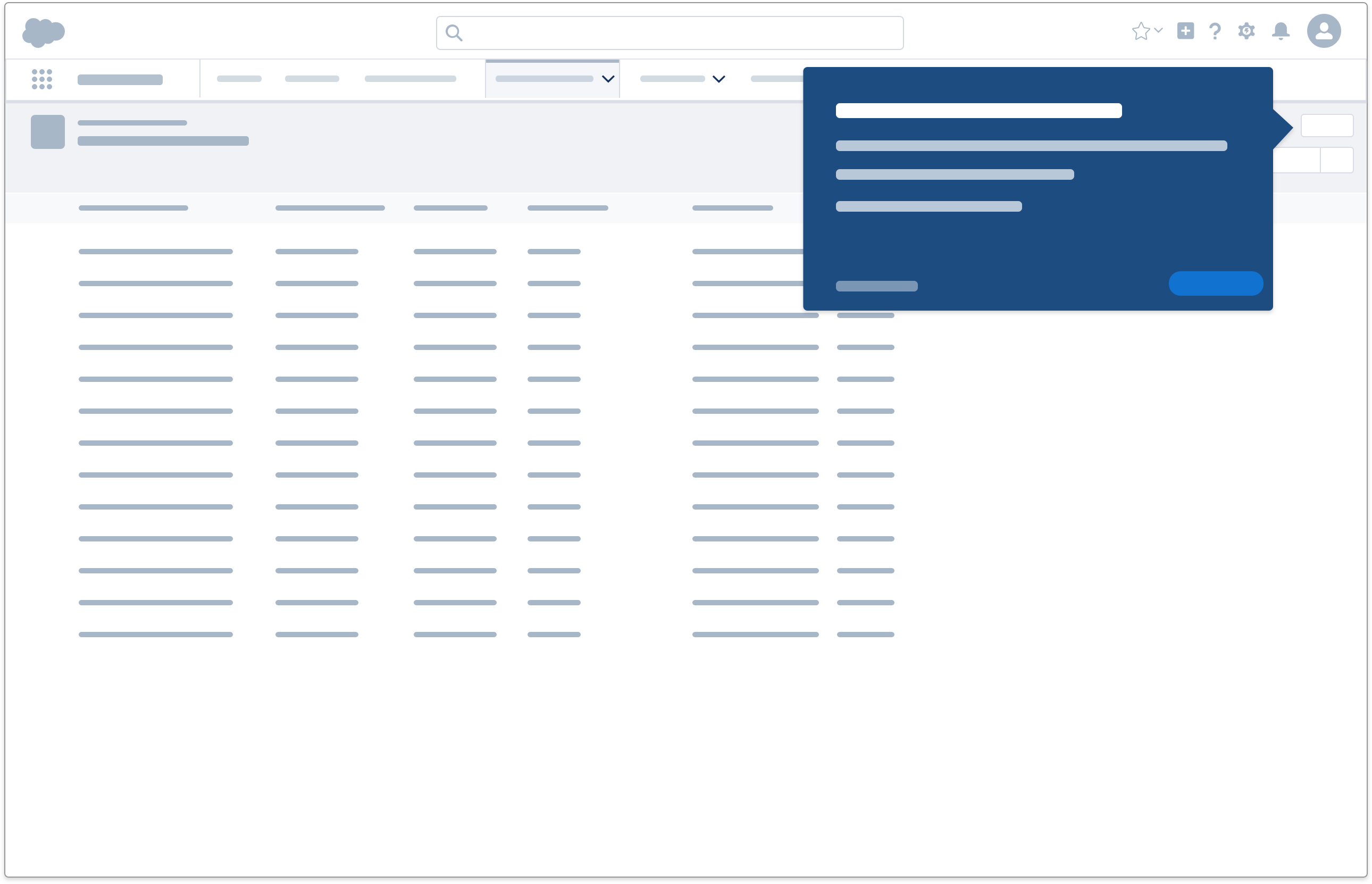
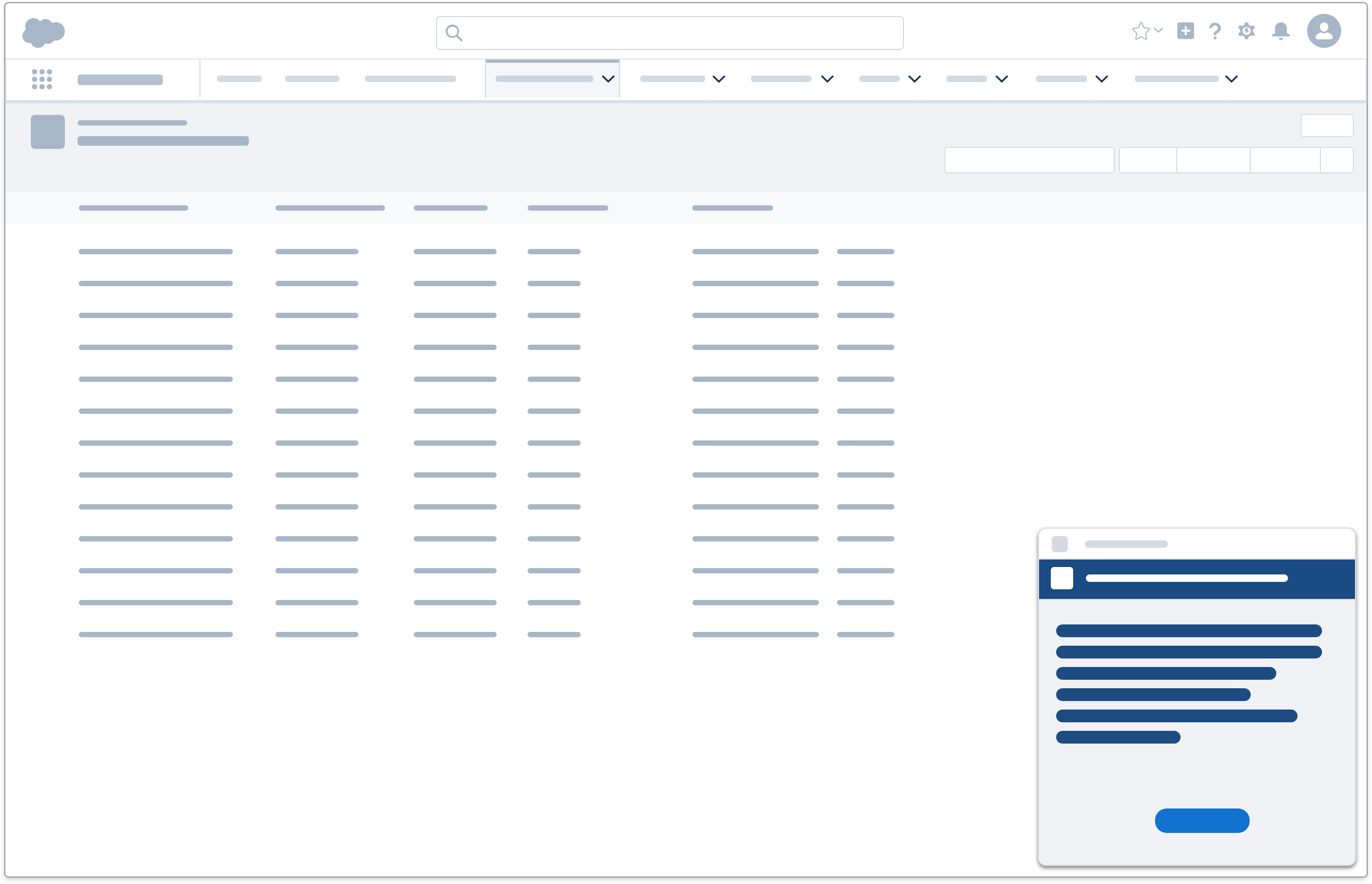
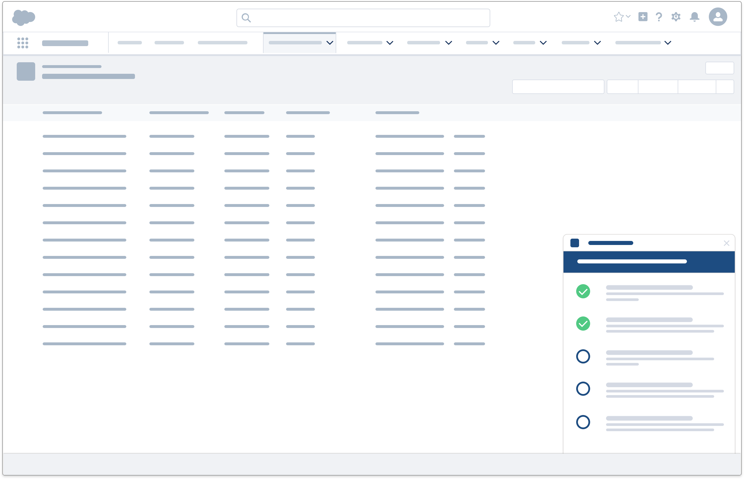
- Feature Popover and Docked Assistant: Link to help topics to provide more detailed explanation about the purpose and benefits of the feature you're calling users' attention to.
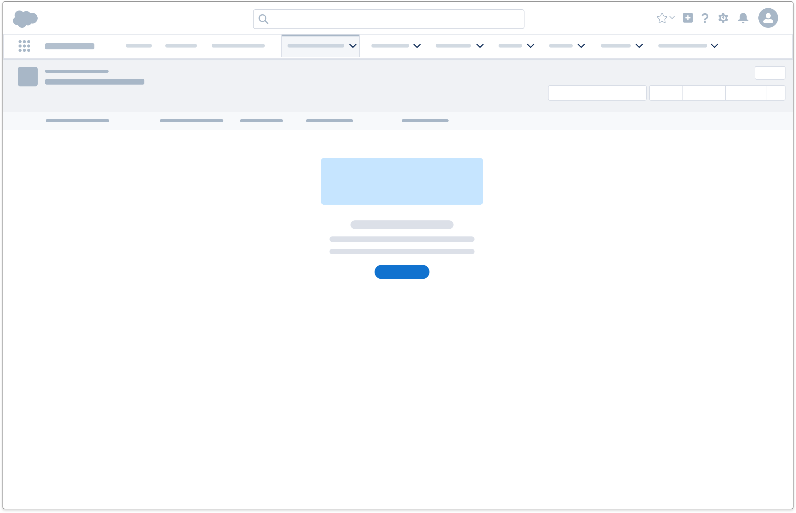
- Error Message and Empty State: Link to help topics containing more information about the issue the user's running into and what can be done to resolve or work around it.