Messaging States
Messaging state informs the UI text’s voice & tone. In keeping with messaging principles, the UI text should be informative and actionable (when possible).
Empty
Empty state can appear in these scenarios:
- A component on a page has no item to show
- A page has no item to show
Each of the scenario above shows the empty message a little differently. Below are some guidelines around what components to use for each case.
Empty component
If… a component on a page has no item to show,
Then… show inline text inside the component.
Empty page
If… a page has no item to show,
Then… load the page with illustration & inline text.

Error
Error state can appear in these scenarios:
- A user submits a form that contains error on one or more fields
- A user completes an action (e.g. submitting a form), but system-related issues prevent the action to be truly executed
- A card’s content cannot be loaded
- A system-related error is affecting the user’s current session
- A system-related error occurs at random
- A page’s content is inaccessible (e.g. it cannot be found, user doesn’t have sufficient privilege, etc).
- A process that the user initiated (e.g. data import) has errors.
Each of the scenario above shows the error message a little differently. Below are some guidelines around what components to use for each case.
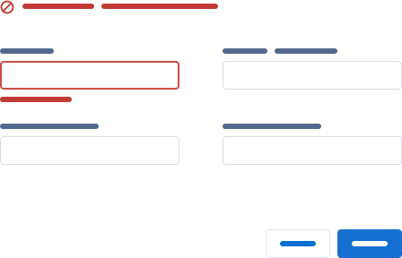
Form Field Error
If… a user submits a form that contains error on one or more fields,
Then… show inline text & pair it up with popover.
The field-level inline text displays error message relevant to that field (e.g. phone number cannot contain letters), whereas the popover shows a high-level summary (e.g. Review the following fields: phone number).
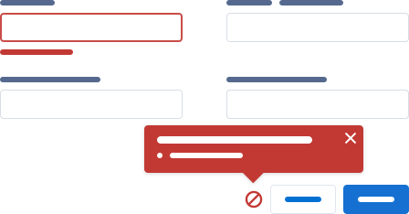
Alternatively… if you cannot use a popover in your design, show inline text (+ icon variant) instead.
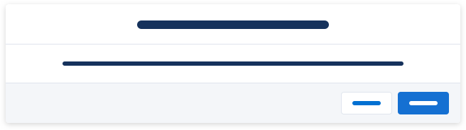
Incomplete Action Error
If… a user completes an action, but system-related issues prevent the action to be truly executed,
Then… display an error toast after the action fails to finish.
Use the “title & description” variant if you need to display additional information.
This should appear rarely and generally should not be a part of a typical user flow.

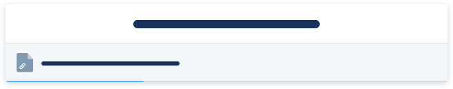
Card Content Error
If… a card’s content cannot be loaded,
Then… show error inline text inside the card.
System Error (Current Session)
If… a system-related error is affecting the user’s current session,
Then… display an alert while the user is using the application.

System Error (Random)
If… a system-related error occurs at random,
Then… call a prompt to notify the user.
Note that a prompt should appear rarely and generally should not be a part of a typical user flow.

Inaccessible Page Content
If… a page’s content is not accessible after the user tries to open it,
Then… load the page with illustration & inline text.
Process Error
If… a process that the user initiated (e.g. data import) has errors,
Then… alert the user via notification.
Informational
Informational state can appear in these scenarios:
- An item has an atypical status, e.g. duplicates
- A user completes an action, but there are some additional info to be shown
- An admin-related status applies to user’s current session
- The system is unavailable, e.g. under maintenance
- The system needs to relay information that’s important but not immediately work-stopping
- The system needs to inform the user about a relevant activity that happened in a different part of the application.
Each of the scenario above shows the informational message a little differently. Below are some guidelines around what components to use for each case.
Item with Atypical Status
If… an item has an atypical status,
Then… show inline text with an icon on top of the content.

Additional Information After a Successful Action
If… a user completes an action, but there are some additional info to be shown,
Then… display an informational toast.
Use the “title & description” variant if you need to display additional information.
For example, a user may have successfully added 100 people to a campaign, but 20 of those were already in the list. The system still added the remaining 80, but it’s useful to tell the user that 20 of them were in the list to begin with.

Admin-related Status
If… an admin-related status applies to user’s current session,
Then… display an alert while the user is using the application.

System is Unavailable
If… the system is unavailable,
Then… load the page with illustration & inline text.
System Information
If… the system needs to relay information that’s important but not immediately work-stopping,
Then… call a prompt to notify the user.

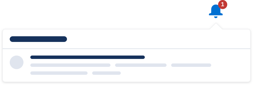
Activity Update
If… the system needs to inform the user about a relevant activity that happened in a different part of the application,
Then… alert the user via notification.
Offline
Offline state appears when the system detects that the user isn’t connected.
If… the system detects that the user isn’t connected,
Then… display an alert until the user is back online.

Success
Success state can appear in these scenarios:
- An action that requires user’s manual input (e.g. submitting a form) is successfully completed
- An action that is triggered automatically (e.g. auto-saving a note) is successfully completed
- A process that the user initiated (e.g. data import) is successfully completed
Each of the scenario above shows the success message a little differently. Below are some guidelines around what components to use for each case.
Manual Action
If… an action is completed after user’s manual input,
Then… display a success toast afterward.

Automatic Action
If… an action is completed automatically,
Then… show inline text afterward.
In this case, the success message is likely to appear frequently, so we want to use a component that is the least obtrusive.

Process Success
If… a process that the user initiated (e.g. data import) is successfully completed,
Then… alert the user via notification.
Transient
Transient state appears when the system is processing an action, e.g. saving, loading, sending email, etc.
If… the system is processing an action,
Then… show inline text and remove it when the system is done processing.
If… the system is processing file upload(s),
Then… show a modal with progress bar and remove it when the system is done processing.
Warning
Warning state can appear in these scenarios:
- The system detects potential issues with the form a user is working on (e.g. duplicates)
- The system nudges the user to engage with a record that hasn’t had recent activities
- A user cannot complete an action due to external factors (e.g. permission) rather than something they can fix right away (e.g. form error)
- A system-related issue is affecting the user’s current session
- A user is about to commit an action that is destructive, has major impacts, or abandons incomplete action
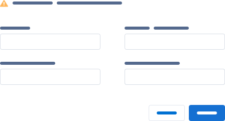
Form Warning
If… the system detects potential issues with the form a user is working on,
Then… show inline text (+ icon variant) on top of the form as soon as it loads.
Outdated Item
If… the system nudges the user to engage with a record that hasn’t had recent activities,
Then… show a popover next to the item in question.
This typically appears in a list/card view, where many records are displayed on the page; the icon would appear inside the affected card.

Incomplete Action Warning
If… a user cannot complete an action due to external factors,
Then… display a warning toast after the action fails to finish.

System Warning (Current Session)
If… a system-related issue is affecting the user’s current session,
Then… display an alert while the user is using the application.

User Confirmation
If… a user is about to commit an action that is destructive, completes an action that has major impacts, or abandons incomplete action,
Then… call a modal to ask for user confirmation.