Messaging Overview
The Lightning Messaging Framework is a design guideline for messaging patterns in the Salesforce ecosystem.
Effective messaging instills trust in the system, communicates relevant information, & creates moments of delight for the user.
General Guidelines
How do I determine the appropriate messaging for x when y happens?
- Select the appropriate messaging type based on user’s interaction with the application
- Pick a messaging component from the category that…
- Makes sense given the user flow & the UI
- Has the appropriate level of prominence
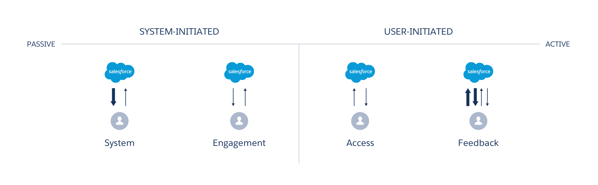
- Examine which messaging state best characterizes the message.
| Messaging Type | Inline Text | Popover | Notification | Toast | Alert | Illustration & Inline Text | Modal | Prompt |
|---|---|---|---|---|---|---|---|---|
| System | Yes | No | Yes | No | Yes | Yes | No | Yes |
| Engagement | Yes | Yes | Yes | No | No | Yes | No | No |
| Access | Yes | No | No | No | No | Yes | No | No |
| Feedback | Yes | Yes | No | Yes | No | No | Yes | No |
Principles
Keep these principles in mind when you design messaging for your feature/product
- Timely, not noisy.
Deliver messages at the right time. Not every interaction requires messaging to go with it. - Informative, not verbose.
Say what’s necessary and not much more. - Actionable, not static.
Enable shortcuts for relevant actions to improve efficiency. - Cross device, not duplicative.
When appropriate, alert users on all their devices, but clear the messaging once user has read it.
Icons
Icons may be used in messaging components. Follow these guidelines when deciding which icon to use in your messages.
| Icon | Use when… |
|---|---|
Error | Something is erroneous. |
Info | Additional information is available. |
Offline | User is in offline mode. |
Success | An action was completed. |
Warning | Something is potentially problematic. |
User | User-related message is shown. |
Wrench | Maintenance-related message is shown. |
Example Usage
A salesperson just got off a call to discuss a potential sale of 100 widgets with ACME that’s been in the pipeline for a while. The sale finally went through, but some of the numbers also changed. She goes into the application and updates this record so the data is properly tracked. What should be the application’s response to show that the record is saved?
First, examine the user interaction in this flow to determine the messaging type.
- User initiated the interaction.
- Since it is user-initiated, the possible messaging types for this flow are “access” and “feedback.”
- The record is accessible, and the user successfully saves their changes. Given that, we are left with one option.
- Messaging Type: Feedback
Next, let’s take a look at the components.
- Based on the guideline, we have these components available for feedback messaging: text, popover, toast, & modal.
- Inline Text is used for empty and inaccessible states in feed/card/related list, field-level error message, or in-between states (saving, loading, etc.). We need something more prominent to display a success message.
- Popover is used to either “engage the user and nudge them to take an action” or “communicate error messages after a user submits their data.” Neither of which applies to this example.
- Toast serves as a “confirmation mechanism after the user takes an action… [and] in conjunction with create/edit/delete actions.”
- Modal acts as “a warning mechanism to ensure the user action is intentional and not accidental.” In this case, the action is completely intentional (editing the record) and no warning is needed.
- From the list above, it seems like toast is the right pick. Check to see if it’s the right level of prominence given the UI.
- Messaging Component: Toast
Finally, determine the messaging state.
- In this case, the user successfully saved the changes they made to the record.
- Messaging State: Success
So what should be the application’s response to show that the record is saved successfully? Based on the analysis above, the application should show a success toast.