Illustration & Inline Text
Guidelines

Illustration & Inline Text work in tandem to communicate a state in a more friendly way.
Usage

- Visual: Pronounced
- Voice & Tone: Informational
- Motion: Static
- Duration: Permanent
- Audio: Soft (or Vibrate)
Illustration & inline text is used to show one of these states:
- Empty: when there is no record in the current page or there isn’t any item that needs attention.
- Informational: when system is under maintenance.
- Error: when a page is not found, user doesn’t have sufficient privilege, or other miscellaneous error (often related to inaccessible content).
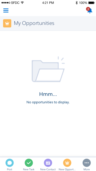
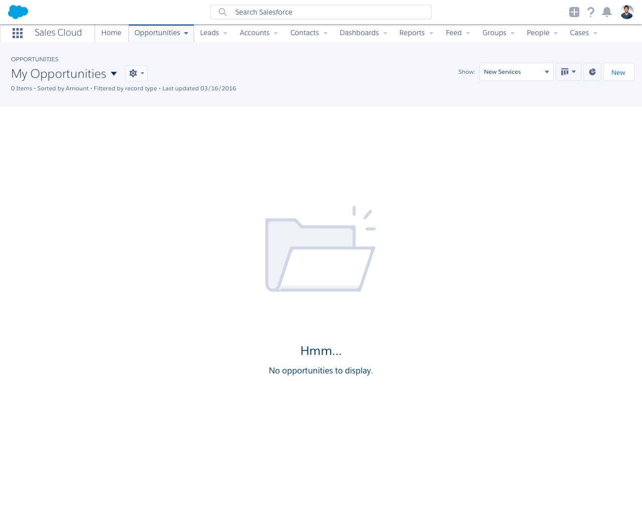
Illustration & Inline Text in Context


Dos and Don’ts
Do
- Do use illustrations to soften negative impacts on the user. When a user expects to see an item but finds out that they can’t, the experience leaves a negative impression on them—illustrations help reduce this.
- Do include actionable text to guide the user. For instance, if the user is seeing an empty list page, include a link in the accompanying text to create a new record.
Do Not
- Do not use illustrations inside related lists or cards. For these, plain inline text is enough.
- Do not display more than one illustration component on a page. Illustrations should not be competing with each other for user attention.
- Do not use illustrations as feedback for direct CRUD actions. Look into toasts or popovers instead.
Variants - Component
Illustrations can either exist as a full page, in the main body, or in the sidebar.


Variants - State
In general, illustration & text show one of three states (empty, informative, or error), but the individual illustration & UI text will vary depending on the context. Below are some commonly used examples, but you are not limited to these variants.

Hmm…
No opportunities to display.

Collaborate with others
No updates here yet.

We are down for maintenance
Sorry for the inconvenience. We’ll be back shortly.

You’re not connected to Google Drive
Let’s get you authenticated.

Page not available
Maybe the page was deleted, the URL is incorrect, or something else went wrong. If you know the page exists but you still can’t get to it, please visit our support page.

You don’t have access to this page
If you think you should have access, ask your admin for help.

Page not available in Lightning Experience
Sorry about that.

Data not available
The data you’re trying to access isn’t available. It might be due to another user deleting it or a system error. If you know the data isn’t deleted and you can’t get to it, please visit our support page.

Walkthrough not available
You may not have access to the items this walkthrough points to. Ask your administrator for the appropriate permissions for this feature and try again.

Can’t connect!
The page didn’t load. Please try again later.
Variants - Screen Size

We are down for maintenance
Sorry for the inconvenience. We’ll be back shortly.
- 300px max width
- 180px max height
- Smaller text
UI Text
UI text can vary greatly case to case, depending on the context. The guidelines below serve as examples, but you are not limited to them.
| State | Title | Body |
|---|---|---|
| Empty | Hmm… | |
| Empty | Collaborate with others | No updates here yet. |
| Informational | We are down for maintenance | |
| Informational | You’re not connected to Google Drive | Let’s get you authenticated. |
| Error | Page not available | |
| Error | You don’t have access to this page | |
| Error | Page not available in Lightning Experience | |
| Error | Data not available | |
| Error | Walkthrough not available |
Recommended Specs
Desktop
| Description | Token | Value |
|---|---|---|
| Title text | $font-size-heading-large | 24px |
| Body text | $font-size-text-medium | 16px |
| Text color | $color-text-weak | #54698d |
| Maximum image width | - | 600px |
| Maximum image height | - | 360px |
Mobile
| Description | Token | Value |
|---|---|---|
| Title text | $font-size-text-x-large | 20px |
| Body text | $font-size-text-small | 13px |
| Text color | $color-text-weak | #54698d |
| Maximum image width | - | 300px |
| Maximum image height | - | 180px |