Validation
Guidelines
Validation identifies, and suggests solutions for, invalid components.
Introduction
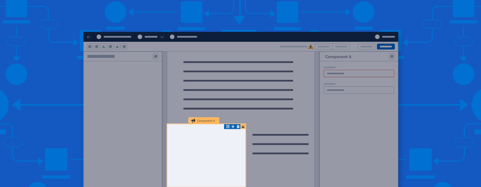
Validation alerts users to invalid components and offers possible solutions.
- If a builder allows saves with invalid components, the validation alert is called a warning.
- If a builder only allows saves using valid components, the validation alert is called an error.
Start using our Design Kits
Open in FigmaUsage
Validation should be implemented as a system, with warnings or errors appearing in the header, on the canvas, and in any relevant panels.
Make validations that require attention easily discoverable. Users should also be able to hide alerts on the canvas, to maintain a clear WYSIWYG view.
Validation can take several forms:
- For builders that allow saving or secondary actions when invalid components exist, any warnings are highlighted in the header, canvas, and panels. A confirmation modal confirms a save or secondary action (such as publishing) despite warnings.
- For builders that don’t allow saving or secondary actions when invalid components exist, errors are highlighted in the header, canvas, and panels. Errors must be fixed before saving or using a secondary action.
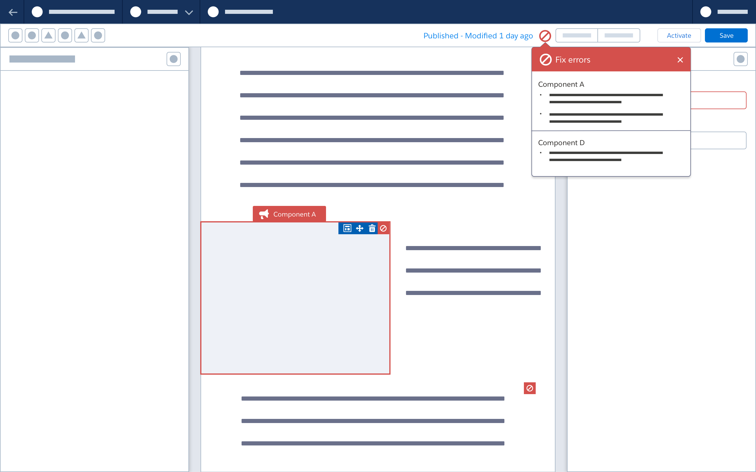
- If warnings and errors exist at the same time, both should appear in the header. Saving and secondary actions should be prohibited until all errors are fixed.
Accessibility Note: When building validation, work with Engineering to specify and implement screen reader notifications.
Variations
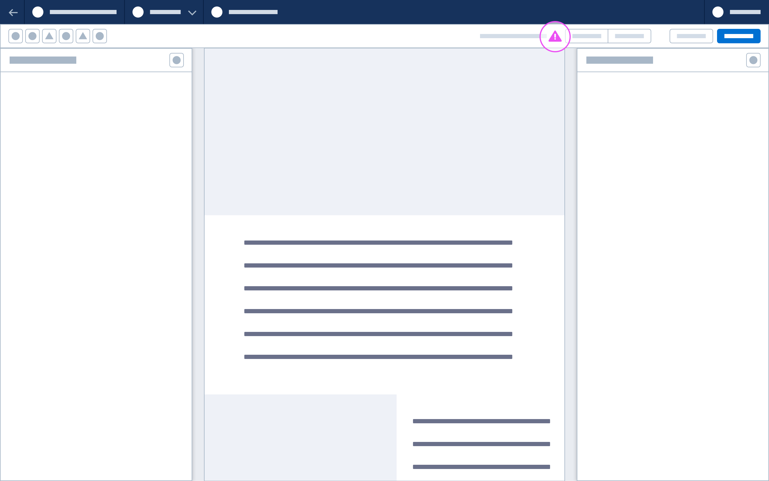
Warning Icon
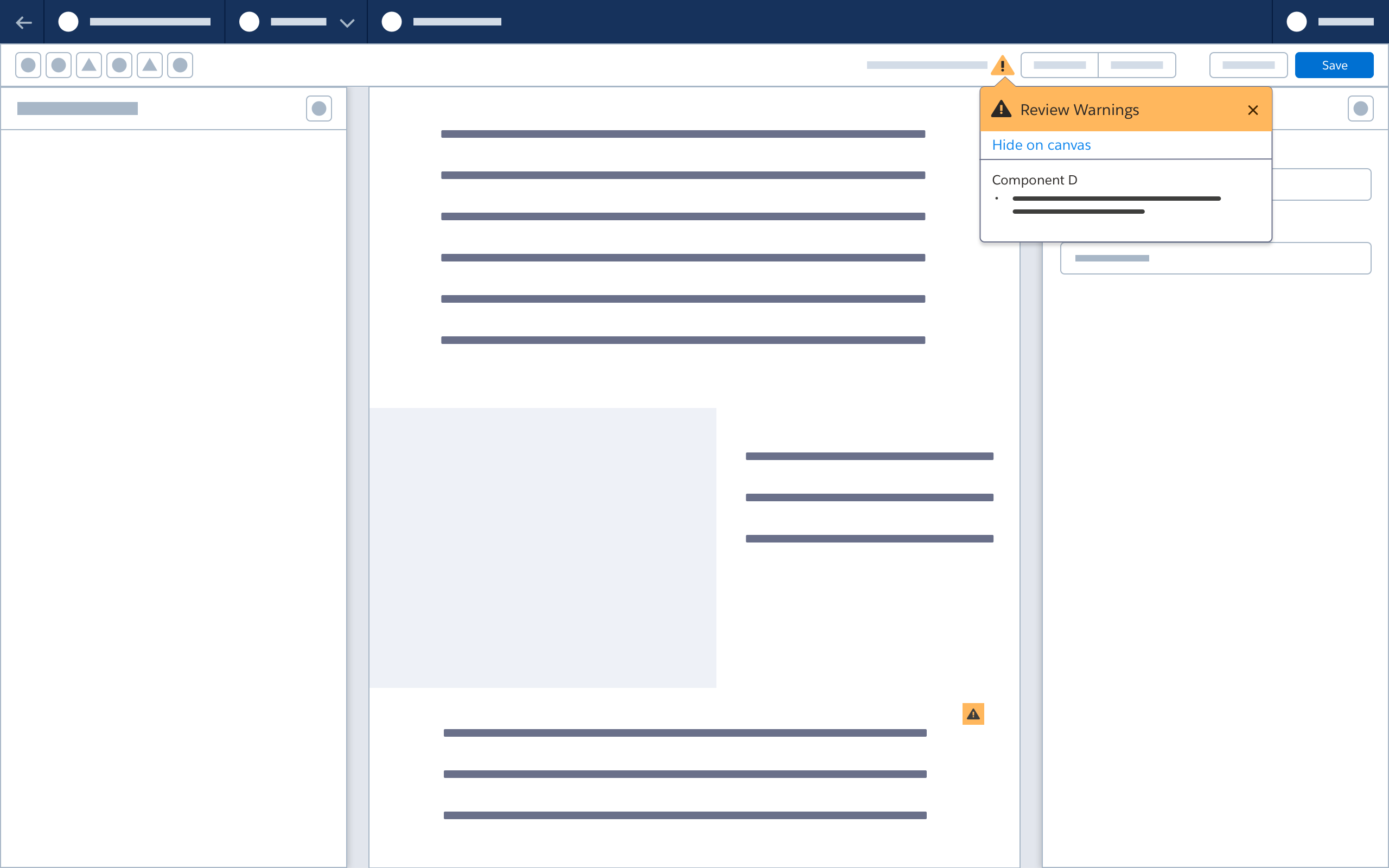
The Warning icon appears in the builder header to alert users to issues that don’t prevent saving or secondary actions.
Warning Popover
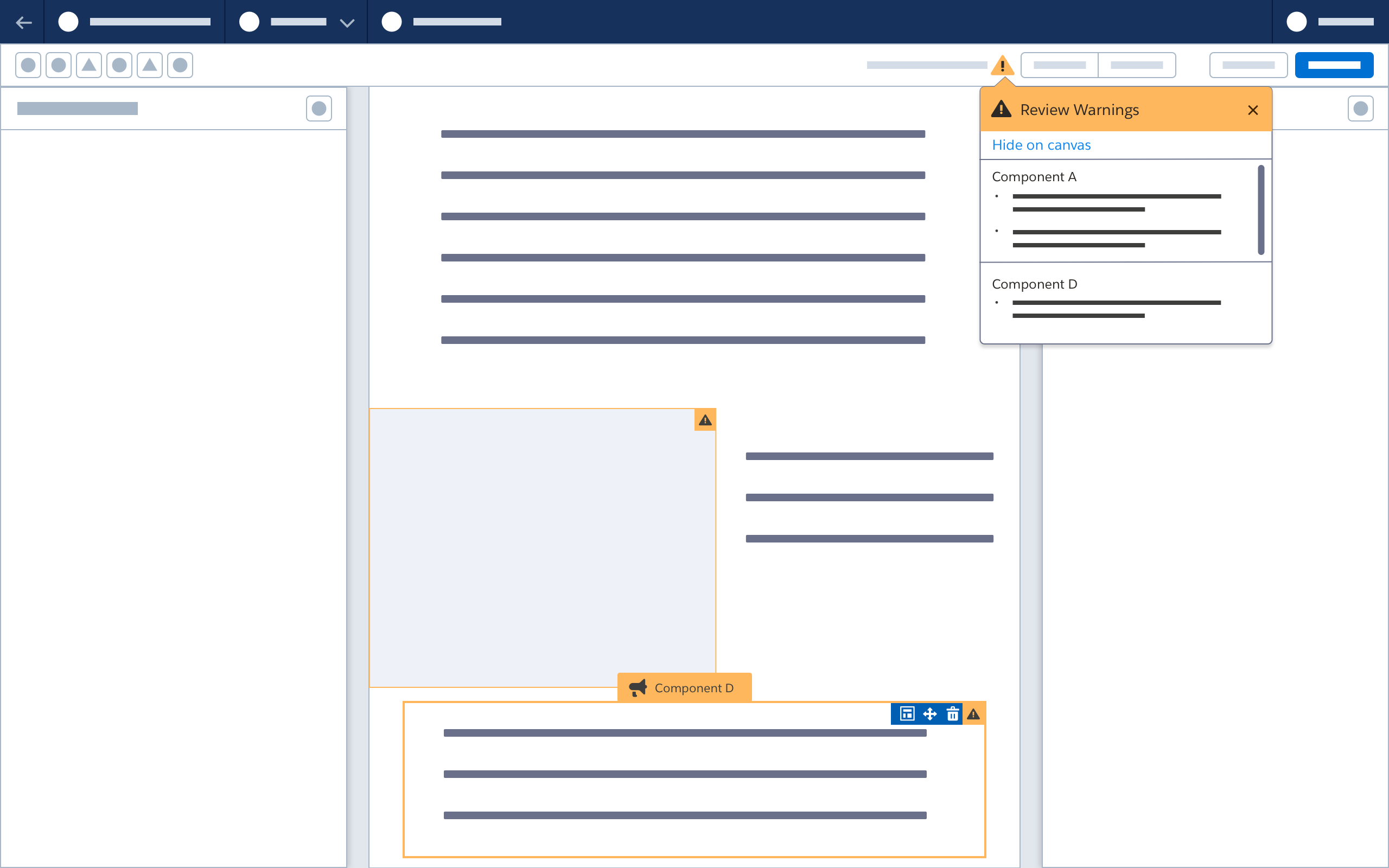
When a user clicks the Warning icon in the toolbar, a warning popover dropdown appears, and warning icons are highlighted on invalid components.
When the user clicks the warning popover dropdown:
- If the associated component is not in view, pan until component is in view and is triggered to the warning-related select state.
- A property sheet opens in the right panel, highlighting any invalid fields.

Hiding Alerts on the Canvas
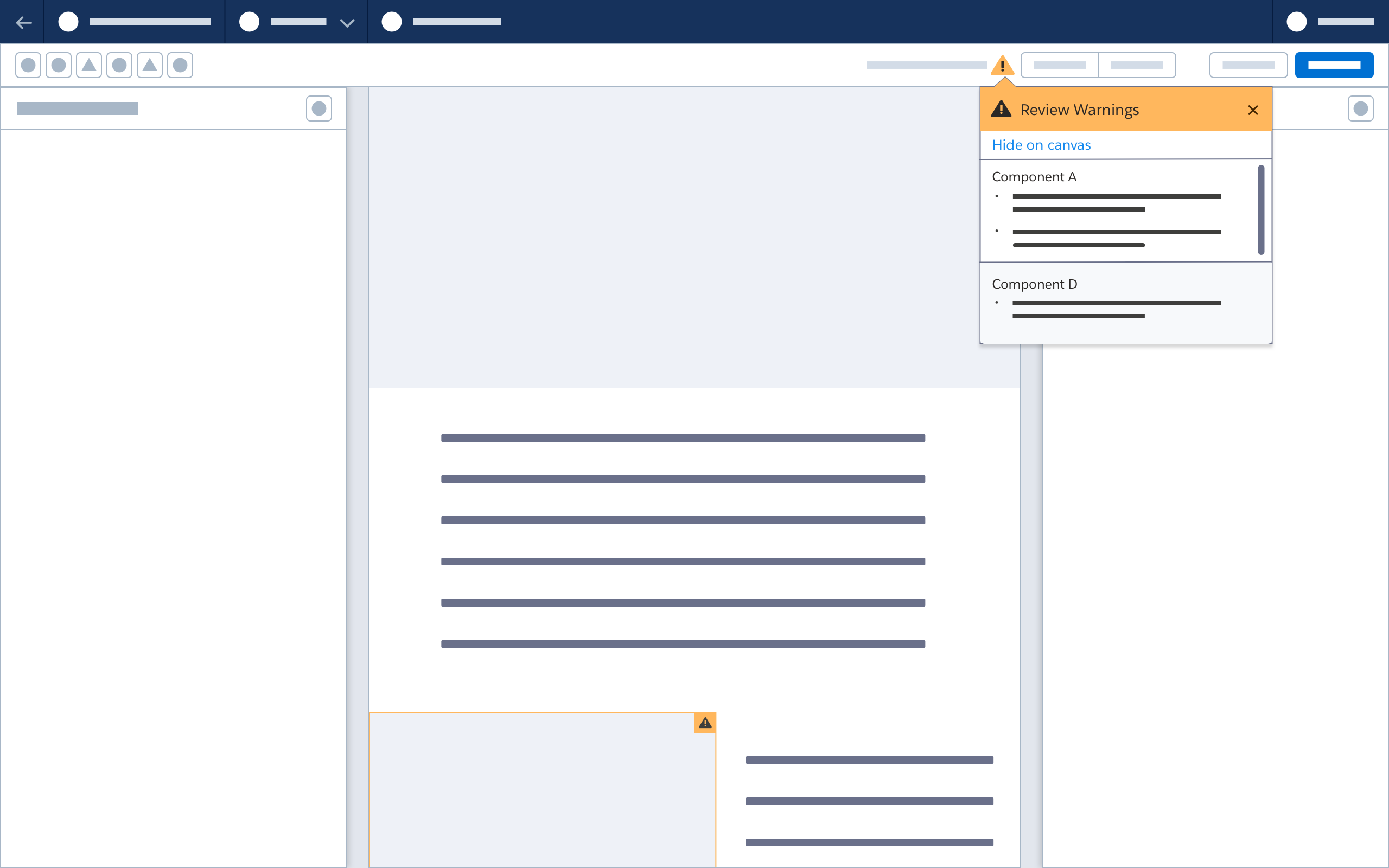
When the user selects the Hide on Canvas button:
- Warning icons on all components are hidden.
- The button name becomes Show on Canvas. Clicking this button is the equivalent of clicking the warning icon in the header; all warning icons reappear on the canvas.
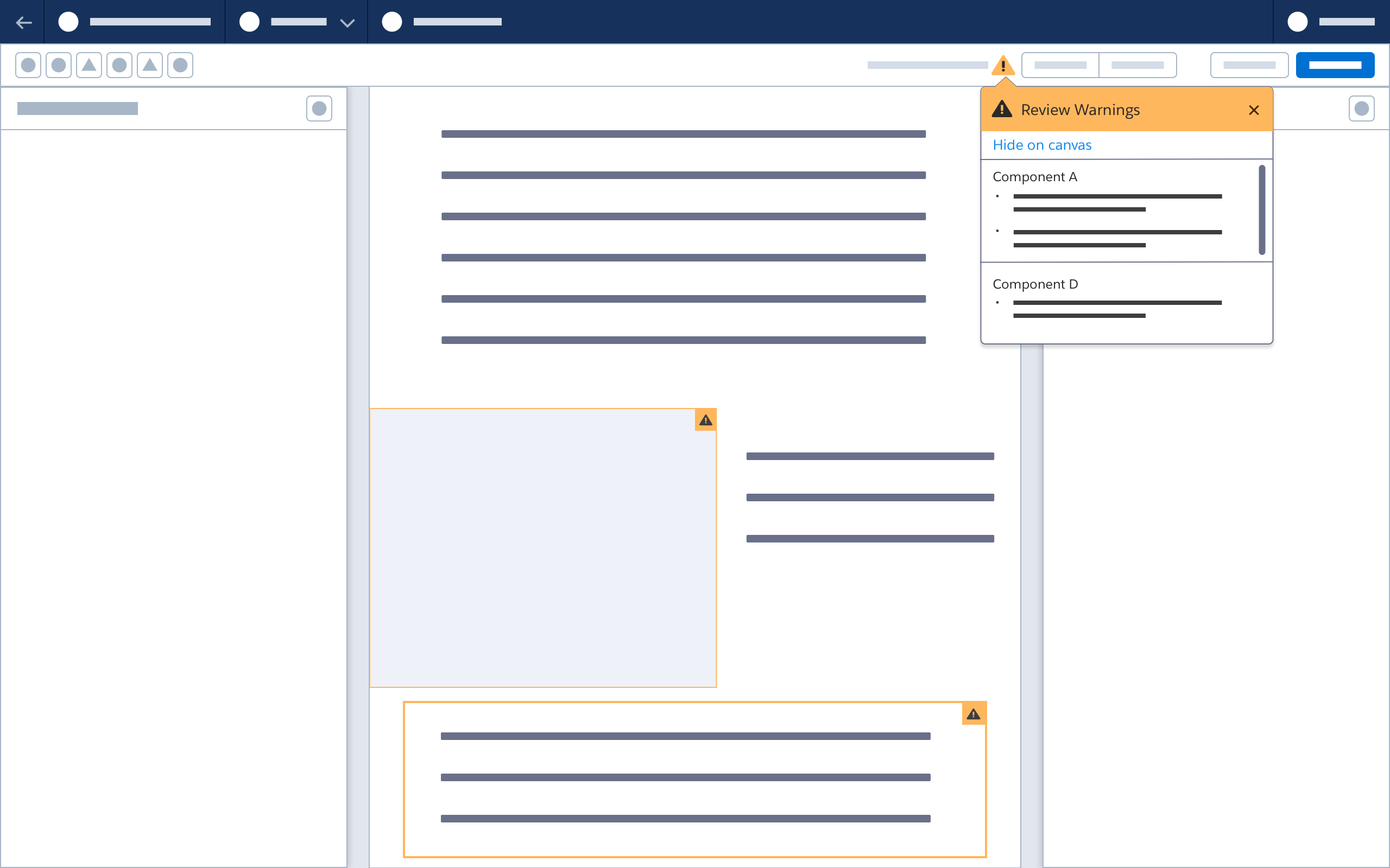
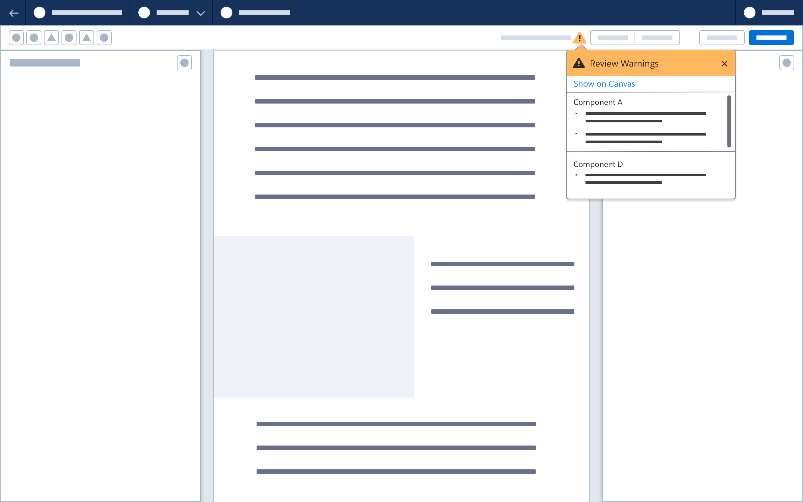
Invalid Components
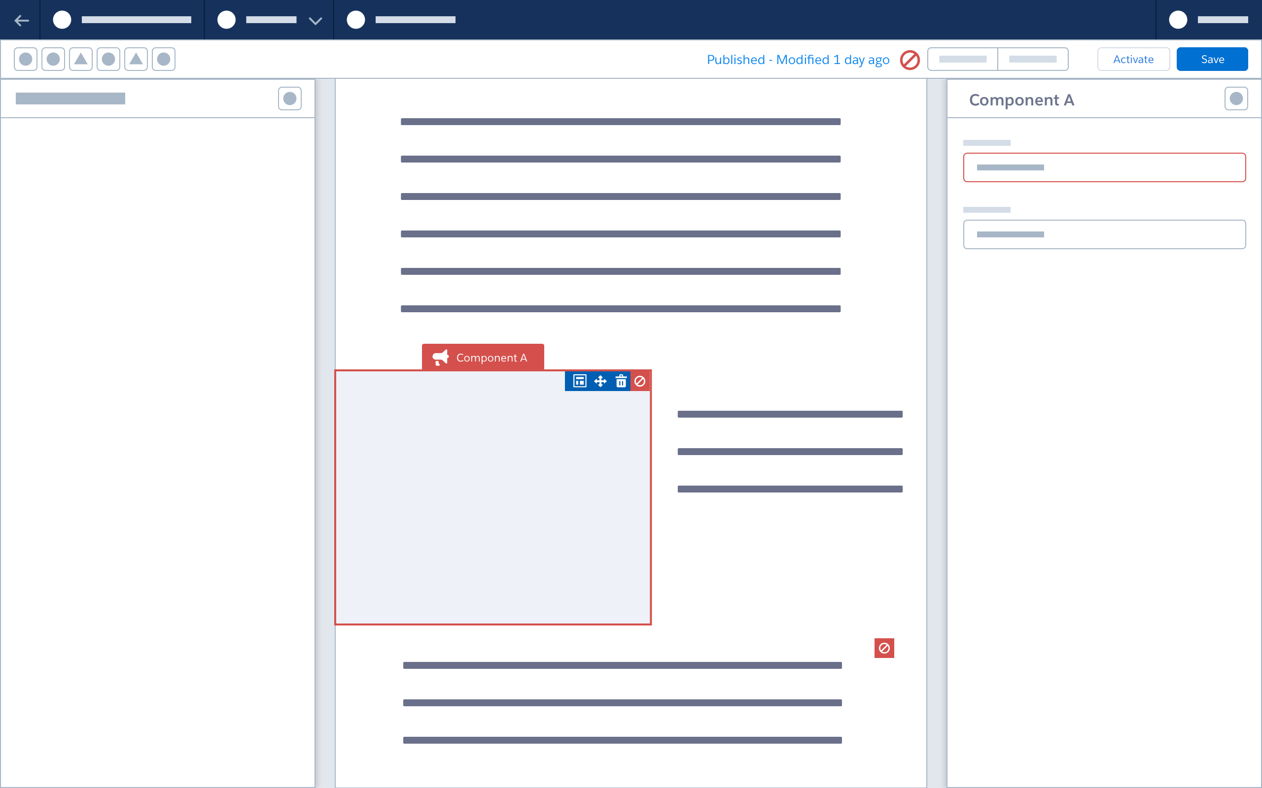
When the user hovers over an invalid component, it enters a state similar to the select state.
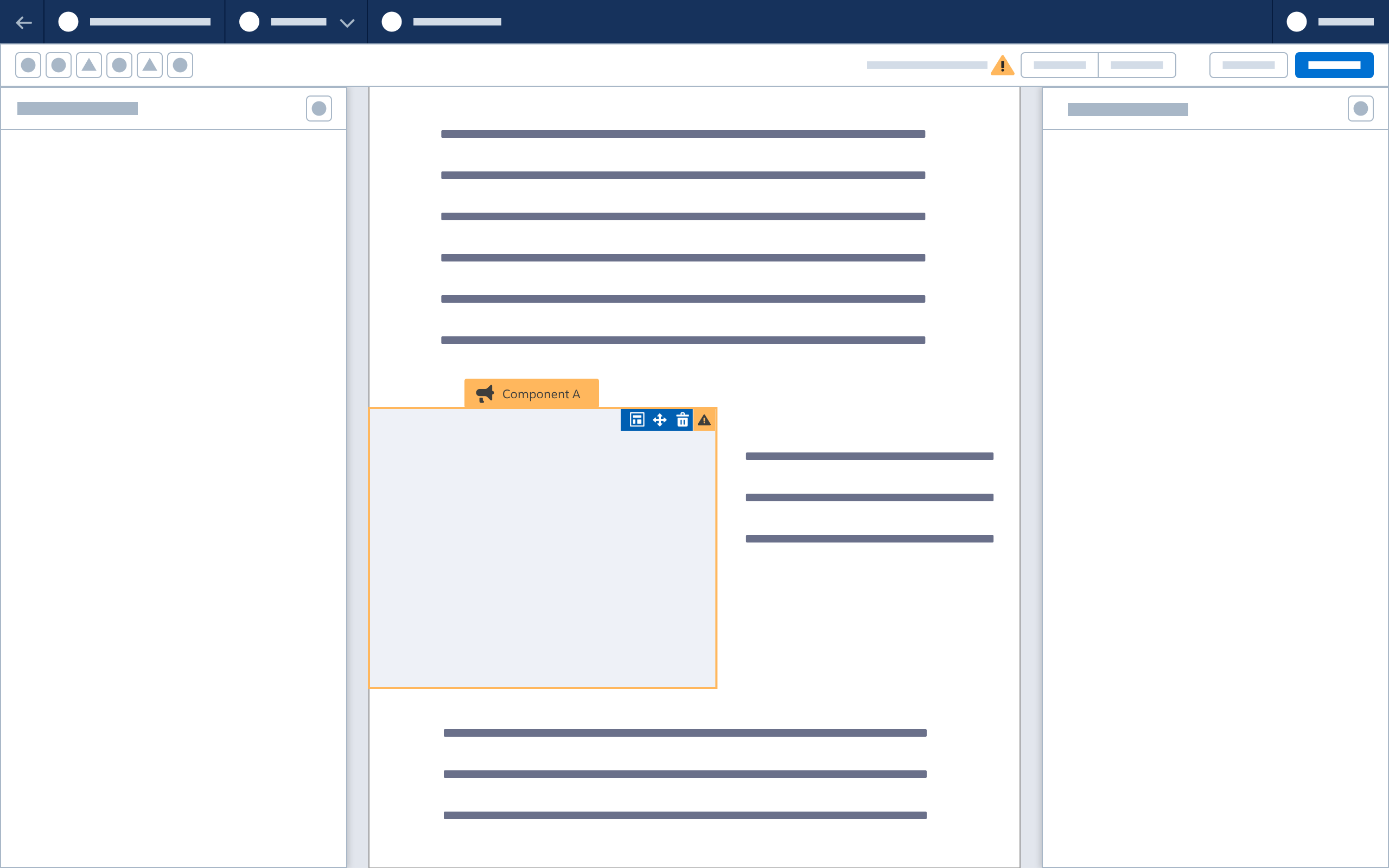
When the user hovers or clicks a warning icon on an invalid component, a popover appears showing warning(s) for that component.
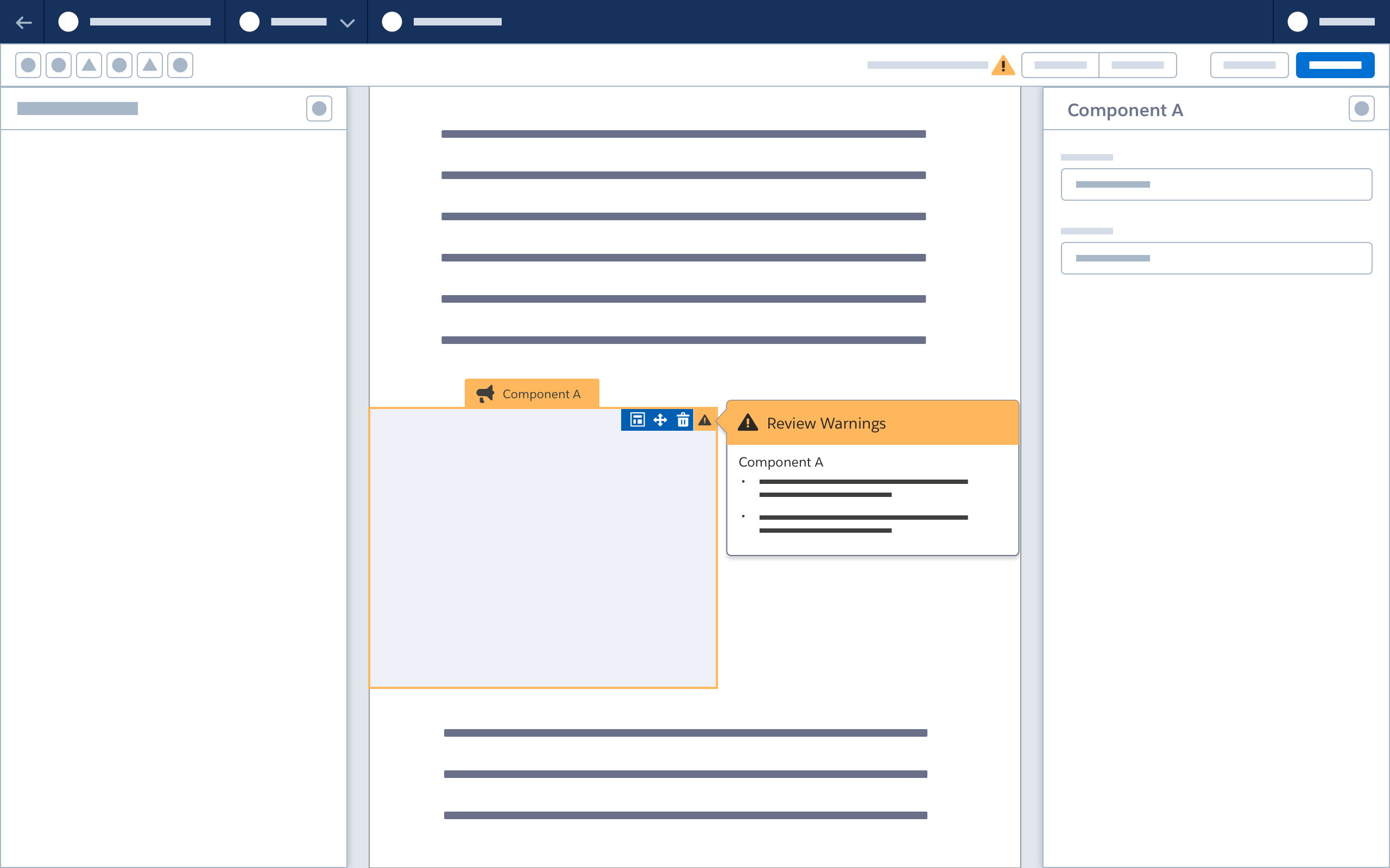
When the user selects an invalid component, a property sheet appears, with invalid fields highlighted.

When all issues are addressed, the component’s select state updates; it is no longer invalid.
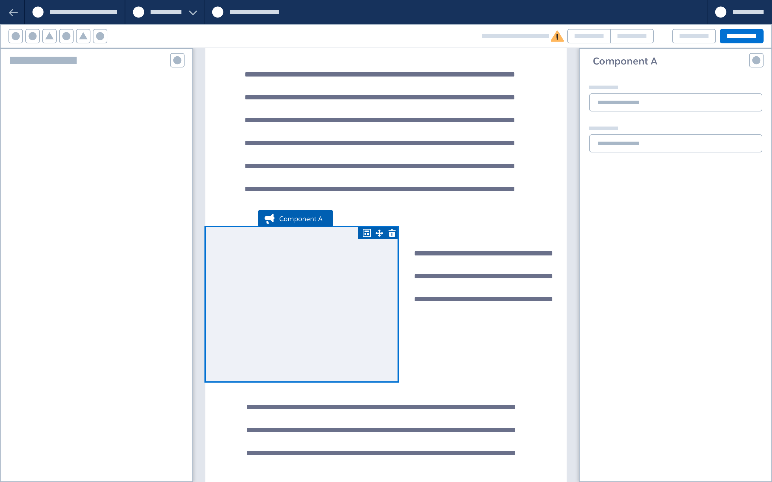
Confirmation Modal
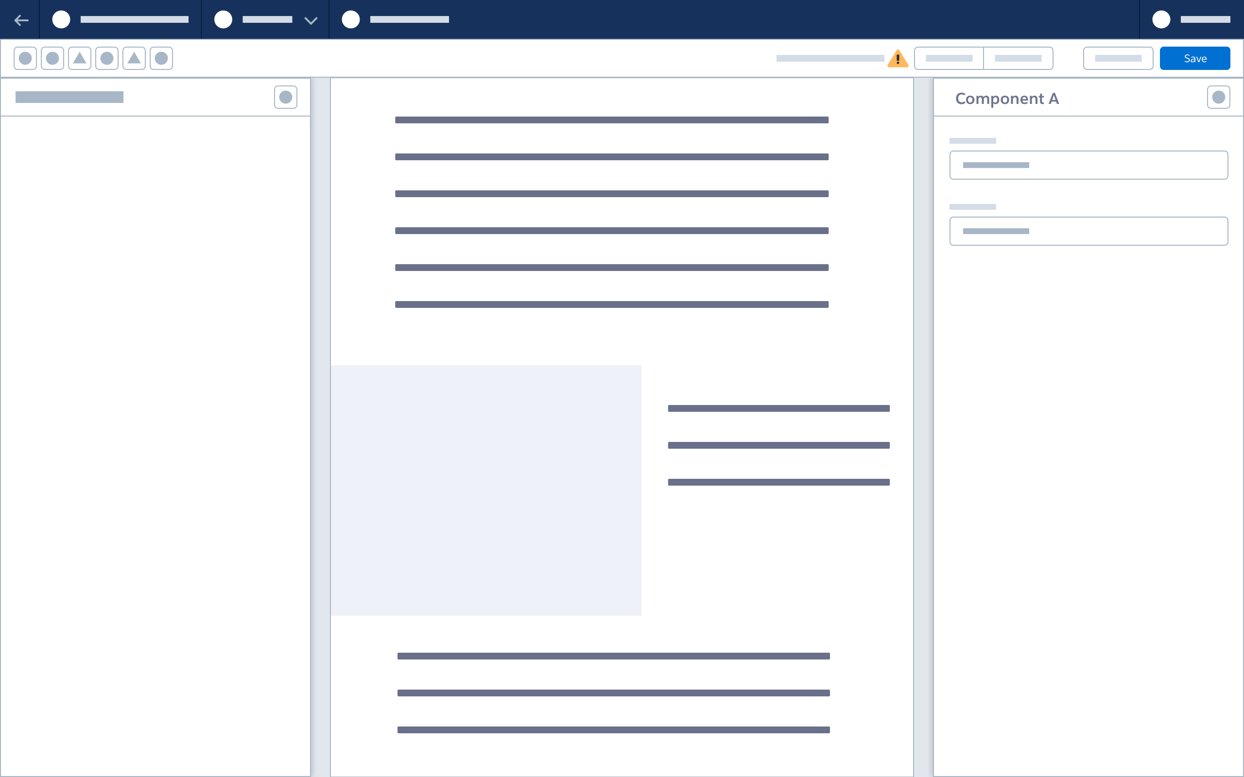
When the user selects Save, a confirmation modal displays existing warnings. The user can review the warnings, or choose to save.
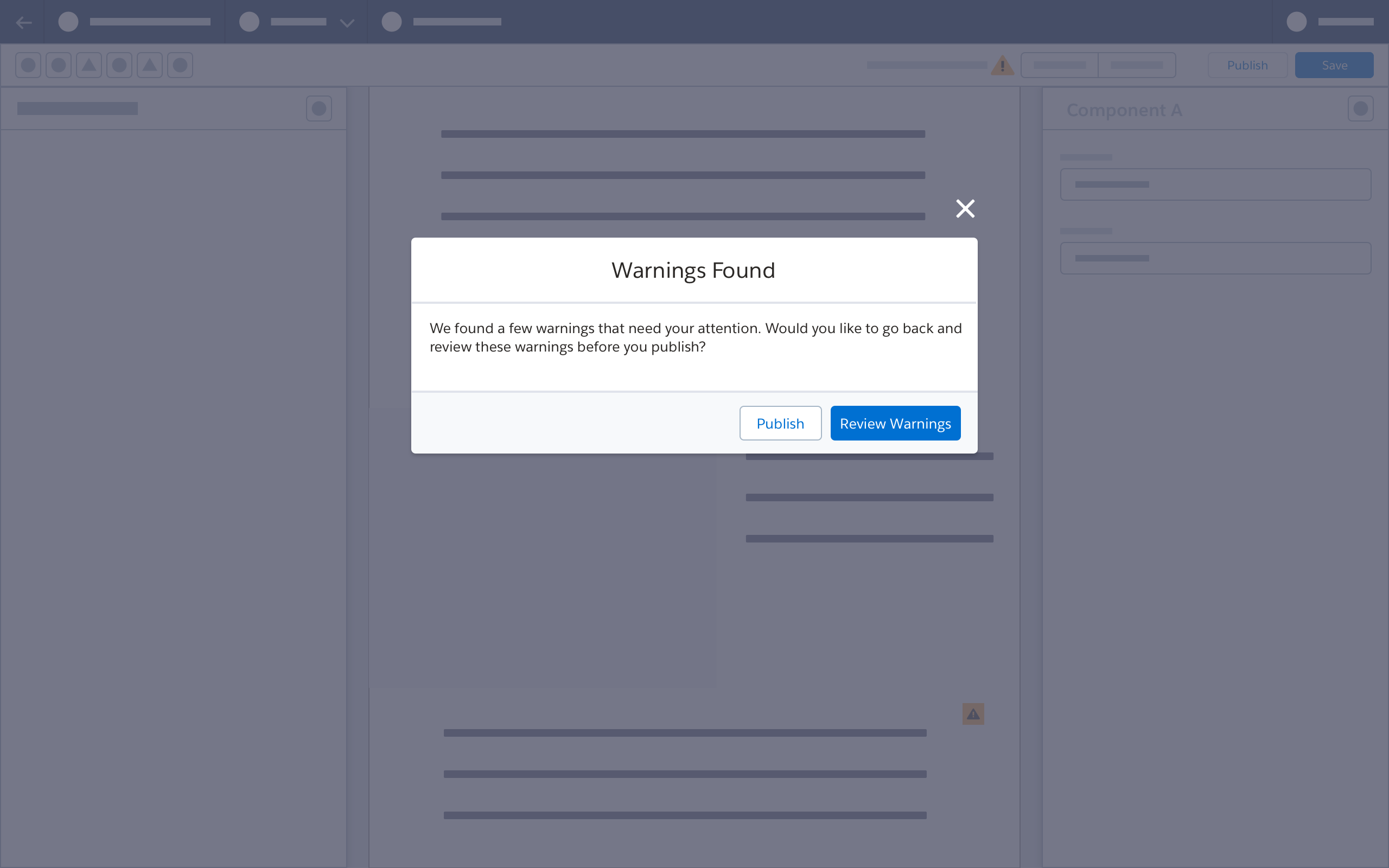
When the user selects Review Warnings, the browser again displays the popover dropdown and canvas warning icons.
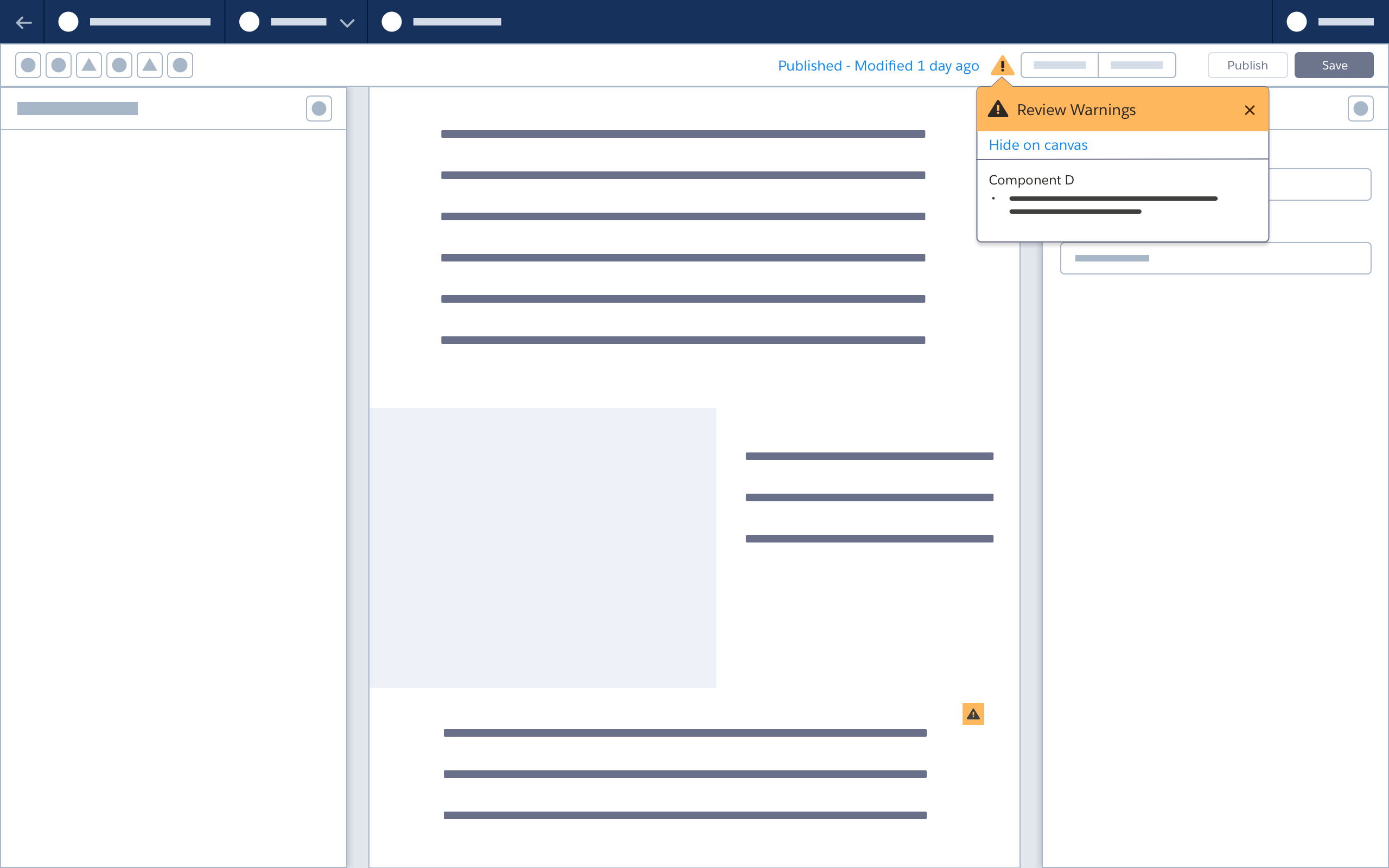
When the user clicks Publish, a confirmation modal displays any existing warnings. The user can review the warnings, or choose to publish.


After publishing, the popover dropdown and canvas warning icons remain. To address warnings for published or activated content, the content may need to be deactivated, then updated, saved and republished.
Popover/Icon Auto-Display
When a user reopens the builder after exiting a previous session, any popover dropdowns and warning icons are displayed.

Error Icon
The Error icon appears in the builder header to alert users to issues that do prevent saving or secondary actions.
Error Popover
When a user clicks the Error icon in the toolbar, a warning popover dropdown appears, and error icons are highlighted on invalid components. Invalid components have a visually distinctive select/hover state.
Error Alert Modal on Save or Secondary Action
When the user selects Save, a confirmation modal displays existing errors. The user must fix all errors in order to save.
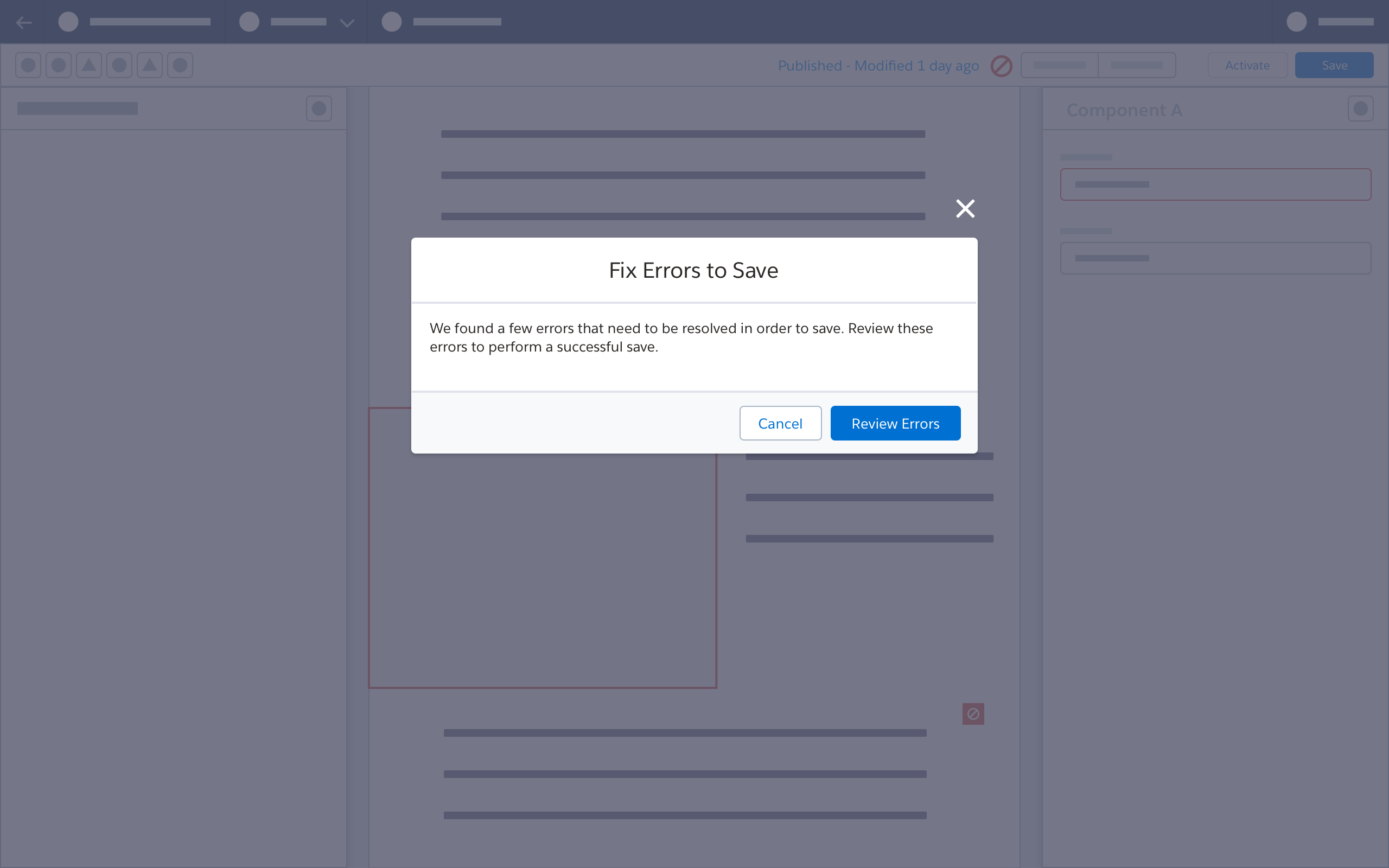
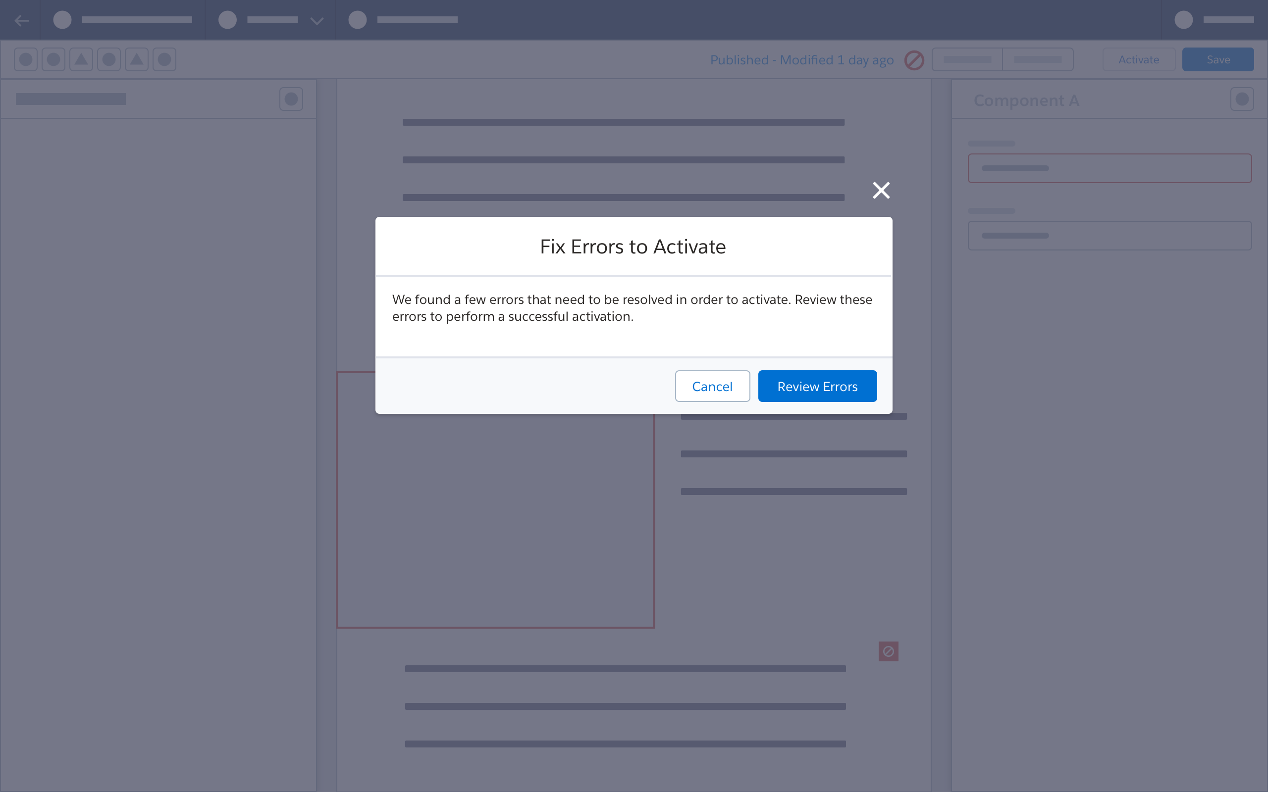
When the user selects Activate, a confirmation modal displays existing errors. The user must fix all errors in order to activate.
Next: Zoom Controls