Accessible Mobile Design Guidelines
Starting Your Design Process
Use existing SLDS components when possible.
SLDS uses global web interaction patterns and visual accessibility affordances. Our goal is to provide a consistent user experience for all users, whether they’re navigating with a mouse/touchscreen, keyboard, or screen reader.
When designing new UIs, rely as much as possible on these existing, accessible patterns, and include links to relevant components in your engineering specs. If you're creating a new component or pattern (one that doesn't exist in SLDS), discuss it with an accessibility specialist to identify any requirements before implementation.
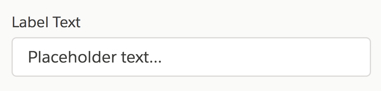
Give every form field a visible label.
Placeholder text isn’t enough—it can deeply confuse users when it disappears.
The only exceptions to this rule (which still require a visually hidden label for assistive technology users):
- Search fields, where the magnifying glass icon serves as a visible label
- Publishers’ rich text area, where surrounding elements provide context
Give every toggle and button a visible label that explicitly conveys its state.
To make them understandable to screen reader users, label toggles and buttons, and identify if they’re in a pressed or checked state. Label both radio button groups and each individual radio button. When using an icon as a button, give each state its own label. For buttons such as the SLDS stateful button that change color when pressed, make sure that the button’s pressed state is returned.
Remember accessibility when creating custom gestures.
Every custom gesture should have a one-finger equivalent, so users with limited motor capabilities can use it.
All custom gestures must be duplicated in the custom actions system of the screen reader. Make custom gestures easily discoverable, and include accessible help text describing their behavior.
Avoid horizontal scrolling lists.
Long or infinitely horizontal scrolling lists make it difficult for screen reader users to track their place, given that only parts of them are visible in the viewport at any given time. Screen readers rely on content to be in the viewport to communicate information reliably to the user.
Refining Your Design
Don't use color as the only visual means of conveying information.
Differentiate elements with a second indicator, such as informational text, icons, textures, or thicker borders. For example, instead of using green text to indicate success and red to indicate failure, use a green checkmark and a red X.
Ensure that text and informational icons have enough color contrast.
Not everyone has 20/20 vision or $1,000 Retina monitors. Plug your colors into www.AreMyColoursAccessible.com to ensure that most users can see them, with a ratio of 4.5:1 or higher for regular-sized text, 3:1 for icons and large text (24px and above or 18px bolded text). Disabled elements, such as a gray noninteractive buttons, do not need to pass contrast requirements.
Use SLDS tokens semantically. For example, don’t use colorTextWarning to make an item red; use it only for warning-state text.
Anchor action bars.
Keep all action bars (those containing buttons or other interactive controls) in the viewport at all times, even when the user scrolls. Screen reader users who use direct touch need such elements to stay in one place.
In the example below, the contents of the record detail change, but the action bar remains in one place.
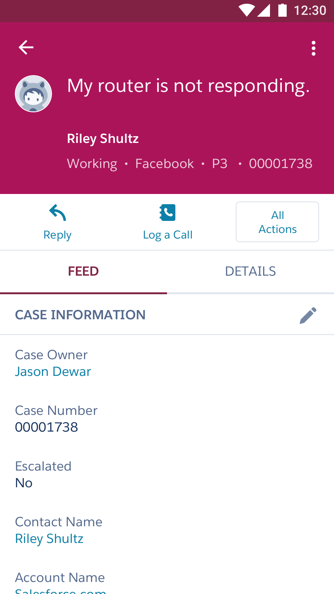
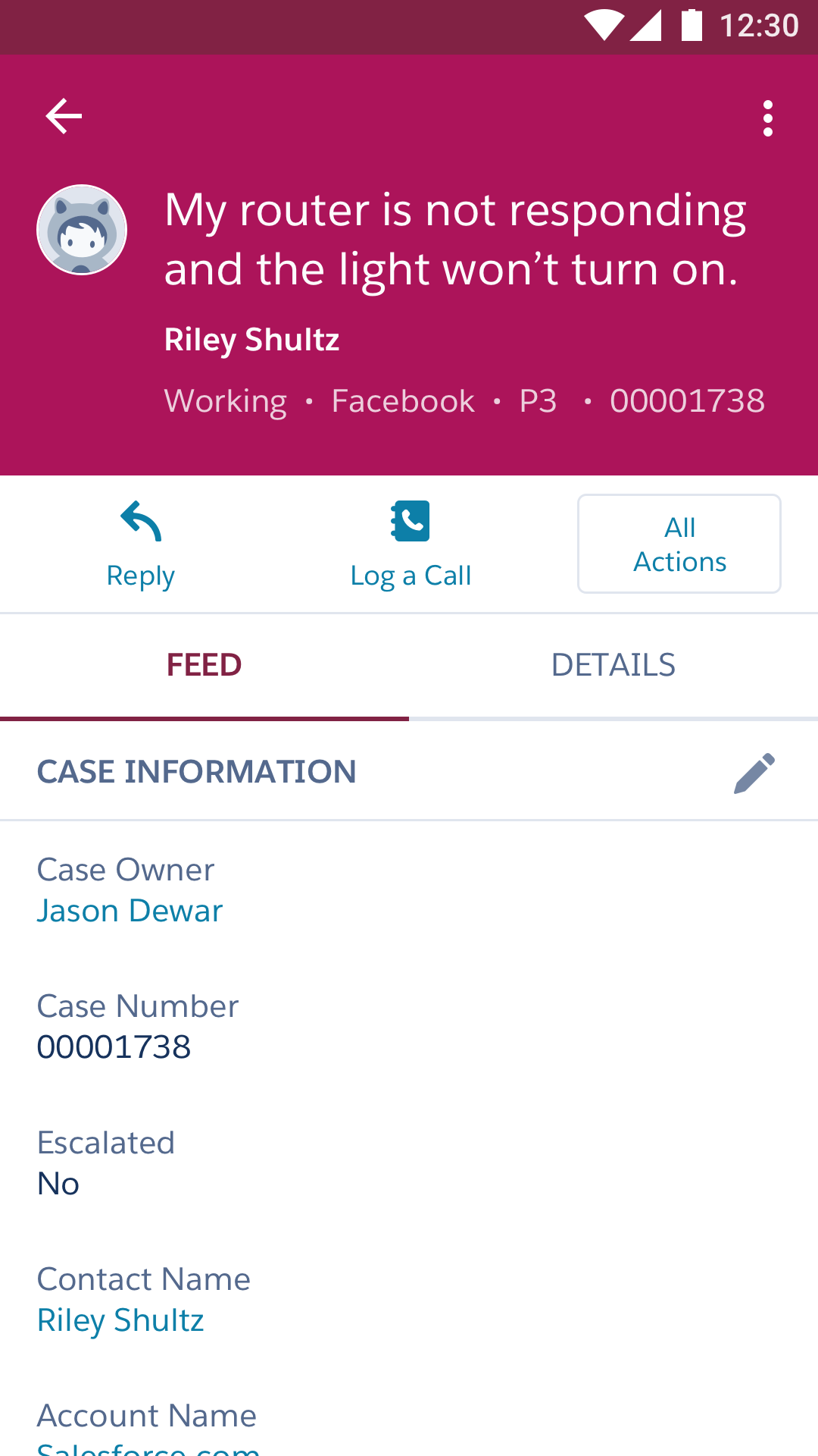
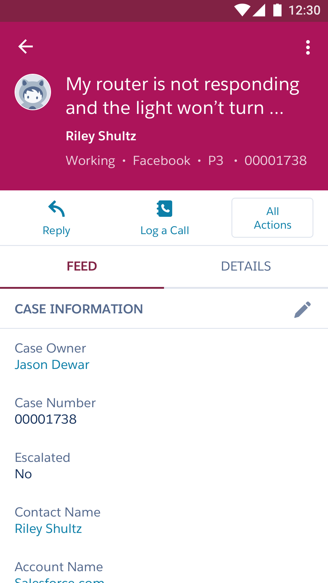
The height of the highlights area does not change when its content changes.
Anchor floating action buttons.
Anchor floating action buttons (those that exist on a plane above the regular scrolling UI) on the page, aligning them either in a corner or centered on an edge. They may disappear, as long as their behavior is reliable. Rare exceptions are possible, but please consult an accessibility specialist.
Make tap targets large enough for all users.
To serve all users, make tap targets at least 44pt/dp/px, regardless of operating system.
Preparing Specs for Developers
Define alternative text for icons and images.
In your design specs, provide good descriptions for informational images, and indicate when images are purely decorative (if you need the image to understand the UI, it’s informational). Unsure? Consult your friendly neighborhood doc writer or accessibility specialist, or check out WebAIM: Alternative Text.
Make sure that modal dialogs constrain their focus to inside the modal.
Users should never be able to touch outside of a modal, or touch any components behind it. Always provide a tap target to close the modal—a gesture is not sufficient, nor is tapping on the mask.
If you use half sheets, provide a tap target to let users toggle between half and full screen. It’s OK to provide a gesture as long as you also provide a tap target.
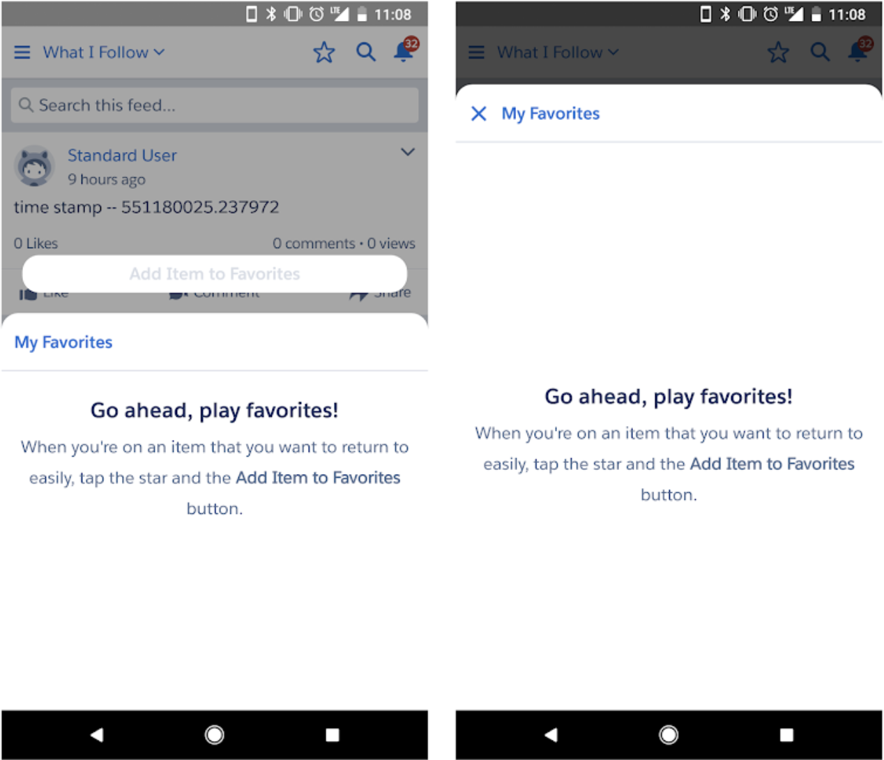
Tapping on "My Favorites" will expand or shrink the half sheet
Keep carousel content accessible.
Present carousel content in a consistent order each time the page or view containing it is loaded. Avoid looping and autoplay, which can leave users unclear as to their location in the carousel. Always include a “view all” or “show more” control.